The network for creativity
Join 1.25M professional creatives like you
Connect with clients, get discovered, and run your business 100% commission-free
Creatives on Contra have earned over $150M and we are just getting started
Back to feedPost

From noise to clarity. Meet Briefline. ✦
A SaaS website concept I designed and vibe coded with Lovable, centred on an AI workspace for turning meetings, documents, and research into clear briefs and decisions.
I explored an editorial direction: warm cream backgrounds, expressive typography, dark product previews, and cobalt-blue accents.
The walkthrough covers the product demo, workspace features, pricing, and FAQs.
Have a SaaS idea or business that needs a website? DM “BUILD” and let’s talk.
DETECH Optimize. Elevate.
#DETECH #WebDesign #Lovable #SaaSDesign #VibeCoding


The network for creativity
Join 1.25M professional creatives like you
Connect with clients, get discovered, and run your business 100% commission-free
Creatives on Contra have earned over $150M and we are just getting started







Related posts


Gorgeous 😍

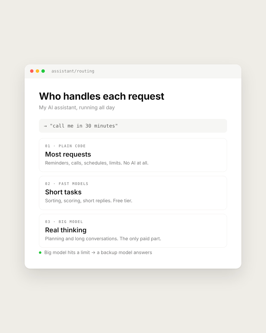
My AI assistant runs all day. The expensive model only does the thinking.
Most requests need no AI at all. "Call me in 30 minutes" is handled by plain code. Reminders, schedules and limits are code too.
Short tasks like sorting and scoring go to fast models on a free tier.
The big model only gets planning and long conversations, where it actually has to think.
If it hits a limit, a backup model answers instead of the app going silent.
If your AI app's bill keeps growing, check what really needs the big model.
What does your app send to the most expensive model?


Same pattern holds in outbound tooling. Filtering, dedupe and enrichment lookups are plain code. The model only writes the first line once the row is already verified. Cuts cost and the weird outputs.

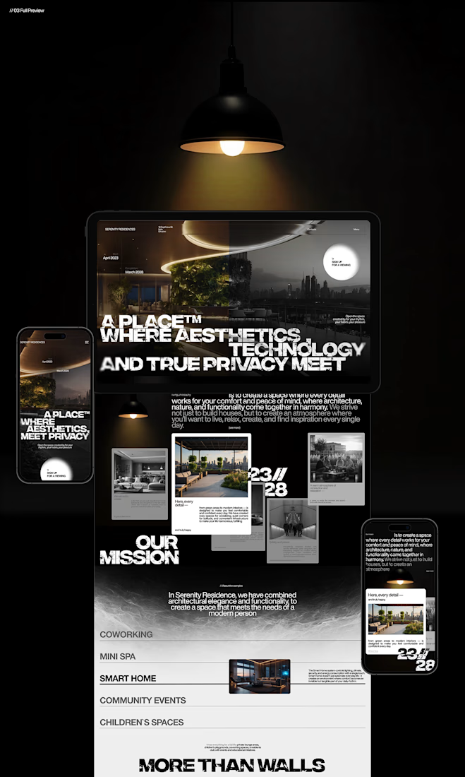
What makes someone stop scrolling and imagine themselves living in a property?
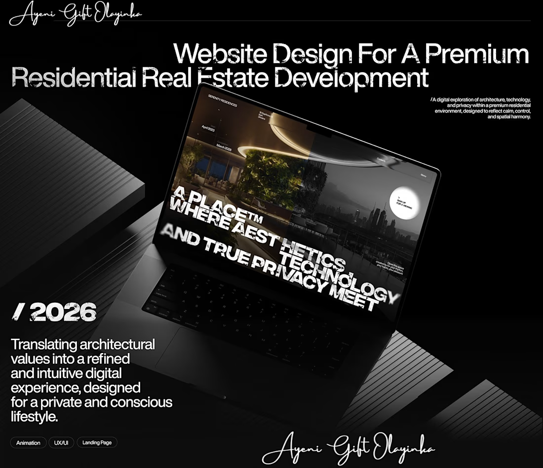
That's something I kept in mind while working on this luxury real estate website concept.
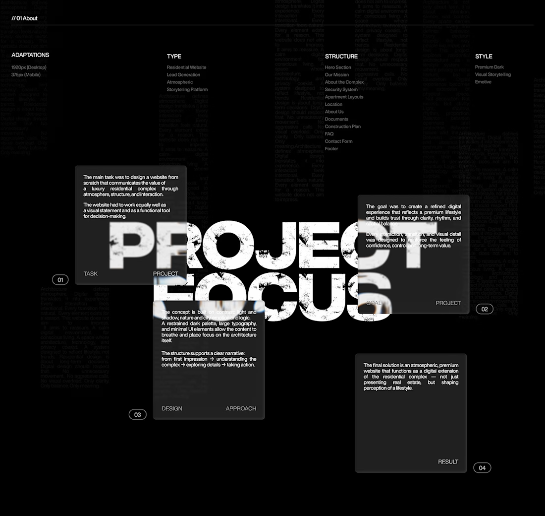
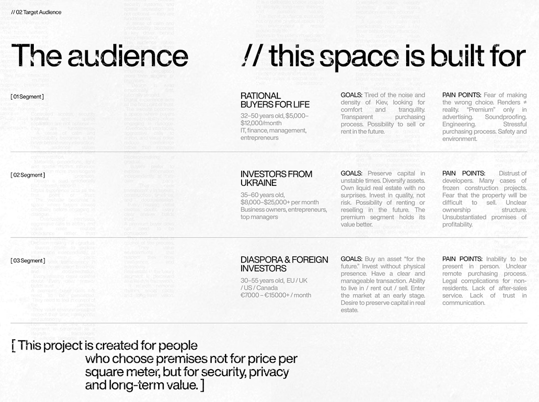
I wanted the design to feel premium without making the experience complicated. The focus was on strong visuals, clean layouts, and a clear structure that lets the properties speak for themselves.
I also paid attention to how visitors move through the website, from their first impression to exploring the properties and taking the next step.
Because when someone is looking for a home, the experience matters just as much as the presentation.
I couldn't fit every screen into this post, so I'll share more of the design in the comments. 👇
I'm curious: when you visit a real estate website, what makes you want to explore further?
#WebDesign #Architecture #LuxuryRealEstate #UIUXDesign #RealEstate #Figma



nice work