The network for creativity
Join 1.25M professional creatives like you
Connect with clients, get discovered, and run your business 100% commission-free
Creatives on Contra have earned over $150M and we are just getting started
Back to feedPost

MOOD MORPH — An Interface That Feels What You Write
Built entirely with Figma Make | #FigmaMakeathon
The UI is not a container for your emotions.
It IS your emotion.
Features:
• Cursor Empathy Engine (cursor shape + trail changes per emotion)
• Physics particle system (different physics signature per mood)
• Procedural mood art generated from your session
• Ambient Web Audio soundscapes per emotional state
• Emotion memory — the app carries over your last session's feeling
All transitions: 1.8s cubic-bezier.
Because emotions don't snap — they shift.
check it out: https://class-agency-84995365.figma.site/
End of session: your UI generates a one-of-a-kind abstract
painting made from your emotional fingerprint.
The network for creativity
Join 1.25M professional creatives like you
Connect with clients, get discovered, and run your business 100% commission-free
Creatives on Contra have earned over $150M and we are just getting started



Related posts

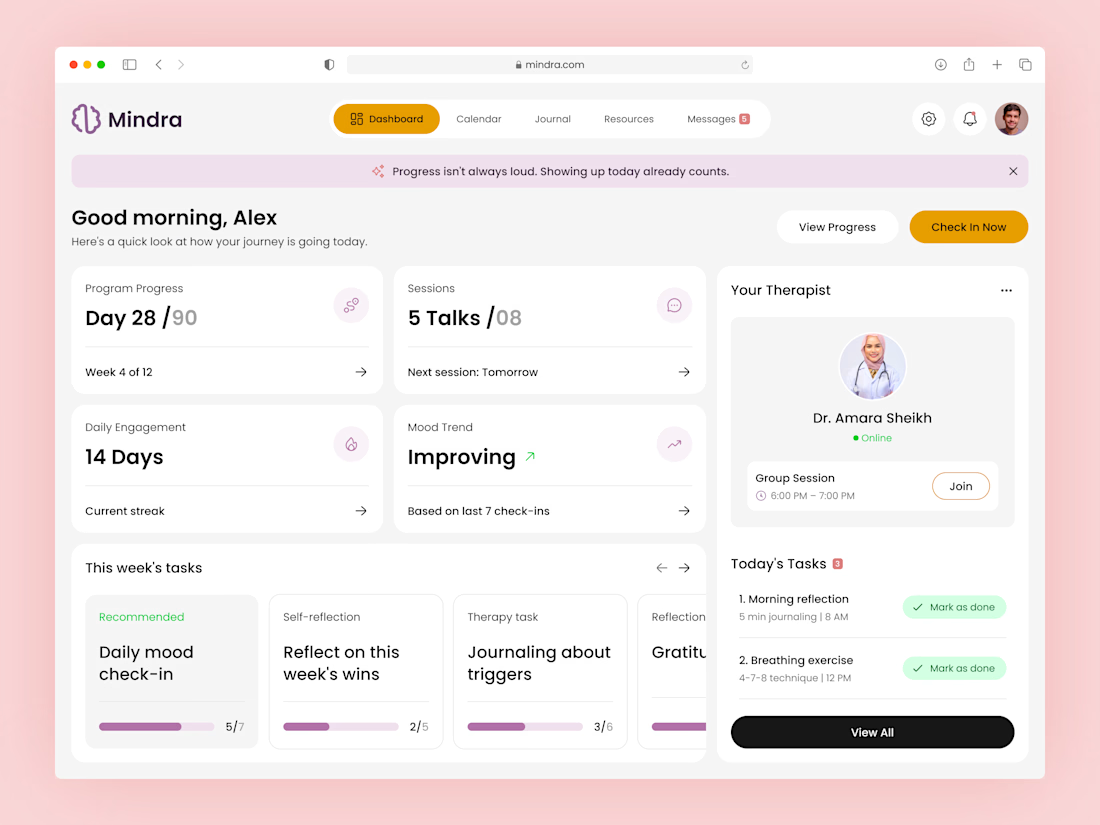
Designing for mental health requires a subtle balance between clarity and comfort. 🧠✨
For the Mindra web app dashboard, my main focus was crafting a clean, low-stress UI that seamlessly integrates therapist connections, mood trends, and daily reflections.
Check out the full showcase on my Contra profile! 👇


So true - clarity + comfort is the hardest balance in mental health design. Love that you focused on low-stress UI for Mindra.
Integrating therapist connections, mood trends, and daily reflections without feeling overwhelming is a real challenge. Would love to see how you handled the dashboard hierarchy. Important work!

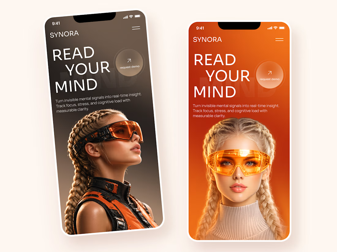
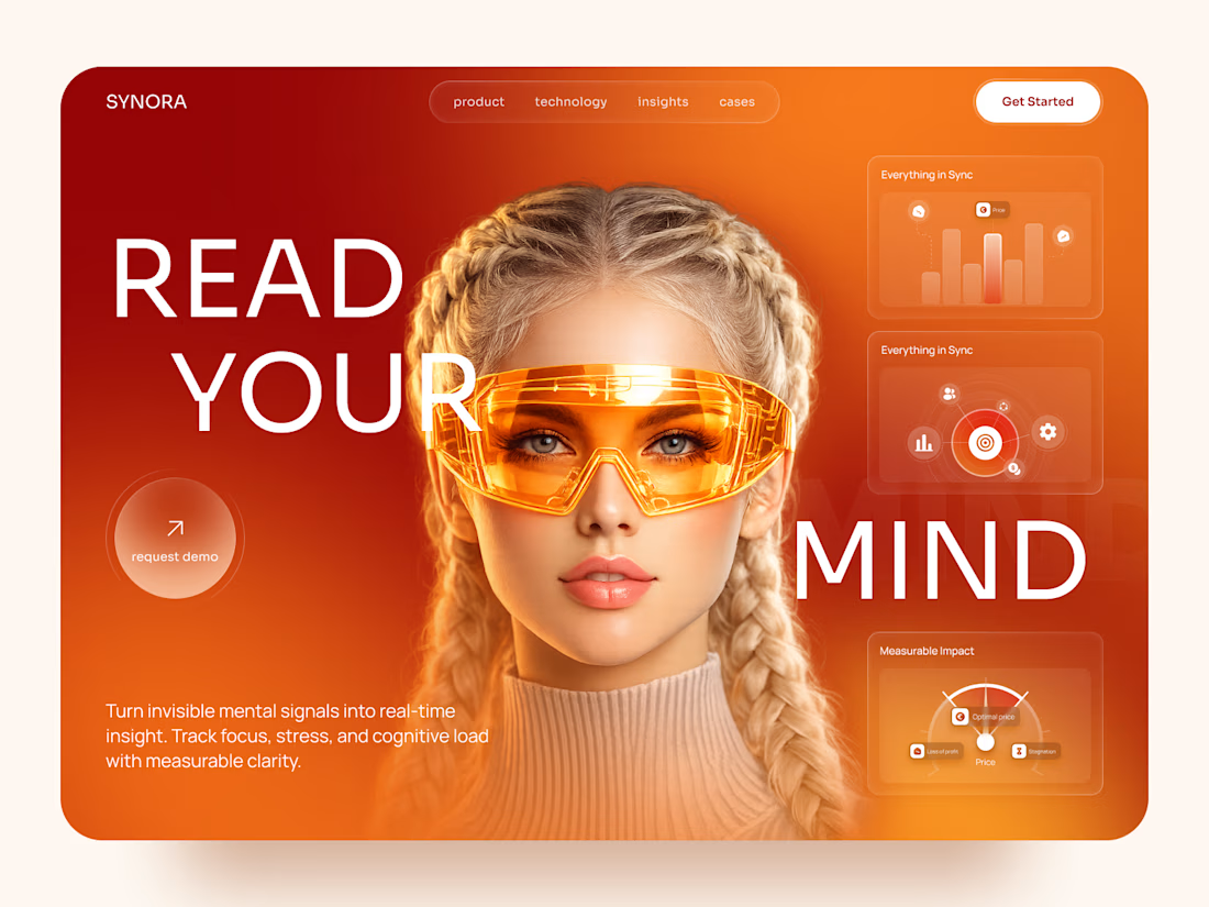
SYNORA — Futuristic Neurotechnology Landing Page
A bold landing page concept exploring the future of neurotechnology, cognitive insights, and human-centered innovation.
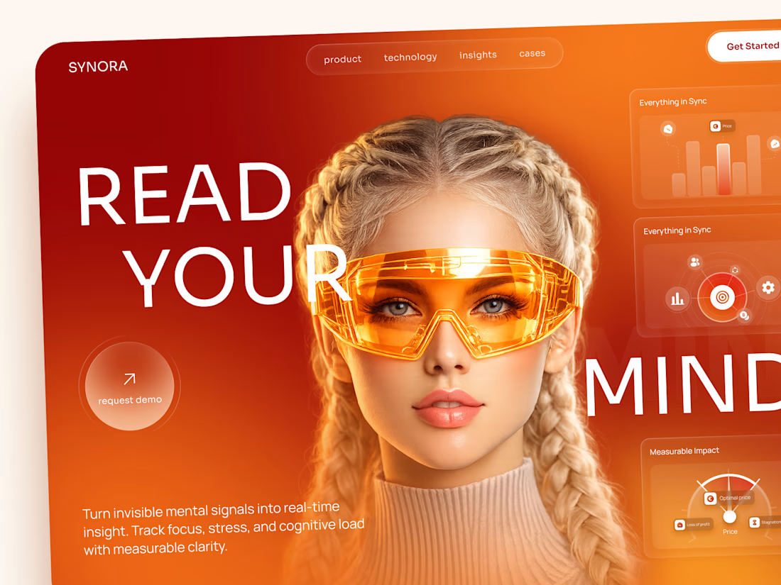
The visual direction combines vibrant orange gradients, futuristic eyewear, oversized typography, and floating data widgets to create a strong, technology-driven experience.
Special attention was given to:
• Bold hero section with futuristic imagery
• Vibrant orange and red color palette
• Oversized typography and strong visual hierarchy
• Floating analytics cards and glassmorphism elements
• Clear request demo CTA
• Responsive desktop and mobile layouts
• Clean navigation and immersive product presentation
The result is a striking landing page concept that makes complex technology feel exciting, modern, and approachable.
Looking to create a bold digital experience for an AI, tech, or innovative product? Let's connect 🚀


the contrast here is perfect

iPhone Duo — UI Motion Design Study
Overview
An independent UI motion design experiment exploring minimalist interface elements through geometric shapes, circular motion, and smooth transitions.
The Concept
This project explores how simple interface components can become visually engaging through motion. The visual system includes Wi-Fi symbols, circular dots, cellular signal elements, and battery-inspired shapes
Design Focus
Minimalist UI composition
Circular dot animation
Wi-Fi symbol and battery icon design
Geometric transformations
Motion timing and transitions
Clean visual hierarchy
My Role
UI Design and Motion Design Experimentation
Tools
Figma and
Project Type
Independent concept project created for portfolio development and creative exploration.
Objective
To explore the relationship between simple interface elements and motion, creating a clean, cohesive visual experience.
This is a self-initiated concept project and is not affiliated with or endorsed by Apple.


Nice work