The network for creativity
Join 1.25M professional creatives like you
Connect with clients, get discovered, and run your business 100% commission-free
Creatives on Contra have earned over $150M and we are just getting started
Back to feedPost

Brand Storytelling and Product Copy for Conscious Wellness Brand
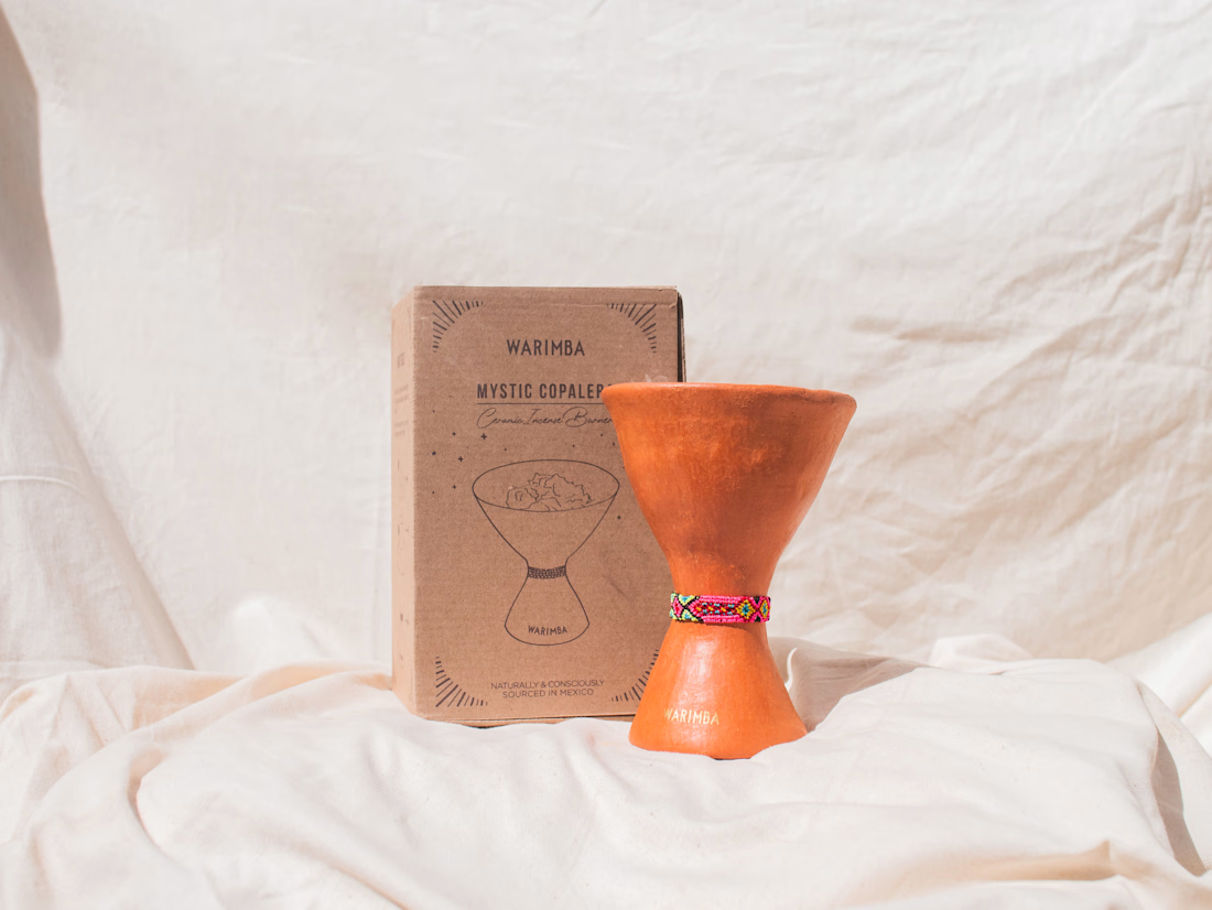
Self Pleasure was a product collection developed as part of the Warimba brand, a conscious lifestyle project I founded centered around ritual, sensory wellbeing, and artisan design.
The Self Pleasure collection explored the idea of creating a sacred and intimate space with oneself through scent, ritual, and simple moments of presence. The concept was inspired by the belief that pleasure can be awakened through everyday sensory experiences, especially through natural aromas and grounding rituals.
For this collection, I led the creative concept, naming, brand narrative, and product copy. I developed the storytelling behind the collection, including the language used across packaging, product descriptions, and brand messaging.
The intention of the Self Pleasure line was to invite women to reconnect with themselves, slow down, and cultivate enjoyment in simple moments through mystical aromatherapy and consciously sourced natural ingredients.
This project reflects my ability to build emotional brand narratives, translate abstract concepts into clear messaging, and create product language that resonates with wellness and conscious living audiences.


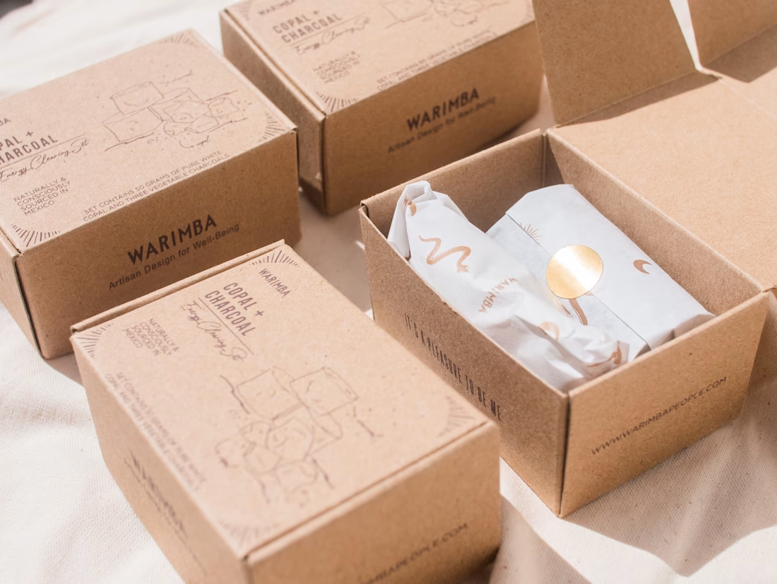
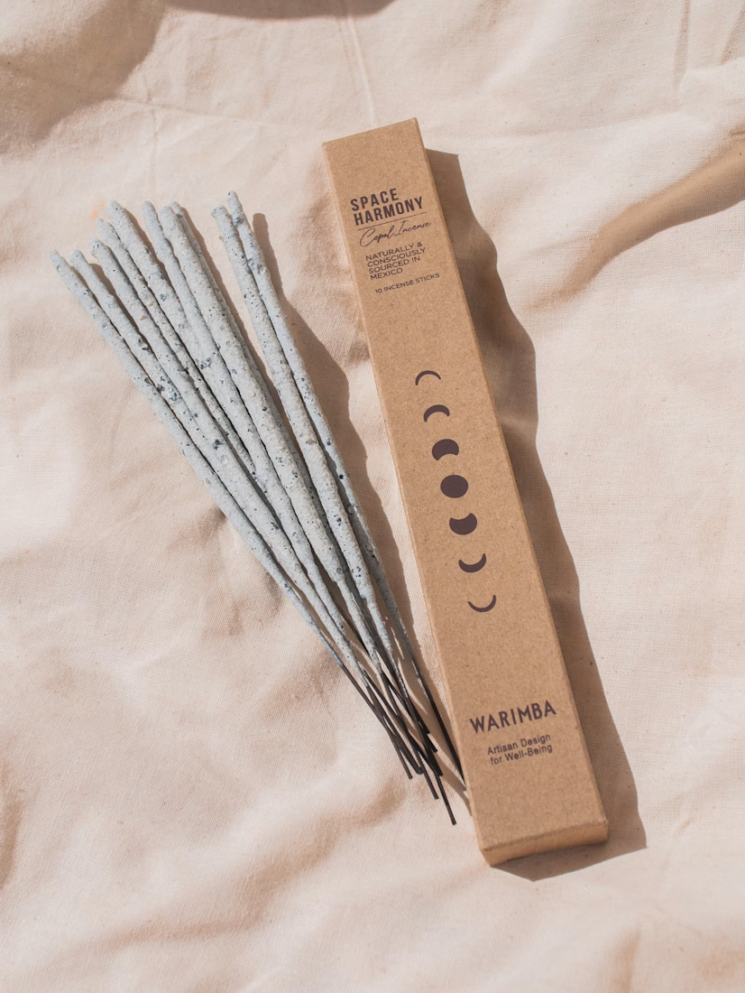
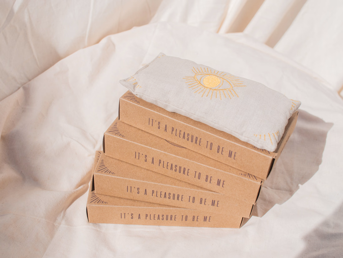


this truly reflects the emotional brand storytelling and abstract narratives😊
The network for creativity
Join 1.25M professional creatives like you
Connect with clients, get discovered, and run your business 100% commission-free
Creatives on Contra have earned over $150M and we are just getting started







Related posts

This is Luméra- a skincare brand rooted in mythical energy which believes in purity, calmness and richness. I designed the logo and its full branding process which gave me the opportunity to bring this brand to life without the traditional skincare brand logo cluttering.




The soft cream serif on amber glass is calm and premium, and the soapy hands shot sells the product better than a flat packshot. Spicy take: without the traditional logo clutter is the right call, but a mythical energy brand with no mythical element anywhere on the bottle is a...

A useful way to evaluate a brand identity: place the business card, packaging, and social posts side by side.
Do they feel like they belong to the same business—even when the logo isn’t prominent?
That’s what I look for in a visual system. Typography creates hierarchy. Color builds recognition. Patterns and layout give the brand a character that can carry across different formats.
For business owners reviewing a new identity, ask your designer to show how it works in the places your customers will actually encounter it. Those applications can reveal more than a logo presentation alone.
Which touchpoint is hardest to keep consistent in your brand?

That's great visuals and motion graphics Great job Mohammed

NOUREST — Nature-Led Brand Identity Design.
A brand about nature should feel natural at every touchpoint. 🌿
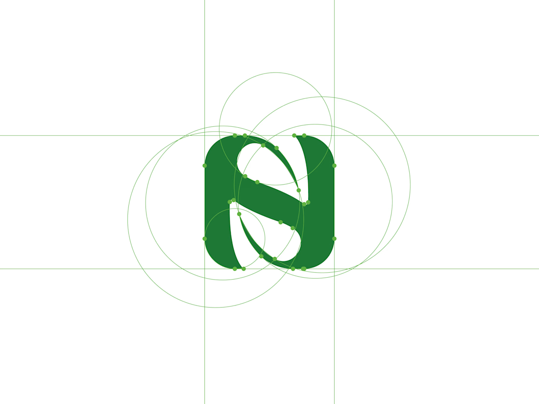
That's the idea behind NOUREST from its leaf-inspired monogram and green-led palette to packaging and brand materials.
One identity.
A consistent experience.
🏀 Full Design Showcase – Better View on Dribbble.
✅ https://dribbble.com/shots/27799268-NOUREST-Sustainable-Brand-Identity