The network for creativity
Join 1.25M professional creatives like you
Connect with clients, get discovered, and run your business 100% commission-free
Creatives on Contra have earned over $150M and we are just getting started
Back to feedPost

Read my article:
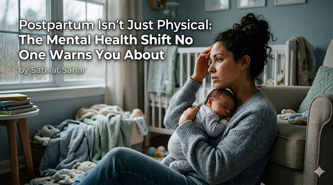
Postpartum Isn’t Just Physical: The Mental Health Shift No One Warns You About “A closer look at maternal mental health beyond physical recovery.”


The network for creativity
Join 1.25M professional creatives like you
Connect with clients, get discovered, and run your business 100% commission-free
Creatives on Contra have earned over $150M and we are just getting started

Related posts

One number told the whole story of the month.
Not a dashboard full of metrics one clear figure that summed up what all the automations actually added up to. That's the version of reporting that actually gets read.
→ A month of work deserves a summary someone will actually open.


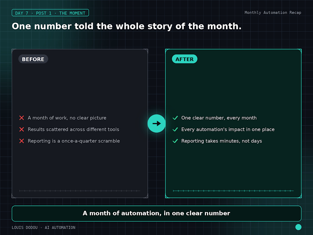

Seeing a single figure that captures the month's automation value makes the report instantly digestible


For your first article, this is really good!

Working on a new homepage direction for OPSTACTICS.
The product is built around practical guidance, systems, and resources for founders and operators, so the homepage needed to communicate clarity without feeling like another generic business education site.
I explored two hero directions here.
One puts the value proposition first, with the content library, focus areas, learner proof, and featured resources visible immediately.
The other is much more founder-led, using a stronger central portrait and a simpler message around building a business that can run with more clarity and less dependence on the founder.
Same brand, same positioning, but two different ways of introducing it.
Now refining which direction gives the rest of the site the strongest foundation. Eager to hear your thoughts!
2 voted
67%
1 voted
33%
3 votes
Closed

founder led





