The network for creativity
Join 1.25M professional creatives like you
Connect with clients, get discovered, and run your business 100% commission-free
Creatives on Contra have earned over $150M and we are just getting started
Back to feedPost

Viewfinder × Framer 📸
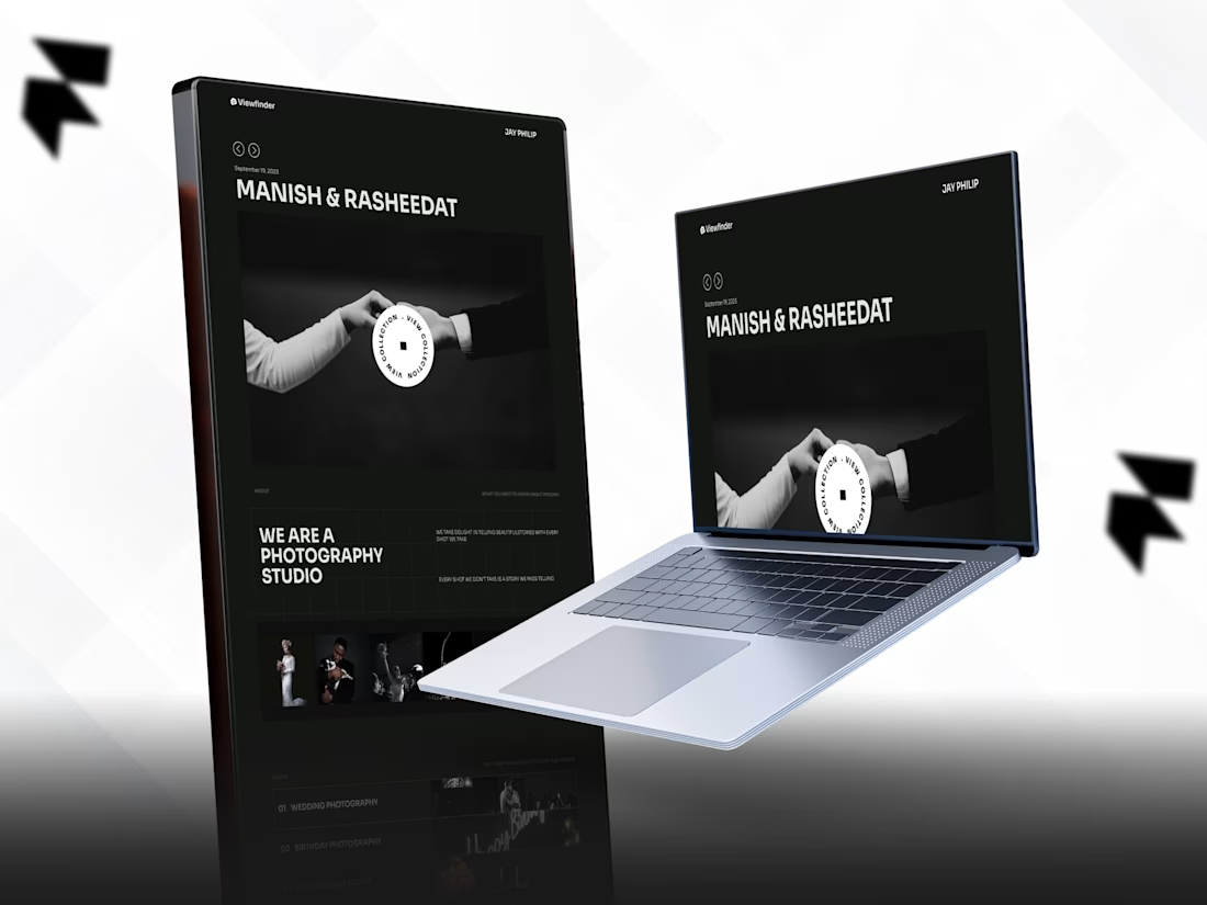
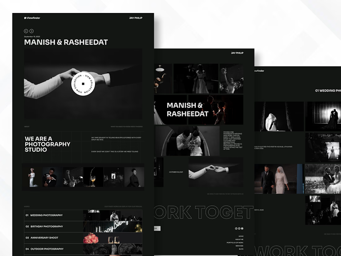
Black, bold, image first.
The idea was to give the photography room to breathe, less clutter, more atmosphere.
I built the Framer website around wedding stories, event photography, galleries, services, and featured moments, using oversized typography, dark layouts, and responsive interactions to create a more editorial feel.
The fun part? Finding the balance between strong visuals and effortless browsing without making the website feel heavy. ✨
🤝 Open to collaborating with photographers, studios, creative teams & developers on interesting builds.
Built with: Framer · Responsive Development · Interactive Galleries · CMS · Creative Web Development
#Framer #FramerDeveloper #WebDevelopment


Super cool work Travis! 🎉
Thank you 🤝


The dark editorial look really suits wedding work, the photos do the talking. Image-first sites like this usually live or die on load feel though. How are you handling the galleries in Framer, native lazy loading with blurred placeholders or something custom? I am a Next.js dev...
Exactly, image heavy sites live or die on performance. I’m using optimized assets and lazy loading to keep the initial load light. Appreciate the thoughtful comment. 💯
Solid setup. One small thing that helped on our image-heavy lamp store: blur placeholders generated at build time so nothing jumps while the gallery streams in. Wedding galleries would benefit the same way. Nice work, Travis.


The network for creativity
Join 1.25M professional creatives like you
Connect with clients, get discovered, and run your business 100% commission-free
Creatives on Contra have earned over $150M and we are just getting started

Challenges
View all


Related posts

New site, fresh launch ✦
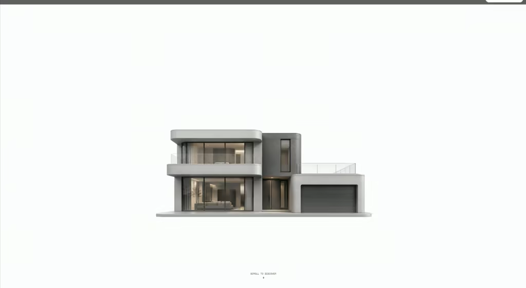
Designed and built LANDWISE — a tokenized real estate platform focused on making fractional property investing feel more accessible, transparent, and global.
For the hero, I wanted the interaction itself to communicate what the product is about.
Hovering over the building reveals property price tags — subtly suggesting that each building represents a tokenized real estate opportunity.
The goal was to make the concept understandable through the visual experience, without having to explain everything upfront.

Creative thinking

I usually don't stop at 3 breakpoints when building a website.
Most people think about: Mobile, Tablet, Laptop
I like adding one more: Desktop
Because what looks great at 1440px can feel completely different at 1920px...
- The layout gets too wide.
- Spacing starts feeling off.
- Content loses its balance.
So I like testing the system across: Mobile → Tablet → Laptop → Desktop
Not because every website needs exactly 4 breakpoints. But because responsive design isn't about making a few screen sizes work.
It's about making the whole system work.
Follow Rushabh for more website fundamentals, experiments, and things I learn while building for the web.

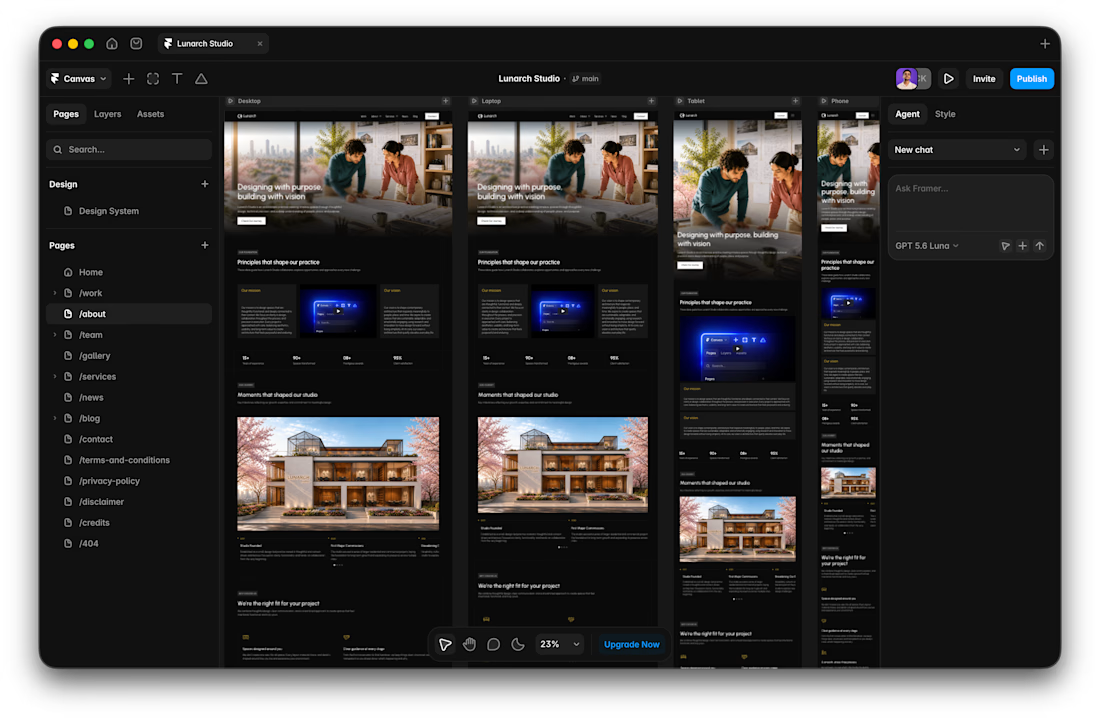

Wide screens expose spacing issues that laptop previews can hide.


A look at the identity we designed for Vetti, a dog health monitoring brand.
There’s a lot of data behind a product like this but the person using it just wants to know their dog is okay.
That’s the balance in the design with a connected dot system that feels precise and warm colors and photography that keep it close to what people care about.
Also, an excellent excuse to spend far too long choosing dog photos.
