The network for creativity
Join 1.25M professional creatives like you
Connect with clients, get discovered, and run your business 100% commission-free
Creatives on Contra have earned over $150M and we are just getting started
Back to feedPost
I designed a loan app where silence is a bug.
Most fintech apps leave you guessing after you hit "Apply."
Approved? Processing? Rejected? Who knows.
That UX gap is what Paisa 108 is built to fix.
What I shipped:
→ 7 loan states — every stage has a name, a visual, and a next action
→ 13 resumable journey steps — drop off, come back, never start over
→ 58-sec processing time surfaced right on the homescreen
→ Dark UI with two emotional accents: red for urgency, teal for progress
The whole system runs on one rule:
the user always knows where they stand.
Full breakdown on LinkedIn (case study + design decisions) 👇
linkedin.com/posts/siddharth-singh...
And the full Behance case study:
behance.net/gallery/250643097/Paisa-108
The red for urgency, teal for progress color system is exactly the kind of intentional emotional design that fintech usually misses. Most loan apps treat all states the same visually, which is why users feel lost.
That's what I tried to fix here :)
This is outstanding!
Thank you so much!!
The network for creativity
Join 1.25M professional creatives like you
Connect with clients, get discovered, and run your business 100% commission-free
Creatives on Contra have earned over $150M and we are just getting started
Trending
Claude
Claude has entered the design space. How are you using Claude Design?
Contra University
Learn from expert creatives how to earn more using next-gen AI tools.
creativeaiflow
Creative AI workflows are evolving. What tools do you use, and what are their strengths and weaknesses?
freelancerlife
Freelancer life is wins, pivots, and everything in between. What’s yours right now?
Related posts
Added some motion to the Marigold concept over the weekend, first time playing with Figma motion as well. Pretty straight forward.
2 more
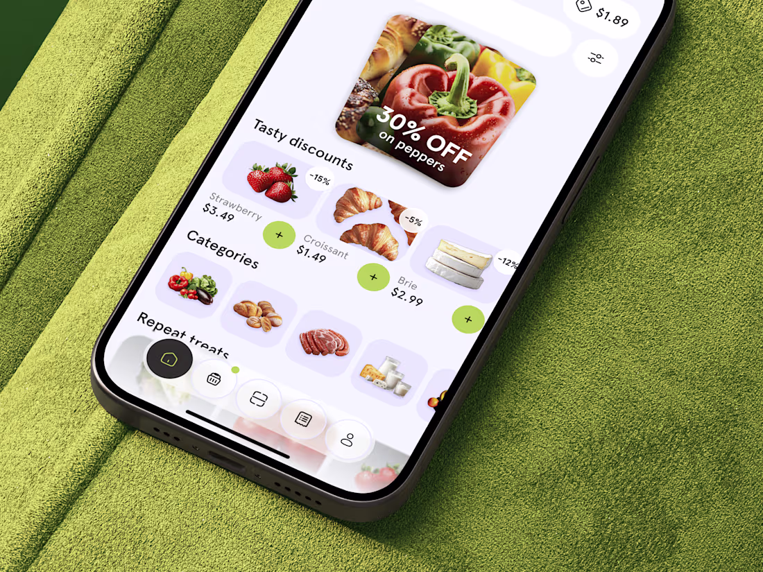
Just shared food delivery app concept 🥐 What do you think?
This looks fantastic. Which stage of the process was the most challenging?
Nice design