The network for creativity
Join 1.25M professional creatives like you
Connect with clients, get discovered, and run your business 100% commission-free
Creatives on Contra have earned over $150M and we are just getting started
Back to feedPost

Happy new week 🌤️
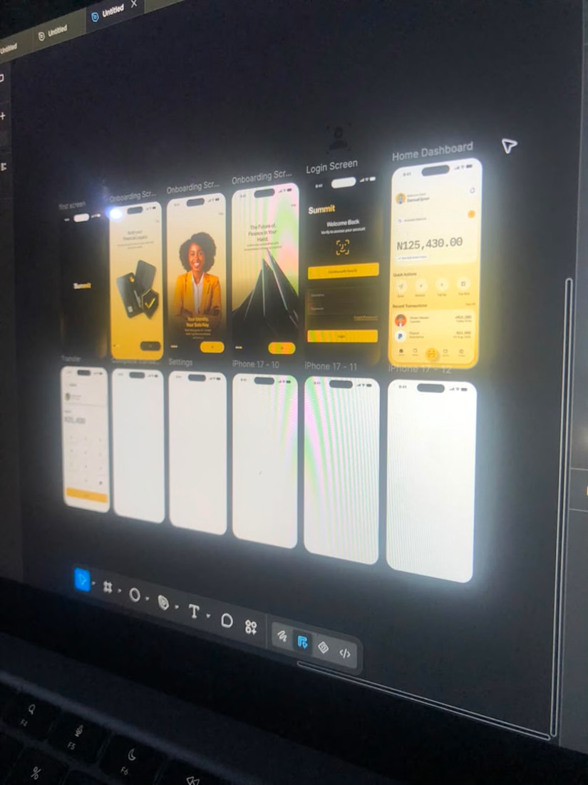
Day 3 of the Summit Bank UI/UX Design Challenge 🏦✨
Three screens designed so far: Onboarding, Login/Biometric, and the Home Dashboard — built on a warm gold-on-dark palette meant to feel premium and trustworthy without being loud about it.
The Home Dashboard was the one that took the most thought: balance front and center, quick actions within thumb's reach, recent transactions visible immediately — no clutter, no guessing where to look first.
Next up: Account Details, Money Transfer, and Transaction History. Still designing with intention, one screen at a time.
#UIUXDesign #ProductDesign #Fintech #DesignChallenge #Figma
The network for creativity
Join 1.25M professional creatives like you
Connect with clients, get discovered, and run your business 100% commission-free
Creatives on Contra have earned over $150M and we are just getting started





Related posts



Professional work


