The network for creativity
Join 1.25M professional creatives like you
Connect with clients, get discovered, and run your business 100% commission-free
Creatives on Contra have earned over $150M and we are just getting started
Back to feedPost
A quick series of shots for the Apple Watch. Which one is your favorite?


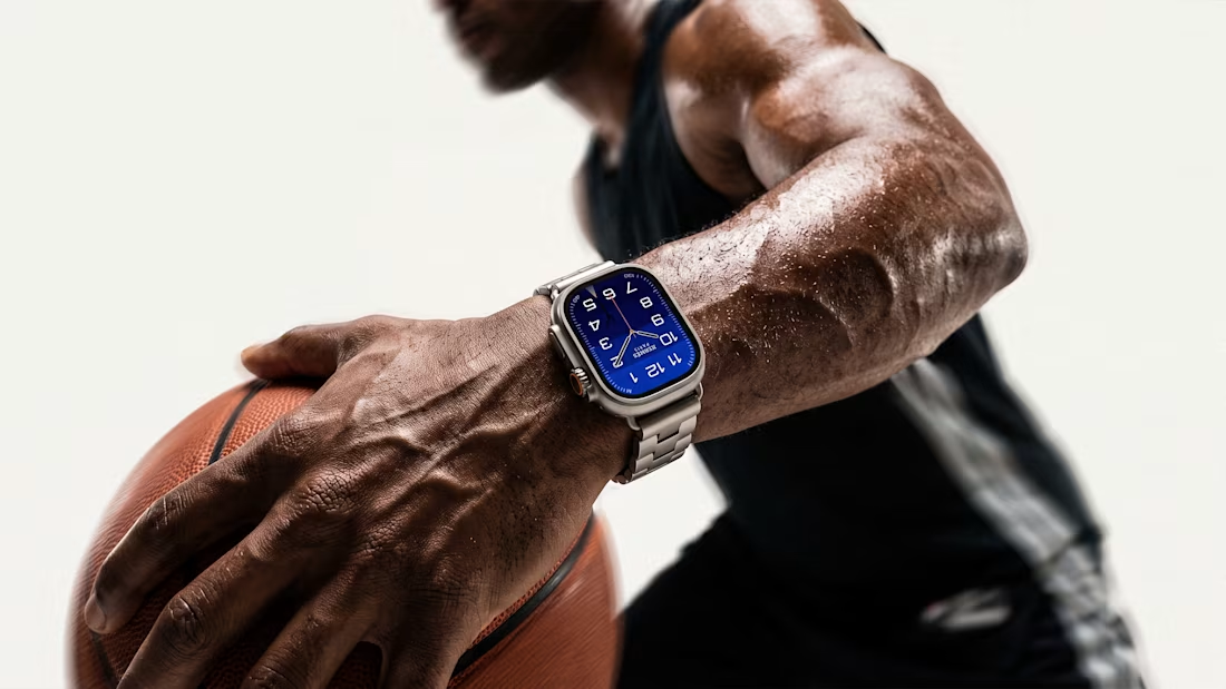

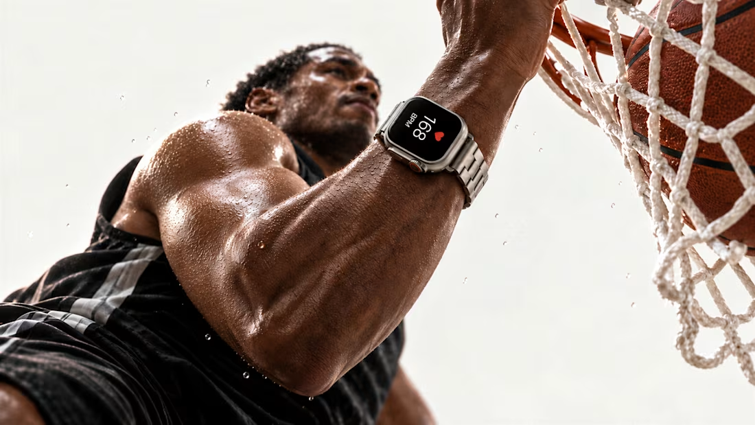

Wow, the first one looks just like a still from a commercial!

Thanks, Sanie😍
I was actually trying to make it look like a shot from a commercial)
The network for creativity
Join 1.25M professional creatives like you
Connect with clients, get discovered, and run your business 100% commission-free
Creatives on Contra have earned over $150M and we are just getting started






Related posts

Designed and developed Crown Timepieces, an interactive luxury watch e-commerce platform built to showcase high-end horology products with smooth browser performance.
Key features include:
• Real-time search and instant category filtering across 100 timepiece models without page reloads.
• Interactive quick-view modal dialogs detailing watch specs, case materials, and dynamic waitlist toggles.
• Integrated media overlays including an embedded brand film player and a boutique appointment booking popup.
• Fully responsive, mobile-optimized UI styled with modern typography and sleek micro-interactions.


100 models with instant filtering and no page reloads is the right flex for luxury — nothing kills a high-end feel faster than a slow catalogue. I liked that the quick-view modal carries the real decision data (specs, case materials) instead of forcing a full page jump, and the...

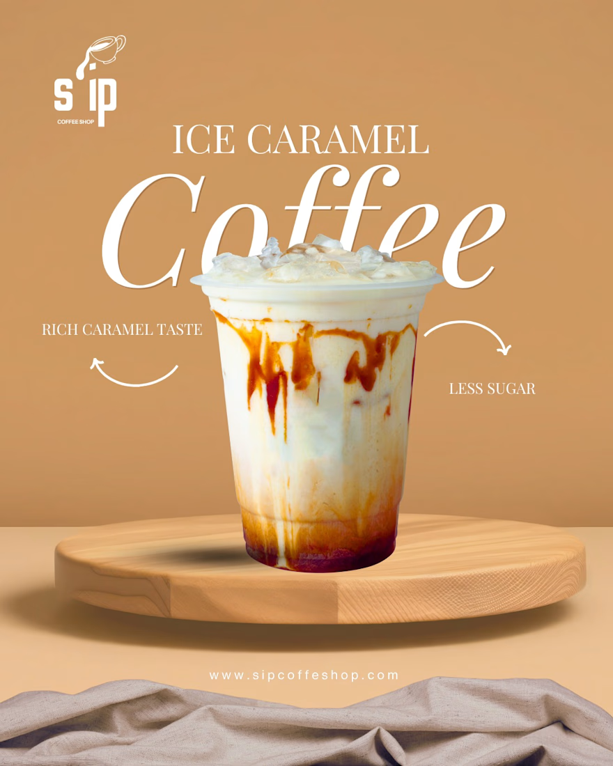
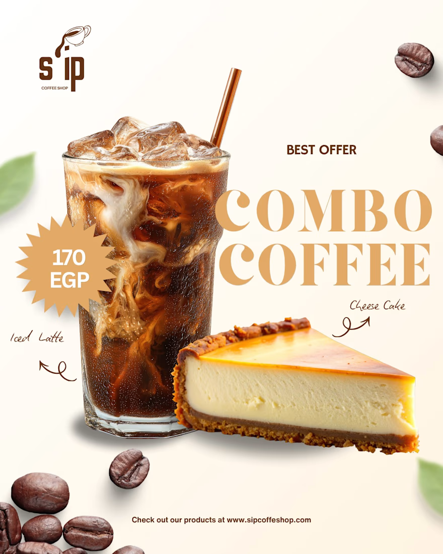
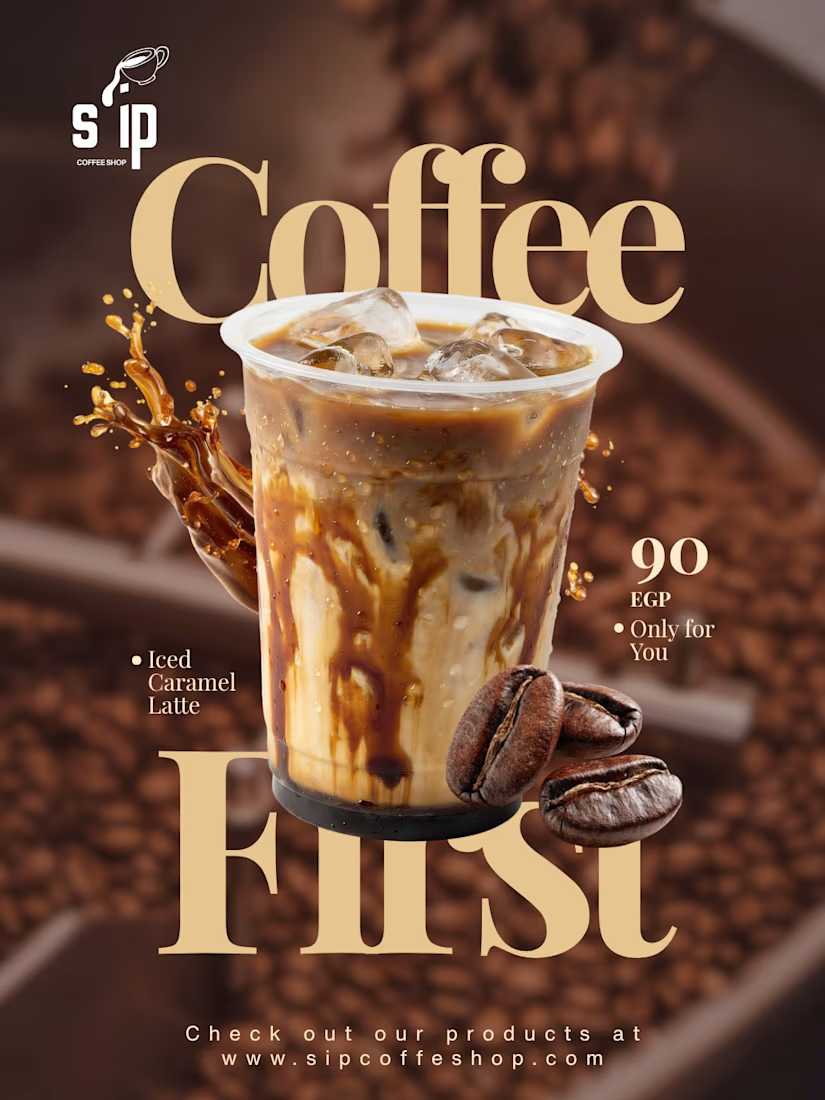
Product visuals created for S'IP Coffee Shop
Delicious designs engineered to turn scrollers into customers