The network for creativity
Join 1.25M professional creatives like you
Connect with clients, get discovered, and run your business 100% commission-free
Creatives on Contra have earned over $150M and we are just getting started
Back to feedPost

Proof that you don't always need code for butter-smooth motion. 🧈
Built this infinite toast loop animation entirely using Webflow’s native engine. Zero lines of code, 100% GSAP-level smoothness.
What do you think of this? 👇
#Webflow #GSAP


The network for creativity
Join 1.25M professional creatives like you
Connect with clients, get discovered, and run your business 100% commission-free
Creatives on Contra have earned over $150M and we are just getting started



Related posts

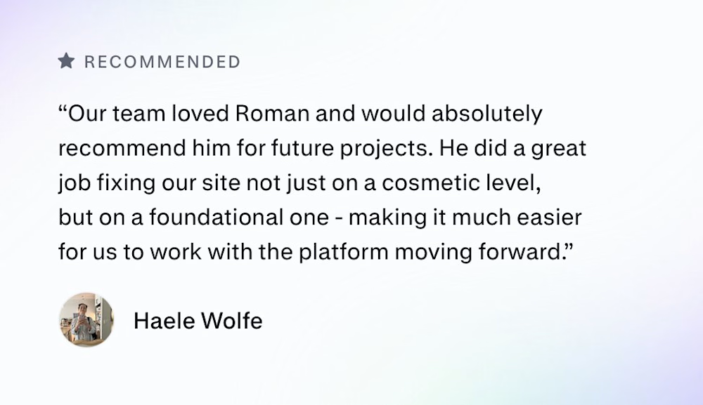
Zencastr came to us with a complex mix: they hosted their homepage on a custom server, blog on a separate platform and the rest of the pages on Webflow.
They had 3 days before the launch to tie it all together. This is their review:

Three platforms behind one domain in three days is a real test. I'd guess the reverse proxy and keeping the nav and footer identical across all three took more care than any of the page building. Did you match the shared header in Webflow or pull it from one source?





Violet/blue look pretty

Card Banking Web Design Exploration
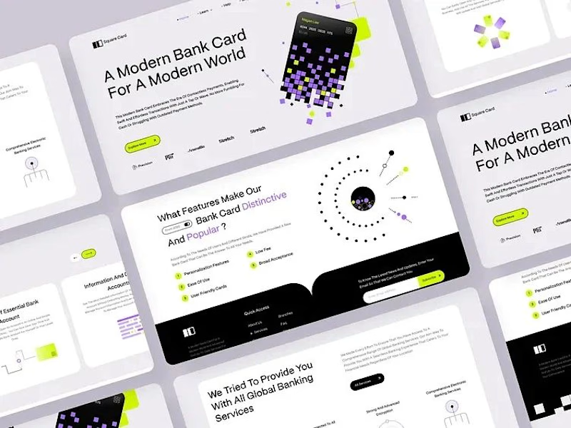
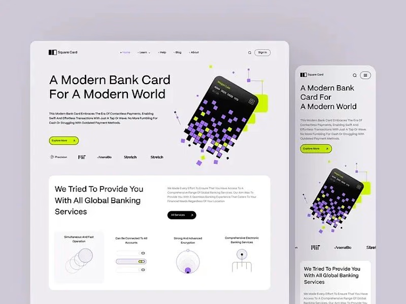
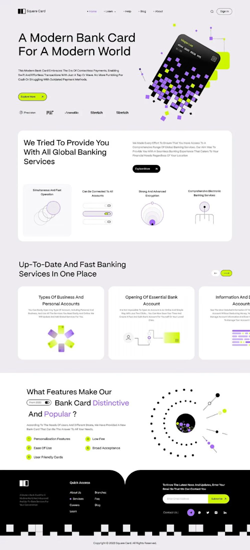
“A modern bank card for the modern world.” That line set the tone, and the layout follows it.
The hero is one pixelated card, built from small squares in lilac, lime and black. It breaks apart into the page, and the product still reads first.
The headline runs large across the left in clean type, so big the message lands before anything else. The card keeps its playful shape, and the words still lead.
Thin line icons and numbered points split the features into small, clear blocks. The busy information gets a strict structure to lean on.
A single lime button sits under the headline and marks where to go next.
Designed by Pixel & Form.
#WebDesign #BankingDesign #FintechDesign #UIDesign #LandingPage #ProductDesign #ResponsiveDesign #CardDesign #Typography #FigmaDesign


Nice work!