The network for creativity
Join 1.25M professional creatives like you
Connect with clients, get discovered, and run your business 100% commission-free
Creatives on Contra have earned over $150M and we are just getting started
Back to feedPost

Finished a landing page design exploration for a digital security product.
One thing this project made me pay more attention to was consistency — especially in spacing and typography.
It's easy to focus on individual components and how they look on their own. But getting the spacing between sections, the hierarchy of text, and the rhythm of the overall page to feel consistent is a different challenge.
I'm still learning to recognise these details and apply them more intentionally. The result may not be perfect, but the process has given me a better understanding of what to look for in my next project.
I also explored how the layout adapts to mobile screens.
Here's the project: https://lnkd.in/dh_fShwH
#ProductDesign #UIDesign #WebDesign #Figma

lnkd.in
This link will take you to a page that’s not on LinkedIn

Whitespace makes such a difference.
The network for creativity
Join 1.25M professional creatives like you
Connect with clients, get discovered, and run your business 100% commission-free
Creatives on Contra have earned over $150M and we are just getting started
Related posts

Casemate: making malware analysis feel calm instead of scary
Cybersecurity websites usually look the same: black background, green code, a hooded guy. I wanted to try the opposite for Casemate, a concept for a malware analysis tool.
The idea is simple: the product keeps a suspicious file in a sealed chamber and watches what it does. So I put a bug frozen in amber in the middle of a canyon. It’s dangerous and under control at the same time, and you get it without reading a word.
Then I made sure the page still works for a security lead who wants facts. The stats sit right next to the headline: threats isolated, latency, endpoints covered.
The hardest part was keeping it warm without losing trust. I stayed with one terracotta colour, wide capitals and mono labels, so it reads like a serious tool and not a poster.
I’m taking on new projects for SaaS and tech teams. If you have a product that’s hard to explain in one glance, send me a message.
What do you think, would you trust a security product with a canyon on the homepage?


I love it! It feels so calm, and I would definitely try it! This is amazing, Kris. I never thought cybersecurity could be this cool ❤️🔥


A great website should do more than look good, it should make choosing a business feel easy.
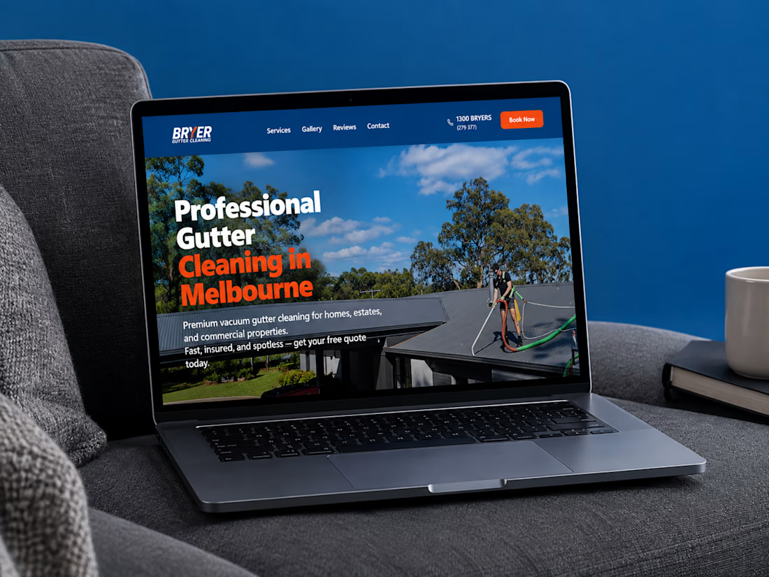
I recently completed a website project for Bryer, a Melbourne-based gutter and solar panel cleaning business.
The goal was to create a clean, professional online presence that communicates their services clearly, builds trust, and makes it easier for potential customers to request a quote.
Now, I’m curious:
When you visit a service-based business website, what matters most to you, the design, the information, or how easy it is to get in touch?
Let’s hear your thoughts! 👇
#WebDesign #Webflow #UXDesign #WebDevelopment #WebsiteDesign #Contra



this is amazing work

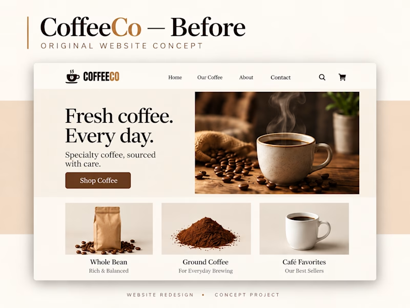
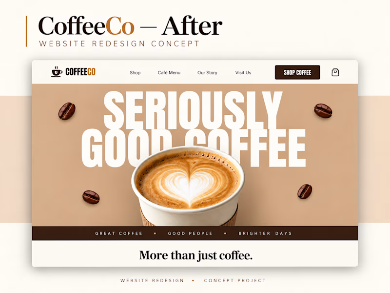
Which CoffeeCo website would make you more likely to order coffee—Before or After? ☕
I explored a bolder headline, warmer visuals, and a stronger brand personality in this redesign concept.
Vote for your favorite—I’d love to hear why!
1 voted
13%
7 voted
87%
8 votes
Closed

after redesign..