The network for creativity
Join 1.25M professional creatives like you
Connect with clients, get discovered, and run your business 100% commission-free
Creatives on Contra have earned over $150M and we are just getting started
Back to feedPost

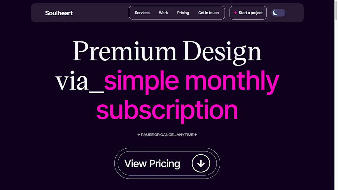
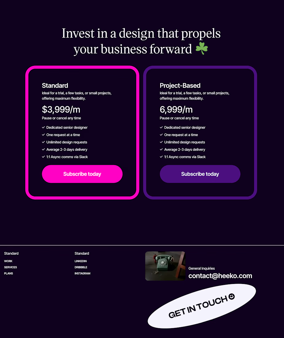
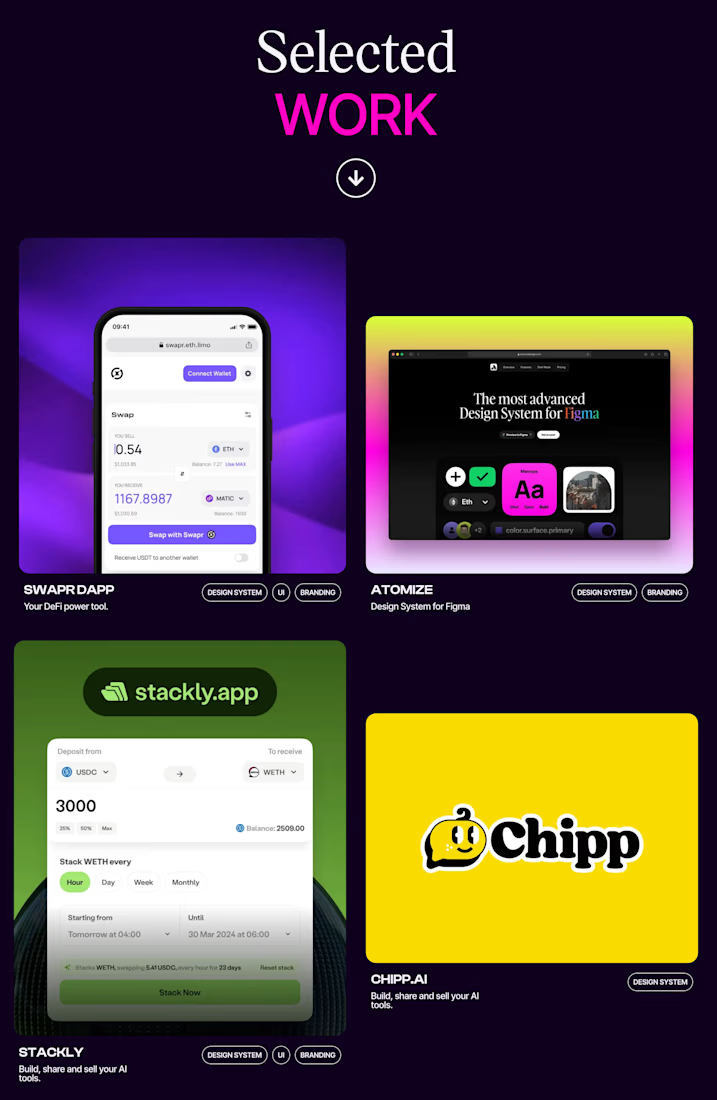
Can WordPress really match the polish of a Framer website 😒
Someone challenged me to recreate a Framer template using only WordPress and Elementor.
I accepted.
What started as a simple replication project quickly became a chance to push beyond my comfort zone. Instead of stopping at matching the design, I decided to add something the original didn't have, a fully functional light and dark mode.
That turned out to be the hardest part.
Unlike Framer, Elementor doesn't natively support theme switching in the way I wanted. It meant figuring out custom logic, managing CSS variables, preserving user preferences, and making sure the experience felt seamless across the entire site.
After plenty of testing (and a few moments where I questioned my life choices 😅), I got it working.
This project reminded me that great development isn't about the platform, it's about understanding the tools deeply enough to overcome their limitations.
Every challenge is an opportunity to learn something new, and this one definitely expanded what I know is possible with WordPress and Elementor.
I'd love to hear your thoughts on how close you think it came to the original.
https://bingie.victordada.com



Amazing work
Thank you
The network for creativity
Join 1.25M professional creatives like you
Connect with clients, get discovered, and run your business 100% commission-free
Creatives on Contra have earned over $150M and we are just getting started





Related posts

Just created a Framer website preloader with 2 options to choose from. The difference is the sequence of what appears first and the reveal animation. I made two options because I can’t choose which is best lol. What’s your favorite, Option 1 or 2?
BTW if you want this for free (normally $12), like it on the Framer Marketplace (on this link) and comment here so I know, and I’ll send it to your DM.
20 voted
48%
22 voted
52%
42 votes
Closed

Option 1 feels better than Option 2 for me


there are tons of cool things in our latest template
just one of them: team section interaction
get it for free → https://startfrom.co/templates/lapse

This is amazingggg

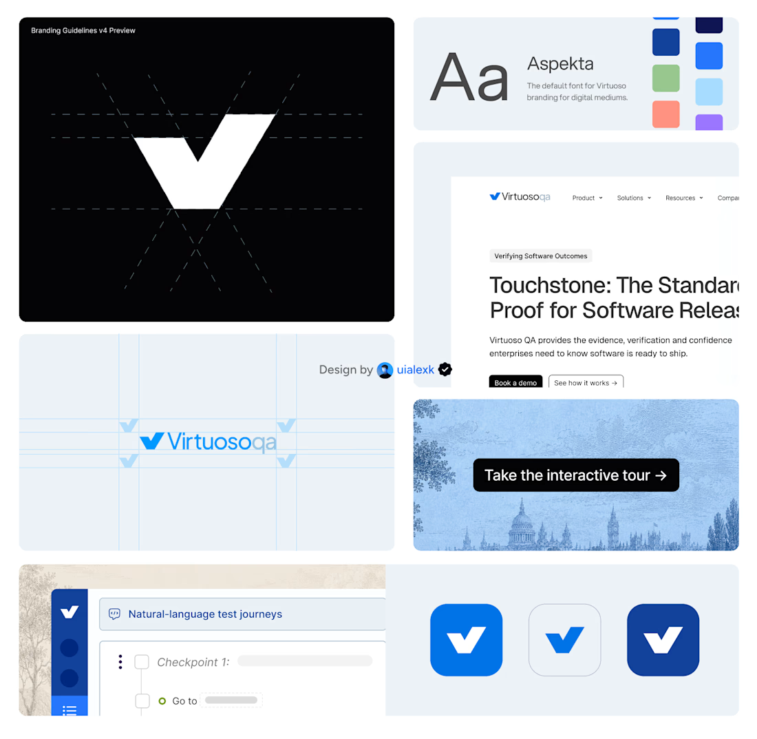
Branding v4 for Virtuoso
This design evolution, made an impact to the brand growth's by:
- Webflow to Framer migration of 150+ static pages and 500+ CMS
- Increasing website conversions
- Having consistent brand presence across digital mediums
- Increase brand awareness
Amazing!