The network for creativity
Join 1.25M professional creatives like you
Connect with clients, get discovered, and run your business 100% commission-free
Creatives on Contra have earned over $150M and we are just getting started

The network for creativity
Join 1.25M professional creatives like you
Connect with clients, get discovered, and run your business 100% commission-free
Creatives on Contra have earned over $150M and we are just getting started





Related posts


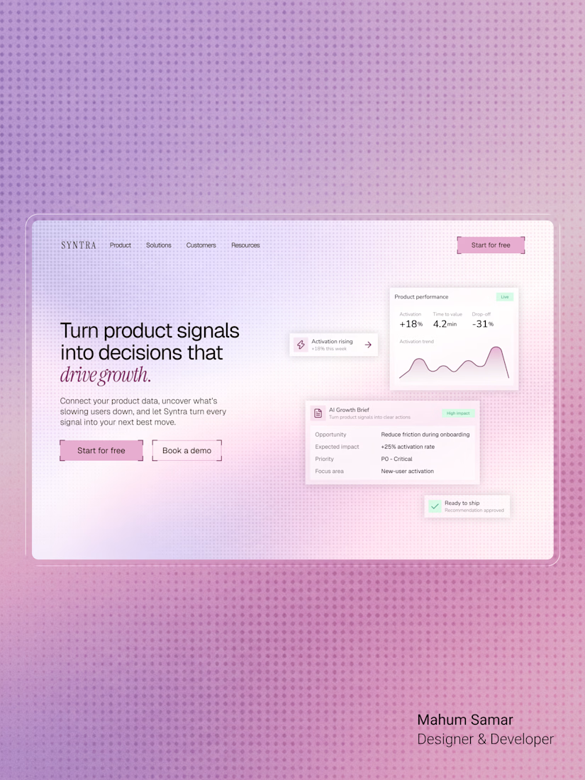

The italic accent on "drive growth" ties the headline together nicely. Soft gradient keeps the cards readable.

Which one would you go for and why? 🚀
Rate this hero section? 👇
5 voted
83%
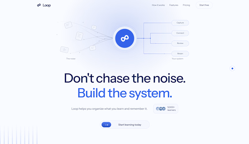
1 voted
17%
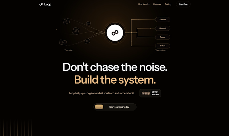
6 votes
Closed

Light mood is working better here than the dark one

Navigation, but a little different.
Built this floating side nav from scratch and designed a hero to match it.
Offset.


I love the smoothness