The network for creativity
Join 1.25M professional creatives like you
Connect with clients, get discovered, and run your business 100% commission-free
Creatives on Contra have earned over $150M and we are just getting started
Back to feedPost

The Noun "Churros"?
Lately, there’s an all-too-familiar pattern in the branding projects of many agencies. The recipe seems set in stone: a wordmark in a minimalist, utterly soulless typeface, or its trendy alternative—a more classic serif that looks overly friendly and "quirky". Add to that a symbol attempting to evoke some pseudo-abstract concept related to the company. A symbol that, more often than not, looks like it was just downloaded straight from The Noun Project.
It’s undeniable that a brand goes far beyond its logo, and I'm not questioning the depth or the quality of the strategy these agencies are selling their clients. But on a visual level, the question has to be asked: do they not realize that all their brands are ending up looking exactly the same?
Given the months of development these projects require, the size of the teams involved, and the hefty price tags attached to them, one has to wonder if this is really all they have to offer. If the trend of churning out cookie-cutter brands continues, we run the risk of never seeing strokes of genius like [insert your favorite example here] ever again.
A truly transformative brand strategy shouldn't settle for a generic visual execution. If the goal is to equip a company with the tools to take a leap in its growth, the final result demands an identity that is not only strategic, but also fiercely recognizable and unique.
The network for creativity
Join 1.25M professional creatives like you
Connect with clients, get discovered, and run your business 100% commission-free
Creatives on Contra have earned over $150M and we are just getting started





Related posts

I wrote a great hook for this one..
That's a fib, but here's a truth, you sell more when you fit into your customers' routines.
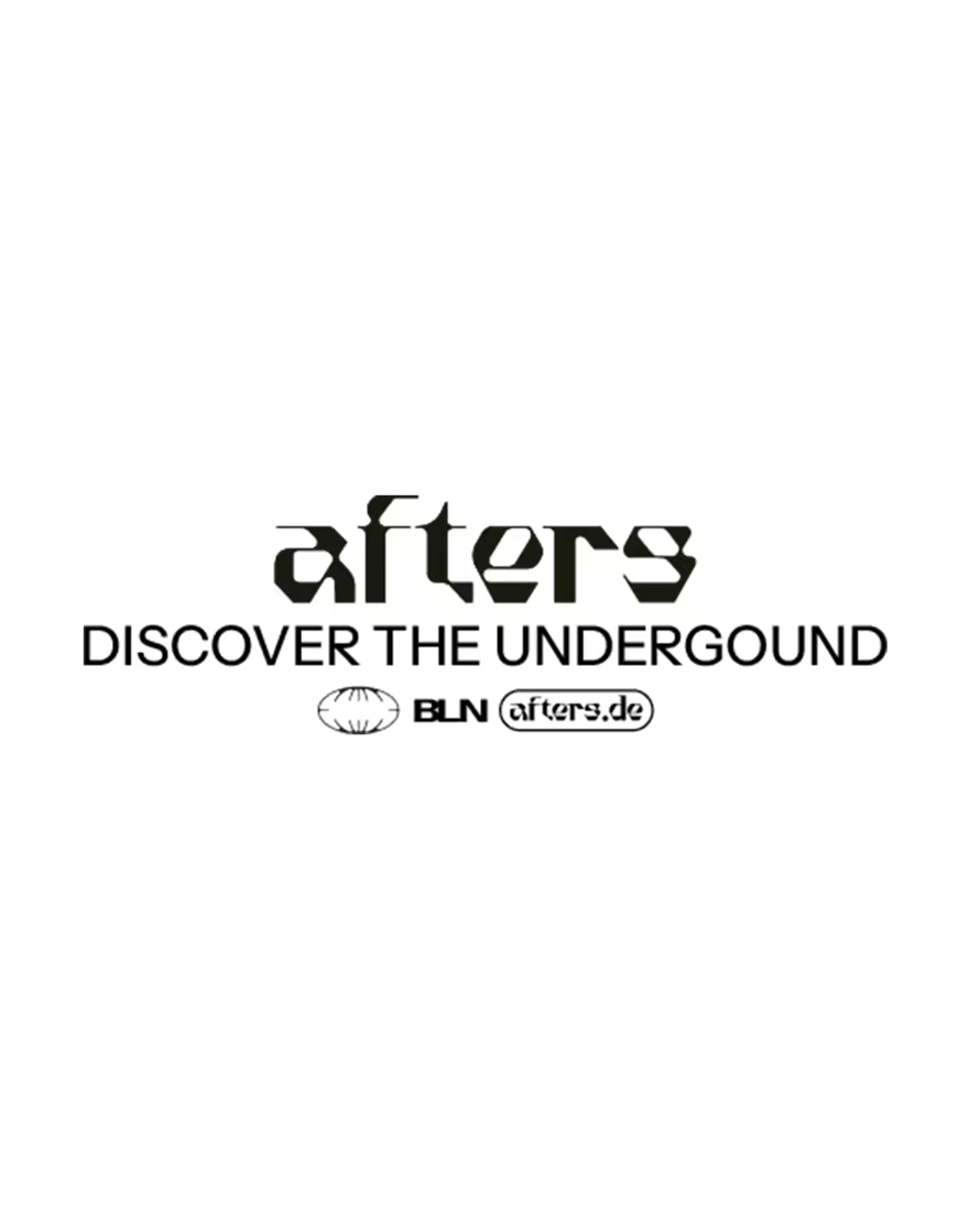
Need an example? Afters is for finding underground parties in Berlin. There are so many ways people can find parties from Resident Advisor to posters on lampposts.
The easy CTA for a brand like Afters is "Find Underground Parties in Berlin".
Short, clear, to the point,
But most people already search on Resident Advisor, how would that line convince them to change their behaviour and search Afters? Unfortunately being a "cooler" app doesn't motivate many people.
With a clear strategy, I delivered a way in that RA could never hope for.
Afters pulls from sources where line ups are posted last minute or after the event – Telegram groups, fan websites, Soundcloud – and being for people in the scene, they're the kind of folk who go to a party for the vibe and look up DJs after the fact.
So I did the opposite of what you'd expect.
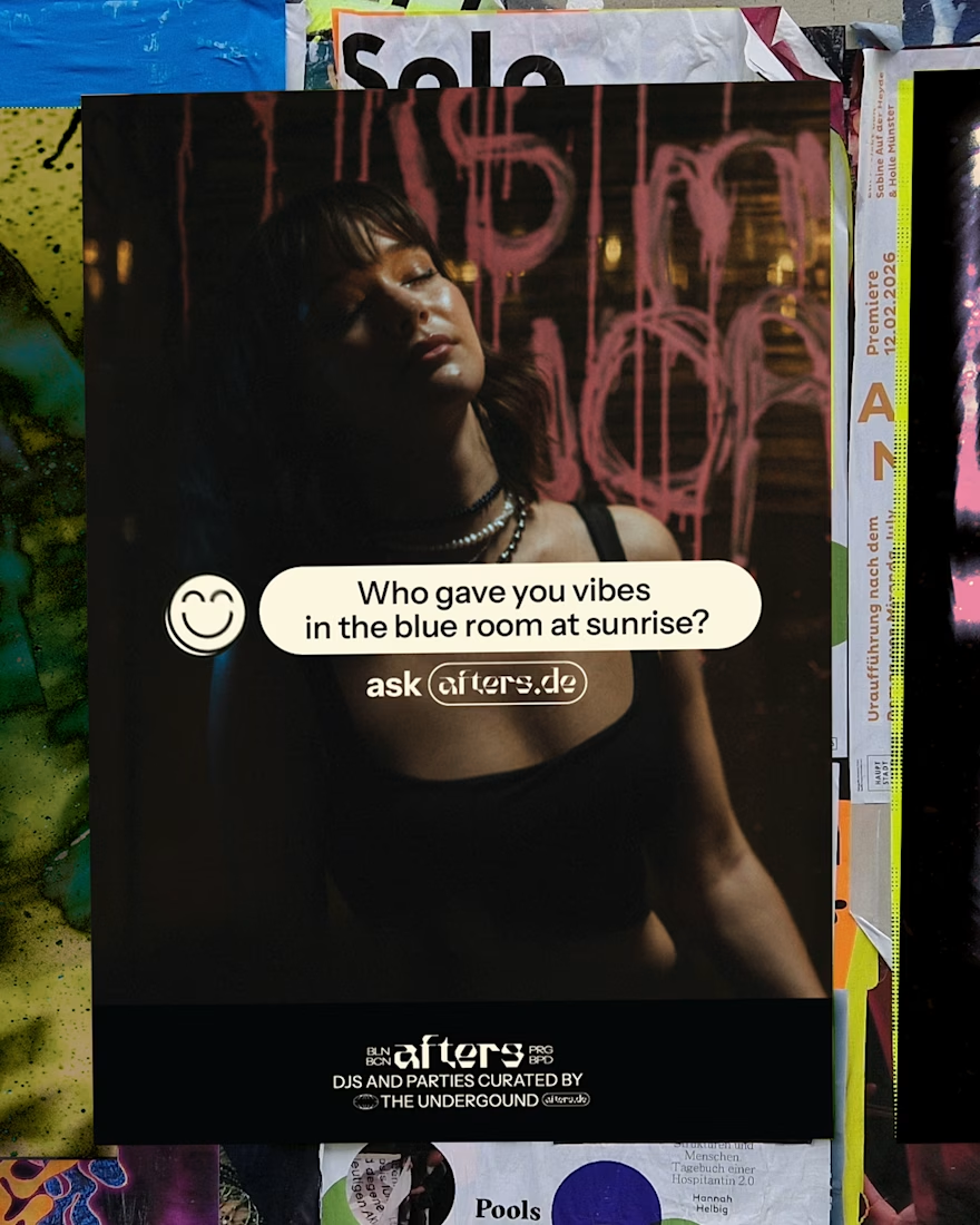
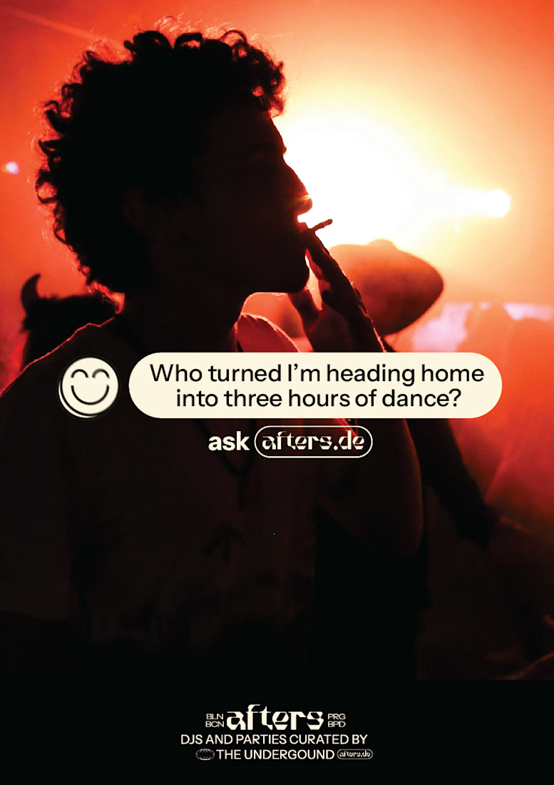
If you want to know who you just danced to, ask Afters.
Instead of competing to be the place to find parties in the future, I found a key moment the target audience has a problem that Afters is uniquely positioned to solve and built the strategy around it. No one can compete, because no one else works like Afters.
Problem -> Strategy -> Branding

Love it!


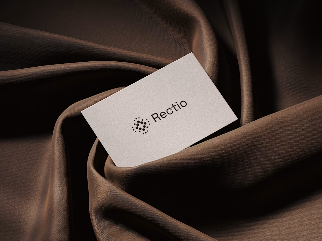
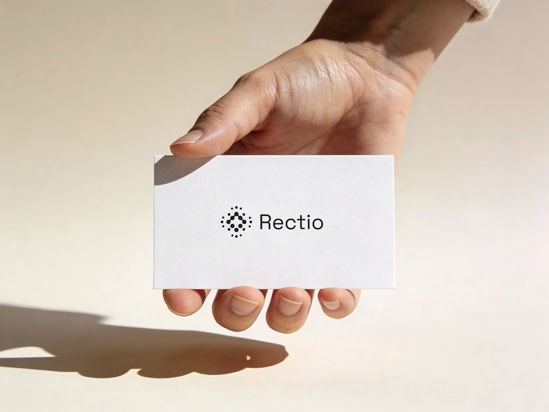
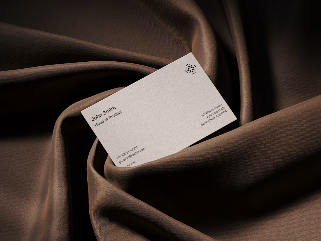
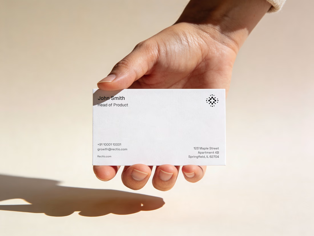
Rectio — Brand Identity
Brand Identity • Visual Direction • Business Cards • Mockups
A modern and minimal branding direction for Rectio, from visual identity to business card applications.
Created by Artonest Design Studio — artonest.design




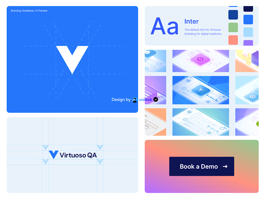
Branding v3 for Virtuoso
This design evolution, made an impact to the brand growth's by:
- Increasing website conversions
- Having consistent brand presence across digital mediums
- Increase brand awareness
See full case study here

One of the best designs I’ve seen today. Really solid work