The network for creativity
Join 1.25M professional creatives like you
Connect with clients, get discovered, and run your business 100% commission-free
Creatives on Contra have earned over $150M and we are just getting started
Back to feedPost

Making of Phantom Pops - Part 5 - 3D packaging!
The final part! in this video I look at how I used graphic templates to manage my scene, and we see the final product of all this work!
Brand Design: @by.skojie (Amazing designer! Check her out on Instagram)
Motion Design: Me!! @studioalexandraink
The network for creativity
Join 1.25M professional creatives like you
Connect with clients, get discovered, and run your business 100% commission-free
Creatives on Contra have earned over $150M and we are just getting started
Challenges
View all


Related posts

A promo video should do more than look good. It should make the product feel clear, engaging, and worth exploring.
For this project, I focused on strong visuals, smooth motion, and UI animation that keeps the story moving without getting in the way.
Simple idea. Strong execution.

The restrained motion is doing the storytelling herethe UI state changes keep the promo legible while the device framing gives it a tangible, product-like feel.

A short motion spec ad for Muji (personal project).
Design, animation and sound design by me :)
Inspired by: Kinisi, Sebastien Camden
Motion DesignmotiongraphicsAnimationAdobe After EffectsAdobe IllustratorAdobe Premiere ProIllustration


the stool tucking into the muji logo at the end got me. how long did the sound design take?

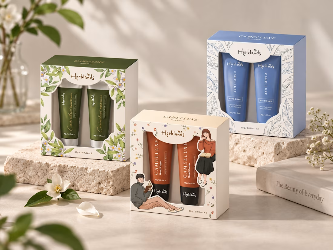
Design Concept — Packaging Proposals
Three Visual Directions
Three packaging concepts explore different styles and colour palettes for the Camelluxe hand cream range.
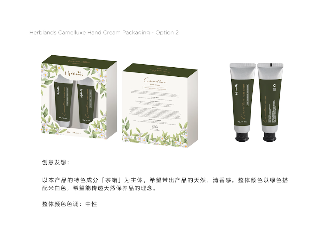
Proposal 01 — Botanical Elegance
Natural & Refined
Deep green tones with delicate floral illustrations create a natural, elegant, and premium botanical identity.
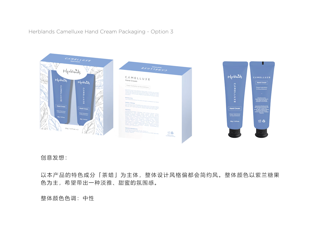
Proposal 02 — Clean & Modern
Fresh & Minimal
Soft blue tones with line-art botanical elements create a clean, calming, and contemporary skincare aesthetic.
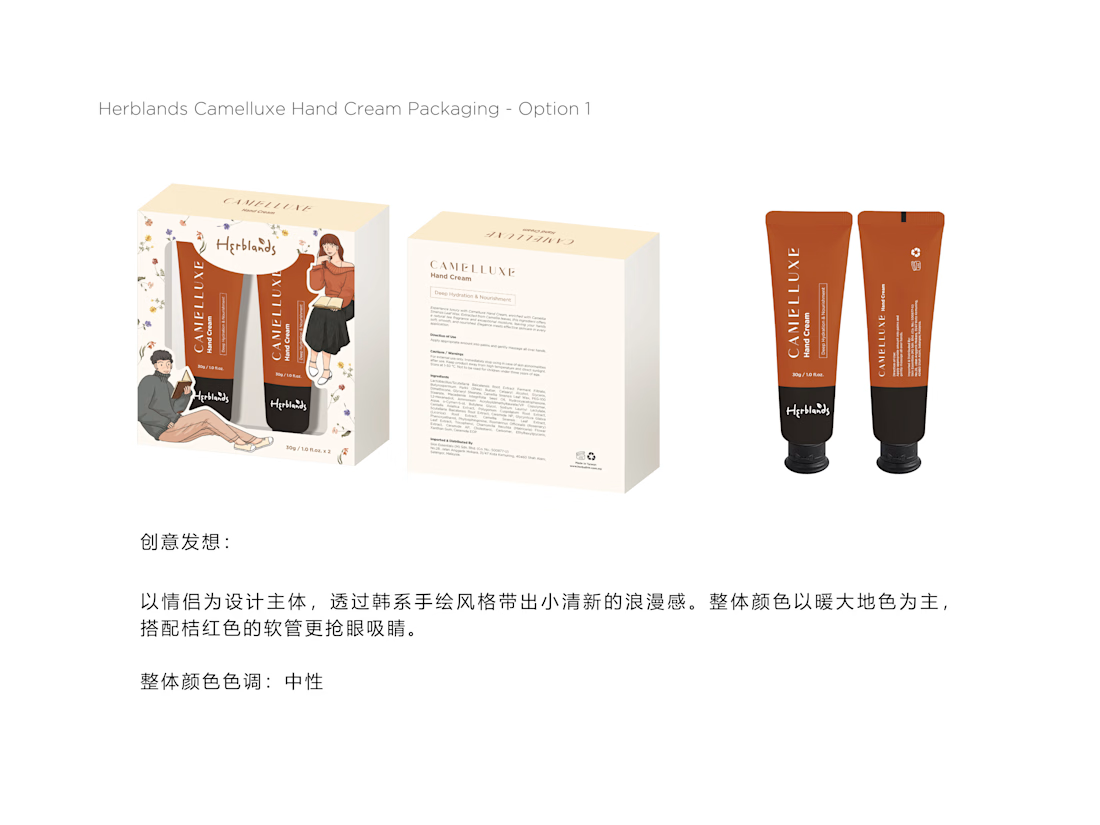
Proposal 03 — Warm & Youthful
Playful & Lifestyle-Led
Warm orange tones, character illustrations, and small floral details create a friendlier, more youthful lifestyle direction.
Credit: HWG

the orange one with the little characters is my pick. did they choose one yet?