The network for creativity
Join 1.25M professional creatives like you
Connect with clients, get discovered, and run your business 100% commission-free
Creatives on Contra have earned over $150M and we are just getting started
Back to feedPost

Created Landing page in less than 3 Hours.
Claude. Claude. Claude. It's everywhere now.
From idea to execution — fully automated. 🚀
Built a complete high-converting landing page using Claude AI + Playwright + Elementor (free components) — powered entirely by a well-crafted prompt.
Started with deep competitor analysis, and Claude handled everything end-to-end — from structuring the header, crafting persuasive sections, designing inquiry forms, to building a clean, conversion-focused footer.
No manual design. No trial & error. Just strategy + prompt engineering.
This is what the future of web creation looks like — where AI doesn’t assist, it executes.
#AIWorkflow #PromptEngineering #WebDesign #Elementor #Automation #LandingPageDesign #DigitalMarketing #NoCode #UXDesign #FutureOfWork


The network for creativity
Join 1.25M professional creatives like you
Connect with clients, get discovered, and run your business 100% commission-free
Creatives on Contra have earned over $150M and we are just getting started



Related posts


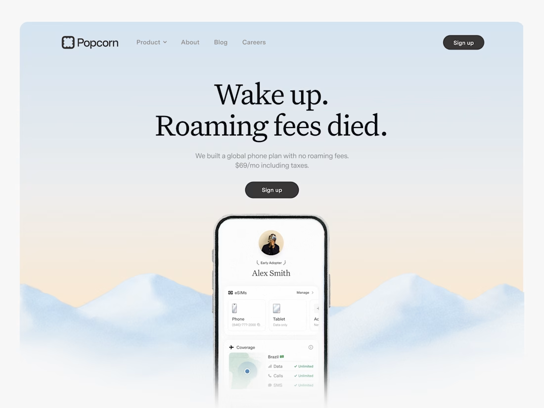

Looks great! What about readability though?
Text seems low contrast to me. Although I have a poor vision and most things seem too small and low contrast to me.

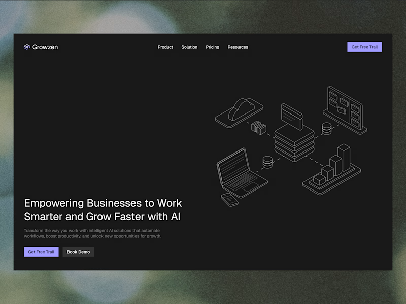
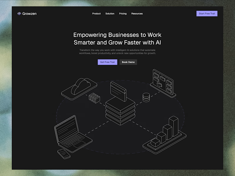
Designed a website concept for AI powered platform.
I wanted to give it a clean, minimal with a custom isometric illustration in the hero section.
Which version do you like better?
19 voted
59%
13 voted
41%
32 votes
Closed


A great website should make the right first impression before the journey even begins.
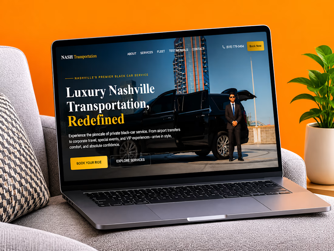
Just completed a website project for Nash Transportation, a luxury transportation service offering professional chauffeur experiences in Nashville.
The focus was on creating a clean, premium digital experience that communicates comfort, reliability, and professionalism while making it easy for customers to book their next ride.
I'd love to hear your thoughts:
What makes you choose a private transportation service, comfort, reliability, pricing, or the overall experience?
Let's discuss in the comments!
#WebDesign #Webflow #UXDesign #WebsiteDevelopment #LuxuryTransportation #WebDesigner


Amazing work!