The network for creativity
Join 1.25M professional creatives like you
Connect with clients, get discovered, and run your business 100% commission-free
Creatives on Contra have earned over $150M and we are just getting started
Back to feedPost

Remember this? 👇
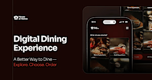
The digital dining experience is done.
Designed in Figma. Built in Webflow. Powered by CMS and custom code, and honestly a lot more custom code than I expected going in 😅
It's fully responsive, works across desktop and mobile, and covers the full menu experience: browsing by category, favourites, search, and the small interactions that make it feel like a real product instead of a static menu.
Pairing it with the main restaurant site (also built in Webflow, content managed through CMS) means the whole dining experience now lives in one connected system instead of a website and a PDF menu living separate lives.
Genuinely one of the more fun builds I've done this year. Lots of figuring things out, breaking things, fixing them, and staring at my screen wondering why a interaction wasn't firing, then it clicking into place.
The restaurant website - https://digital-dining-experience.webflow.io/
The digital menu - https://digital-dining-experience.webflow.io/
Drop your thoughts below, would love to hear what you think 👇


digital-dining-experience.webflow.io
Restaurant Menu | Order Traditional European Cuisine
Browse our full menu of traditional European dishes, from hearty stews and schnitzels to fresh seafood, desserts, and drinks. Order now for dine-in.

I started building a restaurant website in Webflow and somehow ended up building the digital dining experience too.
The main site was designed in Figma and...
The network for creativity
Join 1.25M professional creatives like you
Connect with clients, get discovered, and run your business 100% commission-free
Creatives on Contra have earned over $150M and we are just getting started







Related posts


A luxury property deserves a presentation that does it justice.
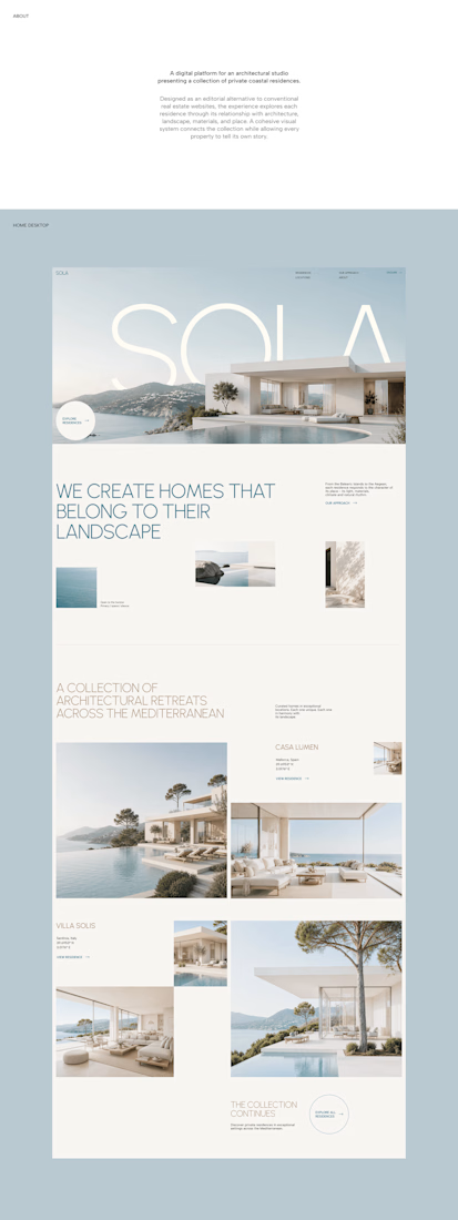
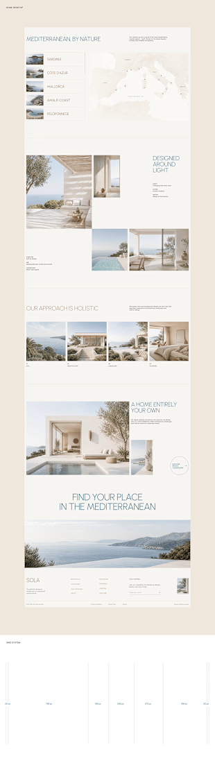
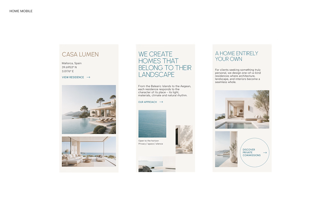
With SOLA – Architecture Studio & Luxury Real Estate, I wanted to bring the beauty of modern coastal architecture into the website itself.
From the large property images and soft blue tones to the clean layout across desktop and mobile, every part of the design helps create a calm, premium feel while making the homes the centre of attention.
I like how the website brings architecture and digital design together, giving visitors a chance to explore the properties before making an enquiry.
If you were looking for a luxury home, would a website like this make you more interested in the property?
#WebDesign #Architecture #LuxuryRealEstate

Incredible work, you transformed SOLA into a premium property brand.


Every element feels perfectly placed! 👏

Four restaurants, one dot, and a suspicious amount of work for a punctuation mark.
07:00 bakery. 12:30 lunch counter. 18:45 dining room. 23:10 bar.
Norr & Co. case study, coming soon