The network for creativity
Join 1.25M professional creatives like you
Connect with clients, get discovered, and run your business 100% commission-free
Creatives on Contra have earned over $150M and we are just getting started
Back to feedPost

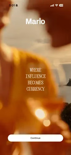
Marlo — Live iOS Lifestyle App | Creator Platform with Non-Cash Payments & Face ID


The network for creativity
Join 1.25M professional creatives like you
Connect with clients, get discovered, and run your business 100% commission-free
Creatives on Contra have earned over $150M and we are just getting started




Related posts

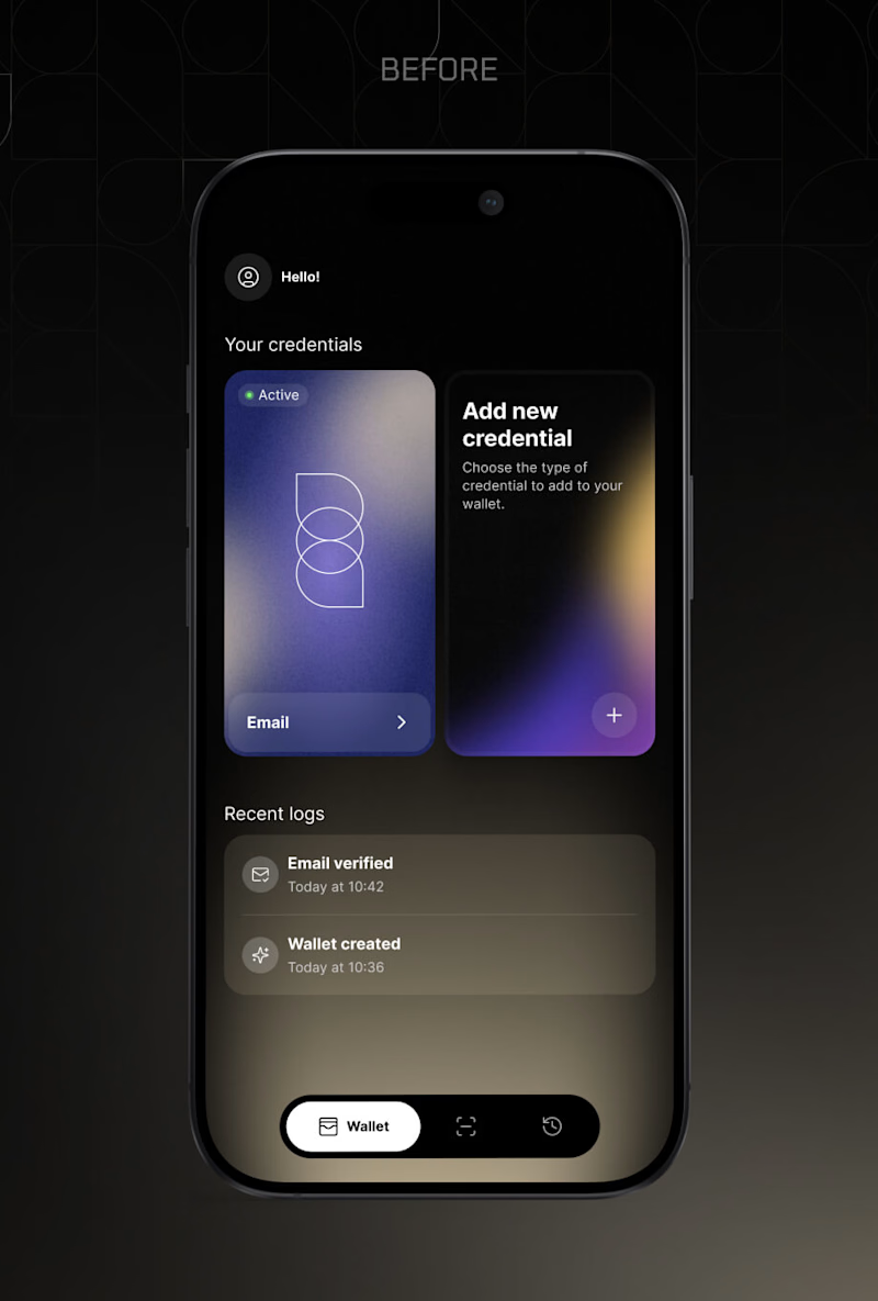
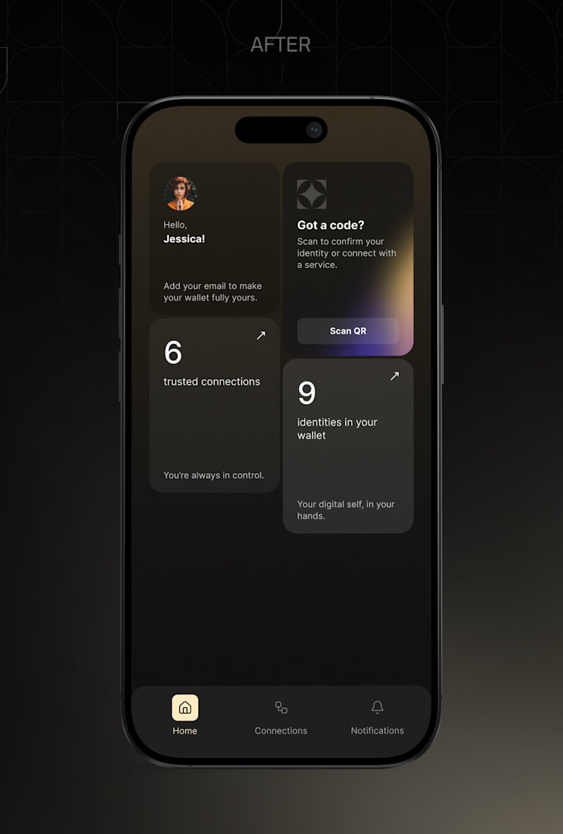
Two home screens for the same digital identity wallet, before and after the alongID brand styleguide.
The old one showed your actual credentials. You saw the card, you tapped it, done. It also showed a log of what just happened.
The new one replaced the cards with counts, 9 identities and 6 trusted connections, and moved Scan QR to the top, because scanning a code is what people open this app to do.
That is the real trade, and I still argue with myself about it. Cards you can touch, or numbers plus the primary action first.
You are opening this app for the tenth time this month. Which home screen do you want?
Vote below. I will post the reasoning behind the decision either way.
11 voted
92%
1 voted
8%
12 votes
Closed

The new version does a better job of prioritizing the main job people open the app for. Scan QR is immediately visible, the hierarchy is cleaner, and the dashboard gives a quick sense of what exists in the wallet.
But the old version has one UX advantage I would not completely...

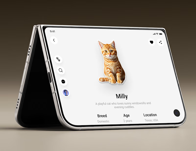
Okay but why did nobody tell me designing for the iPhone Duo would be this fun? 👀
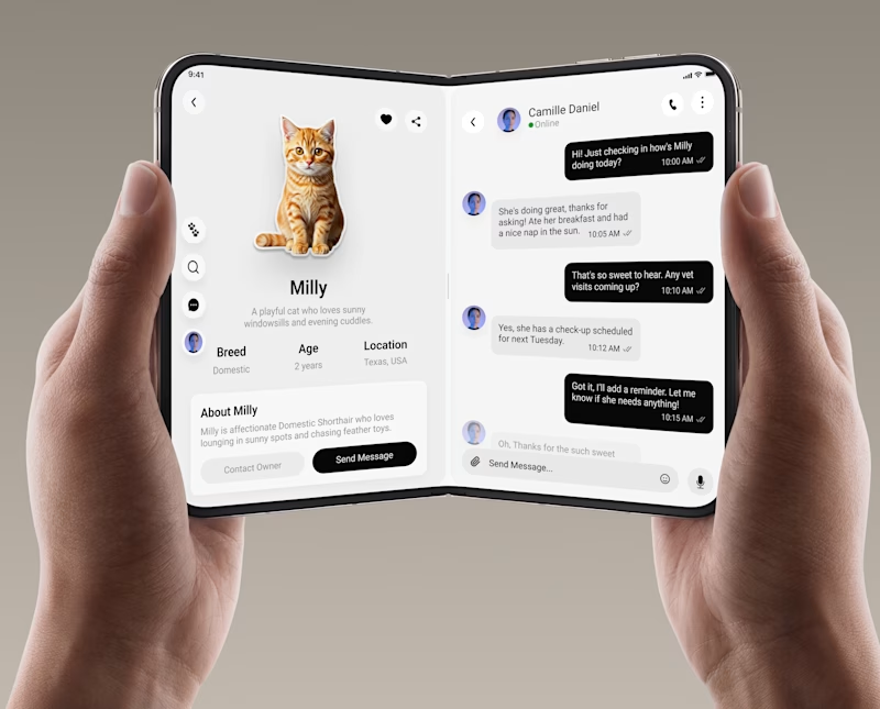
Been deep in a lil experiment testing landscape/fold view on the iPhone Duo to see how two screens can work together instead of one flow doing all the heavy lifting. Used a pet care app concept for it.
The verdict? Side-by-side layouts hit different when you get the balance right. More breathing room, more context, less "wait where did that go."
Still exploring, still tweaking but this might be my new favorite way to design.
Dual-screen or single-screen which team are you on? 👇
#uiux #iphoneduo #mobileappdesign

4 voted
57%
3 voted
43%
7 votes
Closed

Love how much breathing room the split view gives. How do you handle the software keyboard when the user taps into that chat input does it take over the entire right panel or shift into a thumb split layout?


This interaction and the fact that you can use it without launching the app 🤌
https://this-day.app
