The network for creativity
Join 1.25M professional creatives like you
Connect with clients, get discovered, and run your business 100% commission-free
Creatives on Contra have earned over $150M and we are just getting started
Back to feedPost

Banking apps don't have to be boring. 💸
Meet NovaSave! A fresh fintech UI concept with vibrant blues, clean layouts, and a smoother way to manage money.
Here's what went into the design. 🧵
#FintechDesign #MobileAppDesign #UIUX #BankingApp #DesignTwitter
(1/5)
Less confusion, more control. 💳
From welcoming onboarding to spending insights, every screen is designed to make everyday money management feel effortless.
Simple UI. Smarter experience.
(2/5)
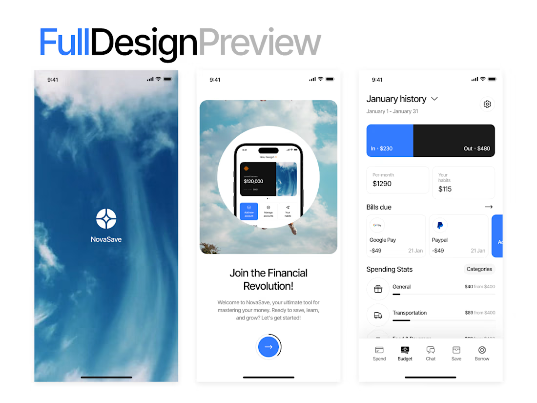
Good design should look even better in your hands. 📱
Clean typography, intuitive layouts, and easy-to-scan financial details bring the NovaSave experience to life on mobile.
(3/5)
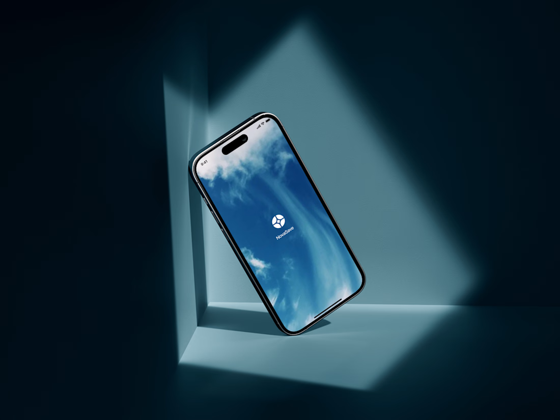
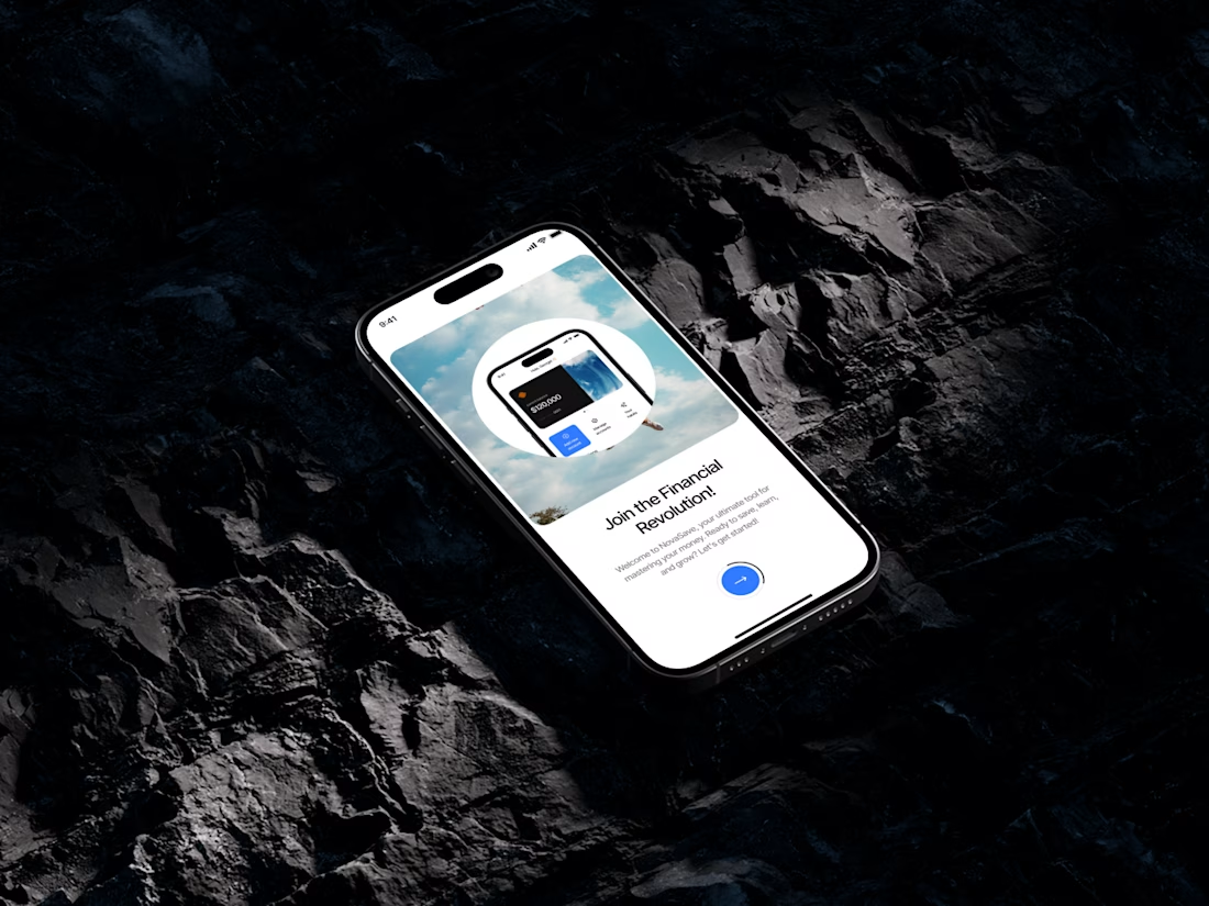
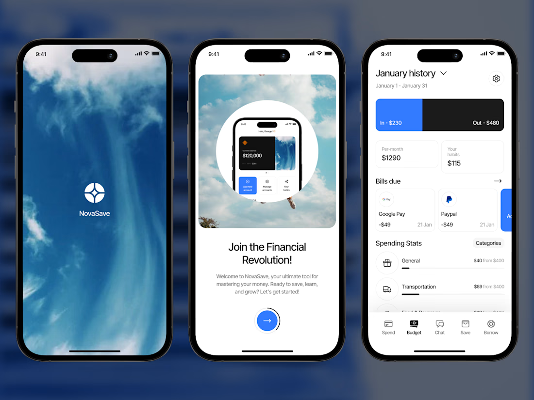
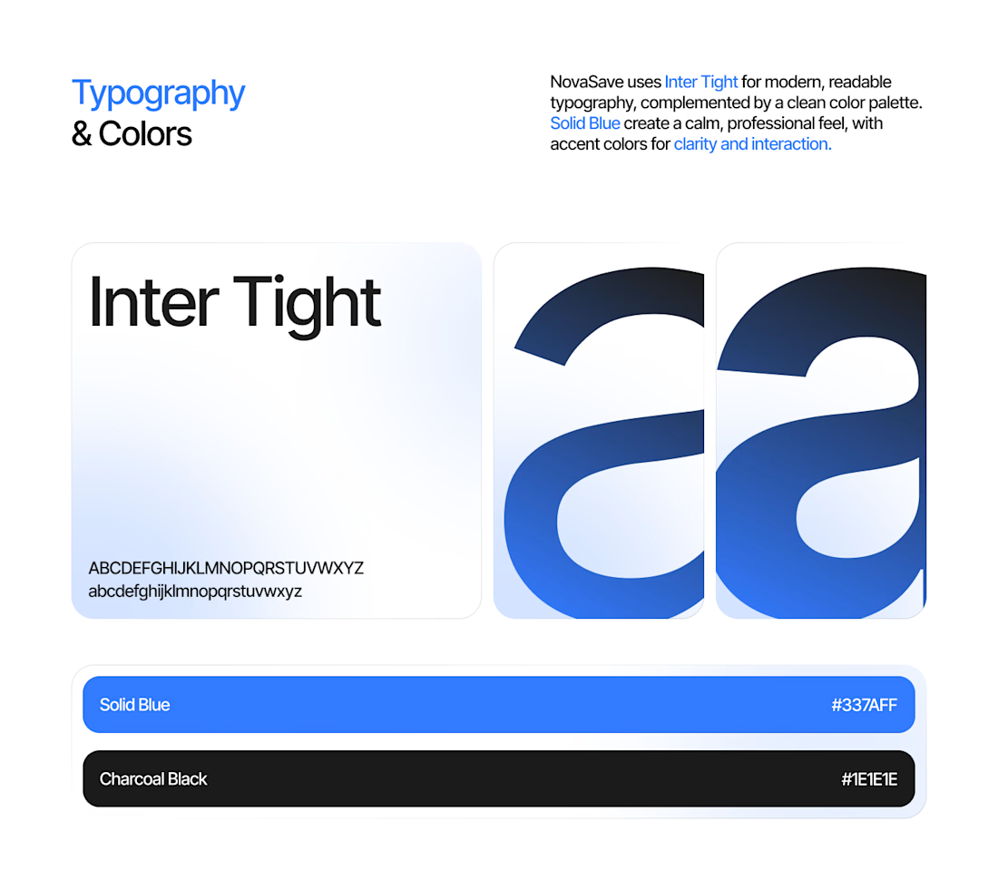
Blue isn't just a color choice. 🔵
It's the foundation of NovaSave's fresh visual direction, paired with minimal interfaces, soft gradients, and crisp typography.
Built to feel modern, approachable, and trustworthy.
(4/5)
And that's NovaSave! 🚀
Which screen is your favorite?
Explore more: https://behance.net/gallery/255685019/NovaSave-Personal-Finance-Budgeting-Mobile-App
Working on a fintech or mobile app project? DMs are open.
(5/5)
The network for creativity
Join 1.25M professional creatives like you
Connect with clients, get discovered, and run your business 100% commission-free
Creatives on Contra have earned over $150M and we are just getting started


Related posts

A 23-second reel of recent FANCY work: fintech landing pages, crypto cards, mobile app screens and 3D hero animation.

Concept redesign: Caixa homepage 🇧🇷
Caixa is one of Brazil’s largest public banks, and its recent rebrand sparked a nationwide debate. I used that as a prompt: what if the new identity carried all the way through to the digital experience?
There was a whole process before writing a single line of code:
• Analyzed the new visual identity created by the agency hired by the bank
• Studied the briefing and what the brand wanted to convey to people
• Created the imagery with AI, placing it in everyday settings so people could see themselves in it
• Designed the assets and then coded the project in Next.js, TailwindCss, Gsap, Motion.
Feedback is welcome!
Ready to transform your digital presence? Let’s talk: lucasvaz.com.br


Carrying the Caixa rebrand all the way into the homepage is a great prompt for a concept, the digital side is where new identities usually get diluted.

Same product, same button, two ways to say "added to cart". Which one makes you buy?
Burst: springy, the bottle flies into the cart. Calm: a quick spinner, then a tick.
Vote, and tell me what you'd change. Both built from scratch in code.
4 voted
57%
3 voted
43%
7 votes
Closed

Burst — the flying bottle makes adding feel fun.
