The network for creativity
Join 1.25M professional creatives like you
Connect with clients, get discovered, and run your business 100% commission-free
Creatives on Contra have earned over $150M and we are just getting started
Back to feedPost

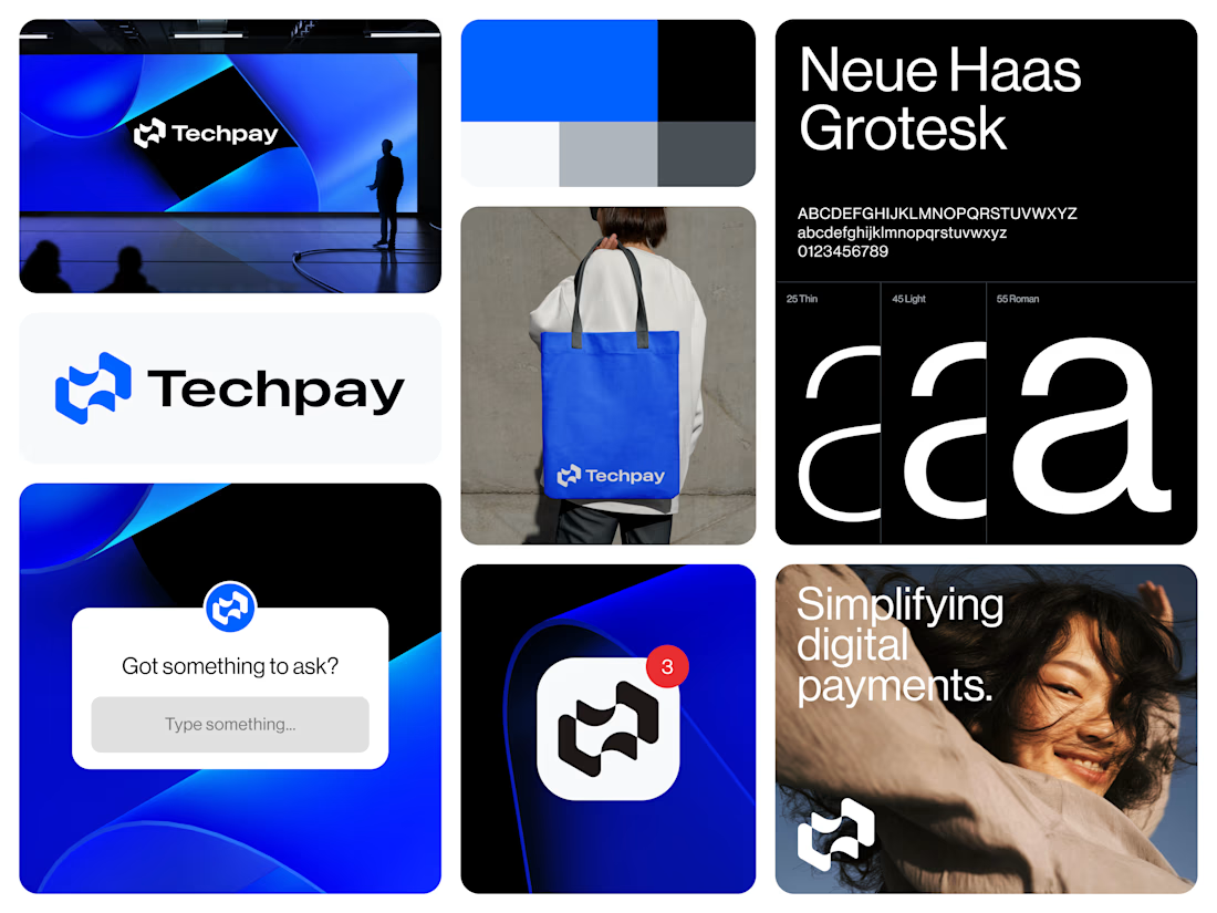
The logo of Techpay, a concept for a digital payment app, revolves around the theme of seamless and secure financial transactions driven by modern technology.
At the center of the design is a flowing currency paper element, crafted to appear dynamic and fluid, symbolizing the effortless movement of digital money. Surrounding this core shape are connected technology nodes, representing the smart, secure infrastructure that powers each transaction. Enhancing the idea of transfer dynamics, two arrows are positioned on either side of the design, facing outward in opposite directions. This outward-facing placement suggests movement, exchange, and expansion, highlighting the app’s role in enabling swift, two-way transactions.
The visual language is clean and futuristic. Altogether, the logo captures Techpay’s essence as a forward-thinking, tech-enabled payment solution.
The network for creativity
Join 1.25M professional creatives like you
Connect with clients, get discovered, and run your business 100% commission-free
Creatives on Contra have earned over $150M and we are just getting started





Related posts


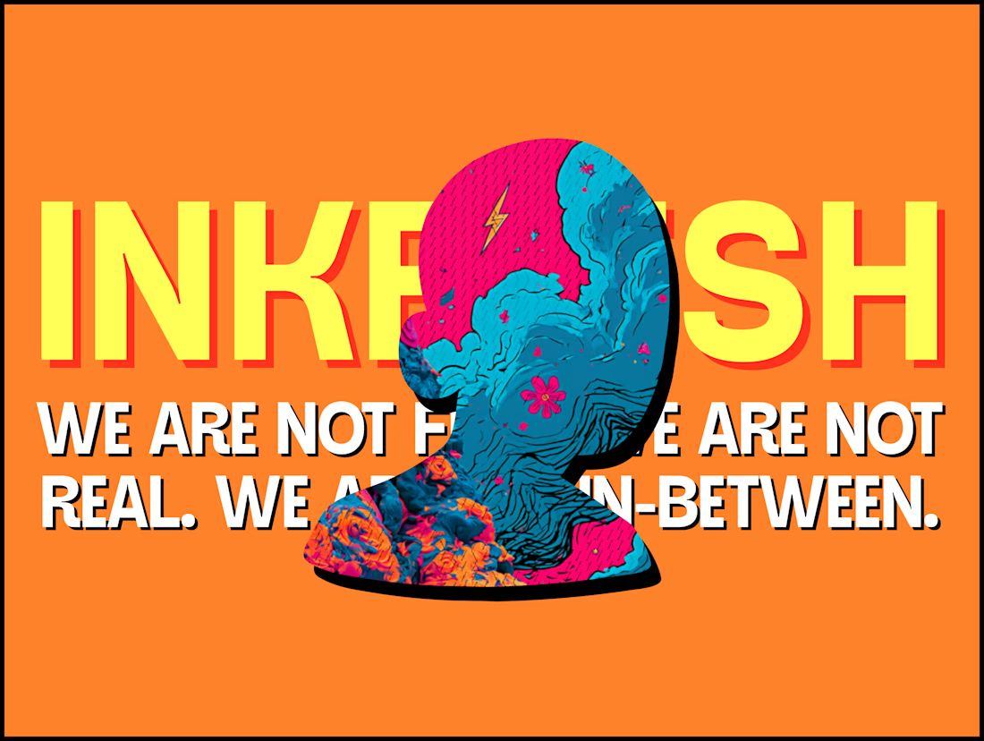
The INKFLESH mark I designed starts with an empty profile avatar. A deliberately plain shape for an identity full of strange characters.
The characters needed room to change. The identity also had to work on a woven label or an app icon, where a detailed illustrated face has very little space to do its job.
I kept the silhouette and palette constant, then let the artwork change around them. The mark can hold an illustration, appear as a solid stamp, or sit on its own at a small size. Each version still has the same shape underneath.
That was the useful constraint: decide what someone should recognise when the most expressive part of the design disappears.
If your identity depends on a detailed illustration, try its smallest application before approving the whole world around it.


Super bold and creative! Love the vibrant colors. 🔥

Ceya Logo & Visual Identity, 2025.
Two offset circles, one idea: a partner that’s always alongside you. 🟢🔵
Full case study in my portfolio.
Got a project ? Let's talk about it.

Great visual identity it was so attractive and unique 🎉🎉🔥🔥

Ambrosia - Bodycare Brand Identity & Packaging
My favorite part of this branding and packaging project was working with the different materials. The dark glass, aluminum, and soft paper each bring something different, so I kept the typography and labels simple to help everything sit together.


Amazinnnggg