The network for creativity
Join 1.25M professional creatives like you
Connect with clients, get discovered, and run your business 100% commission-free
Creatives on Contra have earned over $150M and we are just getting started
Back to feedPost

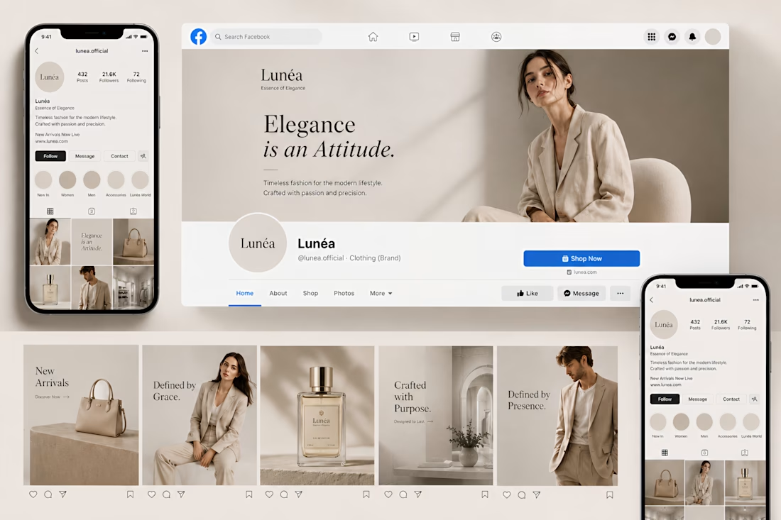
Social media should not feel random.
It should feel like an extension of the brand itself.
This direction was designed to create a consistent luxury presence across every touchpoint through refined layouts, soft visual hierarchy, elegant typography, and a calm premium aesthetic that instantly feels recognizable.
The goal was to build more than beautiful posts. The focus was creating a visual identity that strengthens trust, increases perceived value, and makes the brand feel cohesive across every platform.
The network for creativity
Join 1.25M professional creatives like you
Connect with clients, get discovered, and run your business 100% commission-free
Creatives on Contra have earned over $150M and we are just getting started


Related posts

Rebuilt my portfolio with AI and added new case studies.
Brand, web, and product UI. All custom coded, all in one page.

One page with brand, web and product UI together is a strong move. Clients see the range without clicking around. Rebuilding mine with AI coding tools taught me the same thing: the speed lets you spend the saved time on the case study writing, which is what actually wins work.


Branding & Visual Identity for AirCon West based in London.
Designers! Present your work with motion! It breathes life into your work and conveys your ideas in a dynamic way.
Use free online motion tools to do it.
My favorites:
https://animos.app/
https://arqe.ai/
https://orelin.app/editor
https://openvid.dev/en
(Or animate it yourself, like I did here using EffectCraft!)


Nice work!!

Brand work for Boofi, DeFi platform
We are working on visual direction, motion and animations


So cute! Love it!