The network for creativity
Join 1.25M professional creatives like you
Connect with clients, get discovered, and run your business 100% commission-free
Creatives on Contra have earned over $150M and we are just getting started
Back to feedPost

Ebb is pioneering electrochemical water technology that tackles two of the world's most urgent problems: growing demand for freshwater and excess carbon dioxide in the atmosphere.


The network for creativity
Join 1.25M professional creatives like you
Connect with clients, get discovered, and run your business 100% commission-free
Creatives on Contra have earned over $150M and we are just getting started


Related posts

Quick one for SaaS founders and designers: which homepage hero would make you book a demo?
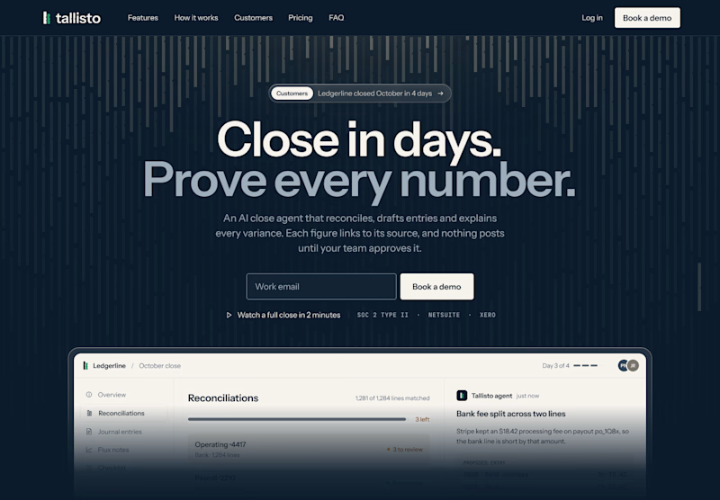
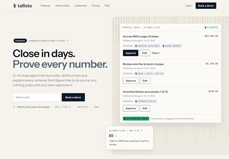
I’m designing the website for Tallisto, a concept AI accounting tool that helps finance teams close the month in days. Both versions use the same copy, so only the layout changes.
A is centred and dark. The headline does the talking, and the product sits right underneath it.
B is a light split layout. You read on the left and see the approval queue on the right, where every entry waits for a person to approve it.
Vote for the one you’d click, and tell me why in the comments. I’m building the winner in Webflow next.
3 voted
60%
2 voted
40%
5 votes
Closed

Split and light for me. The approval queue next to "Prove every number" shows the proof right away, which is what a finance team wants to see. The dark one looks moodier but the product sits low. Will you test the CTA copy too?

A few months ago I got to work with Coderhouse, one of the leading education brands in Argentina, and the place where I took several courses myself.
So this one feels like a full circle. A brand that shaped my career and helped me grow as a designer, and now I got to design for it.
The funny part is Chris had no idea I was a former student when he reached out. I was really happy when that message came in.
I built a visual system for their 60+ course covers, made so their team can keep producing them on their own. Today it lives across their app, website and Meta ads.
Thanks Chris for trusting my work and for the opportunity 🧡 And thanks @Contra HQ for making connections like this one possible.


This looks great

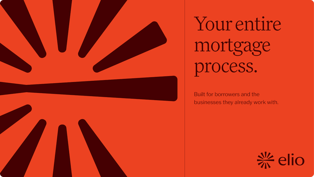
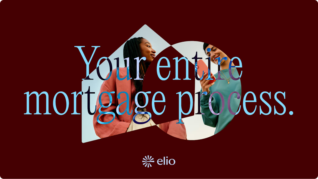
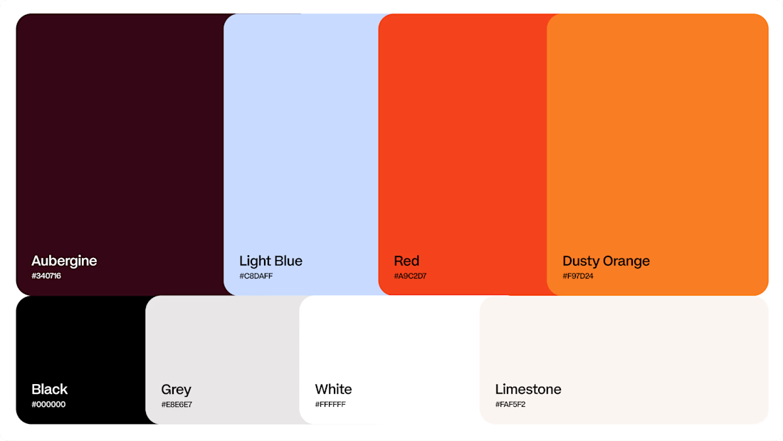
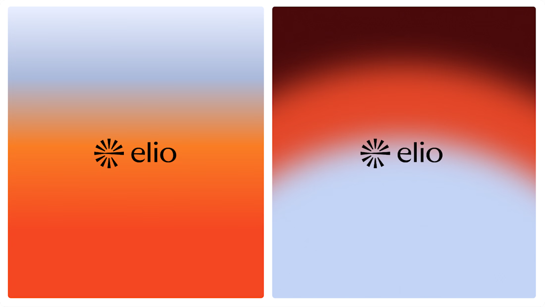
Another very cool brand Identity project I got to work on this year for Elio Mortgage.
Bringing warmth and love to a brand that is usually cold and stressful. Elio are doing things differently to make mortgages easier to deal with. We made a brand that felt more approachable.
Full case study here:

Warm, approachable identity for stressful mortgages.


