The network for creativity
Join 1.25M professional creatives like you
Connect with clients, get discovered, and run your business 100% commission-free
Creatives on Contra have earned over $150M and we are just getting started
Back to feedPost



The network for creativity
Join 1.25M professional creatives like you
Connect with clients, get discovered, and run your business 100% commission-free
Creatives on Contra have earned over $150M and we are just getting started

Challenges
View all


Related posts

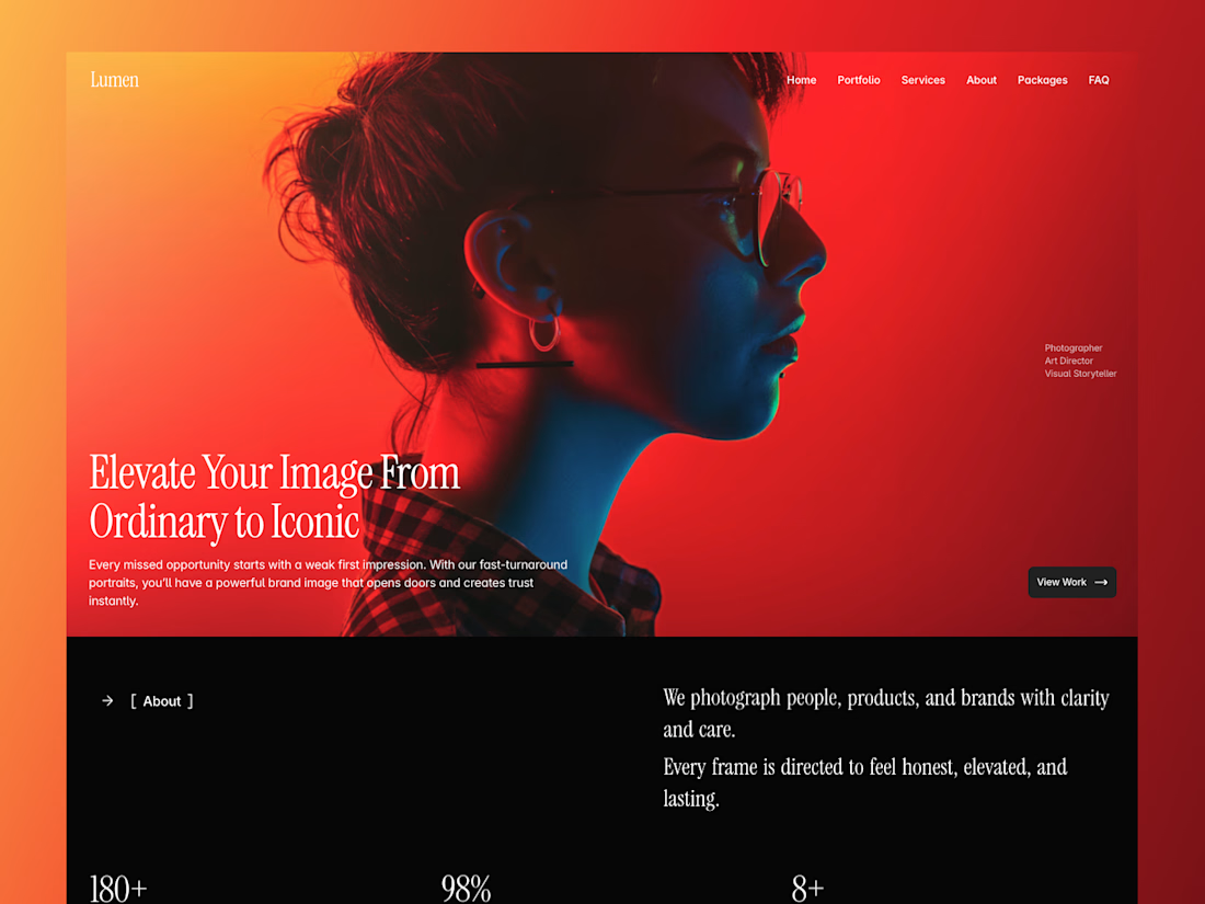
Updating my Sylara - Photographer Portfolio Framer Template to version 2.0.
Just a minor upgrade like changing placeholder images, adding sections, elements and fixing other things buyer won't notice.
Stay tuned for the updated version!
Hero image generated from Lummi ai pro 🔥



Premium design 🙂

Fintech templates usually sell adjectives. This one sells numbers.
NordTech is live on the Framer Marketplace — a ten-page template for payments companies, built for the technical buyer who asks about PCI scope and data residency before they ask about features.
Three decisions that shaped it:
The pricing page has a calculator, not a "contact sales" button. A code component with a logarithmic slider from 10k to 5M monthly transactions that estimates cost per plan and highlights the cheapest one for that volume. Seven colours editable in the panel, no code.
The case studies carry measured deltas, not testimonials: involuntary churn down 61% in five months, renewal approval up 9 points, month-end close from eleven days to two.
Security is a page, not a footer line — four layers of fund protection, data residency per region, and incidents published rather than buried.
Underneath: 35 components, 2 CMS collections driving the FAQs, three hand-tuned breakpoints across all ten pages, 17 colour styles and 33 text styles, so rebranding is one panel.
It's free. Preview and remix: nordtech.framer.website

This is a strong example of using measurable outcomes as the narrative spine—the calculator and plan-level cost comparison make the template feel like a decision tool, not just a visual shell.

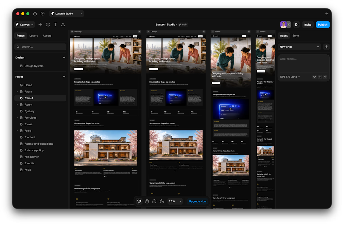
I usually don't stop at 3 breakpoints when building a website.
Most people think about: Mobile, Tablet, Laptop
I like adding one more: Desktop
Because what looks great at 1440px can feel completely different at 1920px...
- The layout gets too wide.
- Spacing starts feeling off.
- Content loses its balance.
So I like testing the system across: Mobile → Tablet → Laptop → Desktop
Not because every website needs exactly 4 breakpoints. But because responsive design isn't about making a few screen sizes work.
It's about making the whole system work.
Follow Rushabh for more website fundamentals, experiments, and things I learn while building for the web.