The network for creativity
Join 1.25M professional creatives like you
Connect with clients, get discovered, and run your business 100% commission-free
Creatives on Contra have earned over $150M and we are just getting started
Back to feedPost

UX/UI Design | WebDesign | Figma | UserExperience | UX | Design | ProductDesign
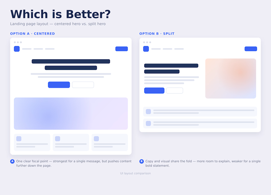
Which UI is better — A or B? 👀
Both layouts communicate the same idea, but the hierarchy and user experience are quite different.
Option A focuses on one clear message and creates a stronger visual focal point.
Option B balances the copy and visual, giving more room to explain the product.
But which one would you choose—and why?
I’d love to hear your perspective. 👇
Feedback appreciated!

The network for creativity
Join 1.25M professional creatives like you
Connect with clients, get discovered, and run your business 100% commission-free
Creatives on Contra have earned over $150M and we are just getting started




Related posts


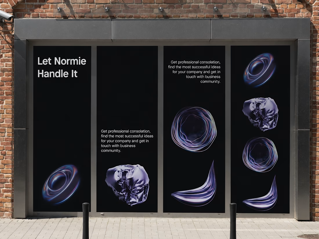
Fantastic execution man, what is the billboard for?

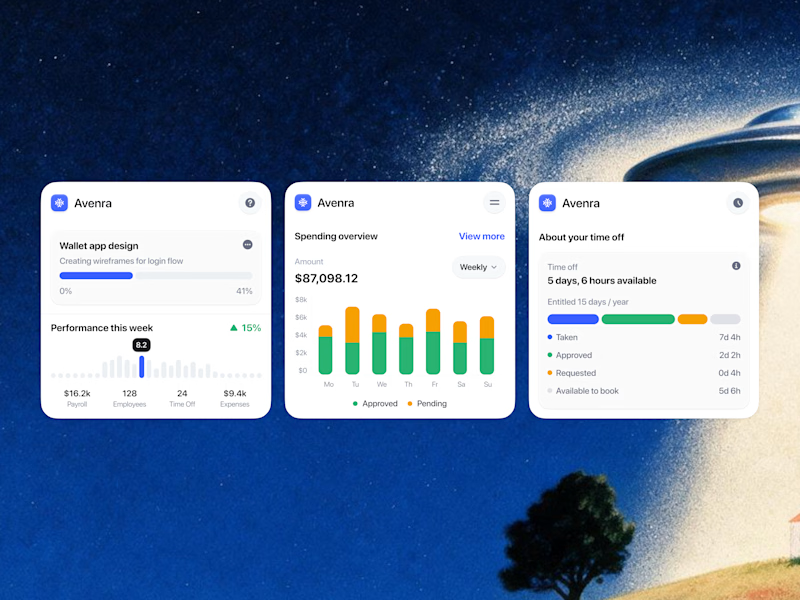
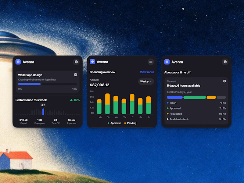
Which style wins for you? 🤔
We’re testing out two theme directions for Avenra’s dashboard component cards; featuring real-time spending breakdowns, project progress metrics, and time-off tracking.
Curious to hear your thoughts! 💬
8 voted
42%
11 voted
58%
19 votes
Closed


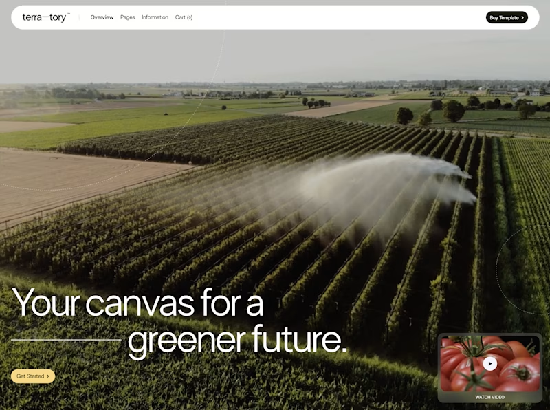
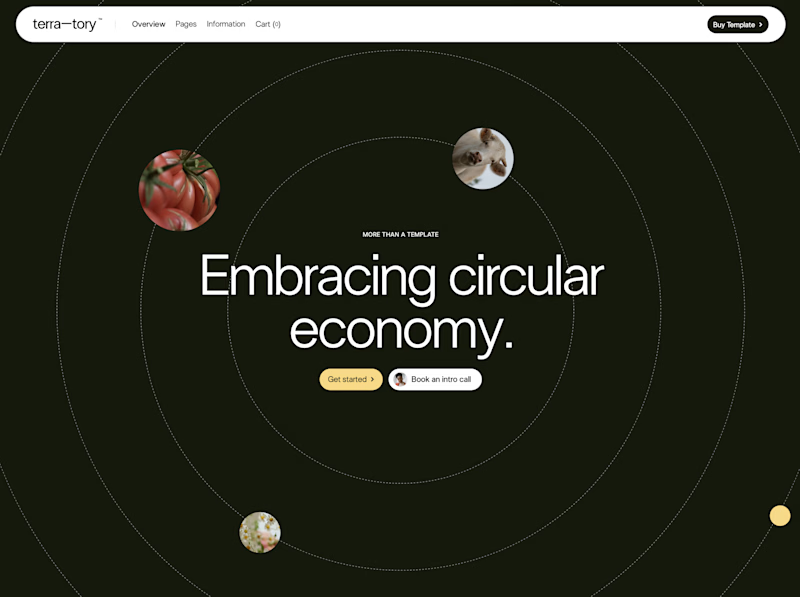
You only get to keep one. Which stays?
The circular layout has a bit of playfulness to it. The landscape gives you a much bigger sense of place.
I can see a case for both. Curious where you land.

93 voted
78%
27 voted
22%
120 votes
Closed

I'd keep the landscape one honestly, that sense of scale feels right for anything talking about sustainability at an industry level. Did the client push back on the crop at all, or were they on board with circular from the start?