The network for creativity
Join 1.25M professional creatives like you
Connect with clients, get discovered, and run your business 100% commission-free
Creatives on Contra have earned over $150M and we are just getting started
Back to feedPost

🌐 Project: VIP Fitness Website
🔗 Live: https://vip-fitness.vercel.app/
🧾 Overview
VIP Fitness is a modern gym/fitness website designed to promote health, workouts, and membership services through a clean and engaging interface. The site highlights fitness programs, benefits, and encourages users to join or subscribe.
Fitness platforms like this typically focus on workout accessibility, membership plans, and user engagement features such as schedules and training programs
🎯 Objective
Build a strong online presence for a fitness brand
Showcase services like workouts, plans, and benefits
Encourage users to join or subscribe
Deliver a smooth and fast user experience
⚙️ Key Features
🏋️ Fitness Program Showcase – Highlights training options and benefits
📋 Membership Section – Clear plans or offers for users
🎨 Modern UI Design – Clean and energetic fitness-themed layout
📱 Fully Responsive – Works across all devices
⚡ Fast Deployment – Hosted on Vercel for speed and scalability
🧑💻 My Contribution
Designed and developed the full frontend
Built structured sections for better user flow
Optimized performance and responsiveness
Deployed the project live
🛠️ Skills (pick 3)
Frontend Development
Responsive Web Design
UI/UX Design
🧰 Tools (pick 3)
HTML5
CSS3
JavaScript


The network for creativity
Join 1.25M professional creatives like you
Connect with clients, get discovered, and run your business 100% commission-free
Creatives on Contra have earned over $150M and we are just getting started
Challenges
View all


Related posts

Working on the homepage for Still Blooming, a wedding and floral studio, I explored two different layout directions for the hero section. Same brand, same copy, just a different structure and visual rhythm.
Option 1 : Left Aligned. Text sits on the left with supporting content beside it, giving an editorial, asymmetrical feel.
Option 2 : Centered. Everything is stacked and centered, giving a clean, balanced, more classic hero layout.
Would love your honest UX/UI take which direction feels more elegant, functional, and true to a wedding/floral brand, and why?
22 voted
41%
32 voted
59%
54 votes
Closed

Great Design :)

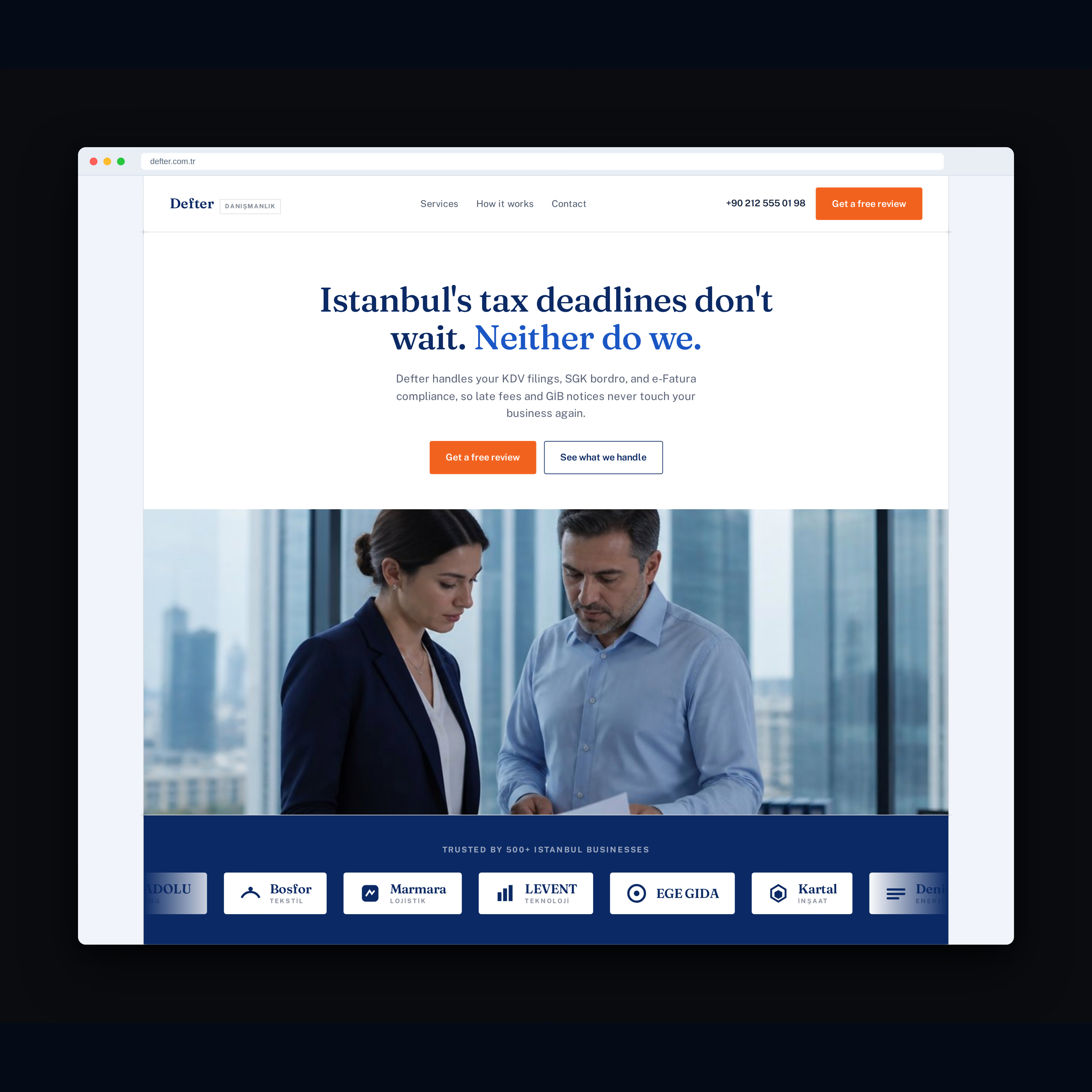
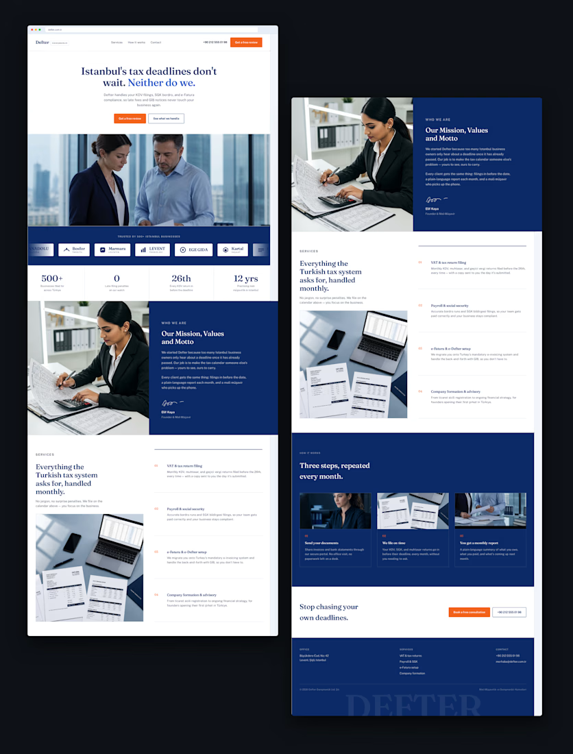
Recent work for Defter, an accounting firm in Istanbul.
The goal was simple: take a traditionally serious industry and create a website that feels modern, trustworthy, and premium.
Clean typography, strong visual hierarchy, and a bold navy + orange identity.
What do you think of the final design?

Looks good!

Brand identity design for Adventum Fitness, a fitness and personal development brand built around physical performance, mental fitness, and personal growth.
The challenge was to create a visual identity that could bring strength, movement, discipline, and personal development together without falling into the usual fitness branding clichés.
The identity was developed as a cohesive visual system across logo design, typography, color, graphic elements, and supporting brand assets, giving Adventum a distinctive and consistent presence across digital and marketing applications.
Full case study available on my Contra profile.
#BrandIdentity #BrandDesign #FitnessBranding #VisualIdentity #LogoDesign #BrandStrategy #GraphicDesign #BrandDesigner #FitnessBrand #PersonalDevelopment


