The network for creativity
Join 1.25M professional creatives like you
Connect with clients, get discovered, and run your business 100% commission-free
Creatives on Contra have earned over $150M and we are just getting started
Back to feedPost
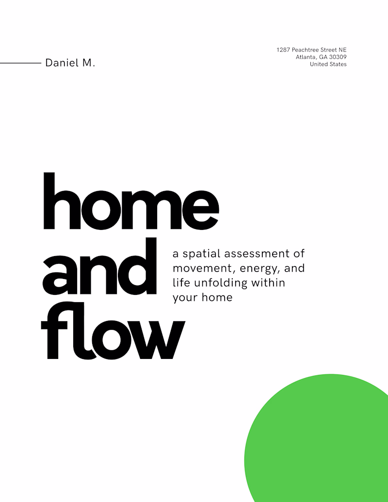
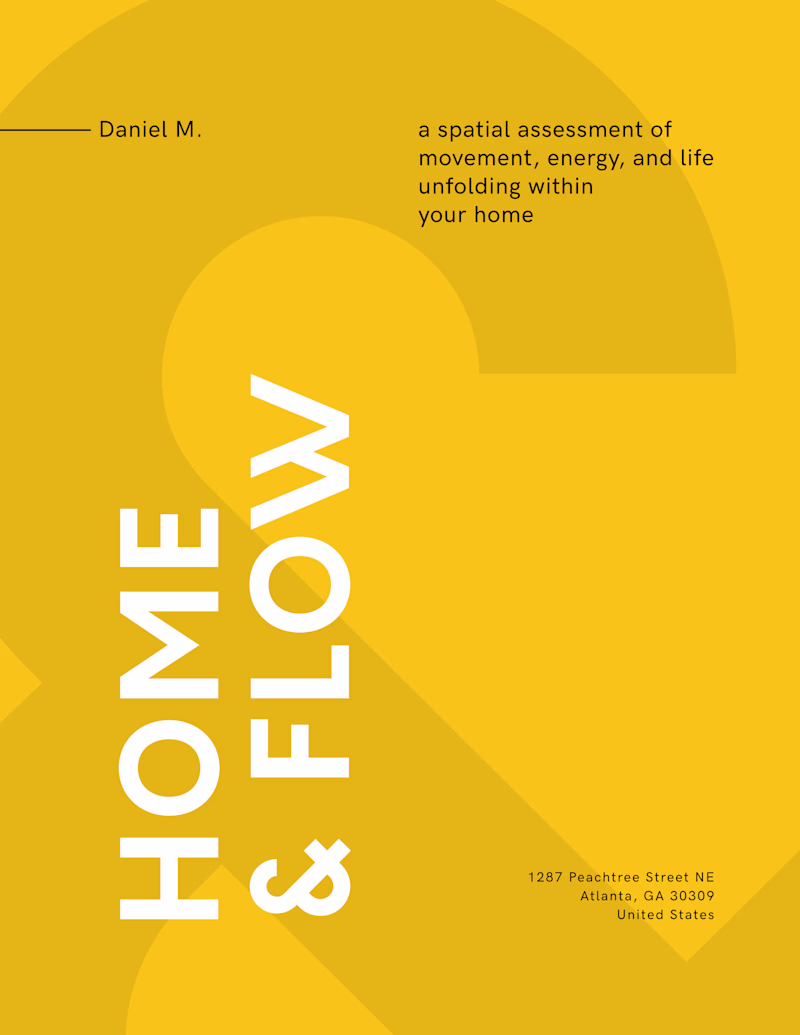
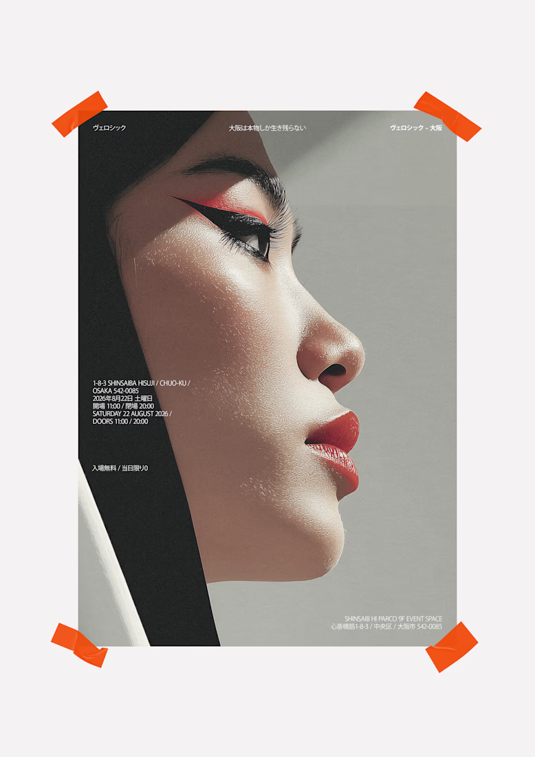
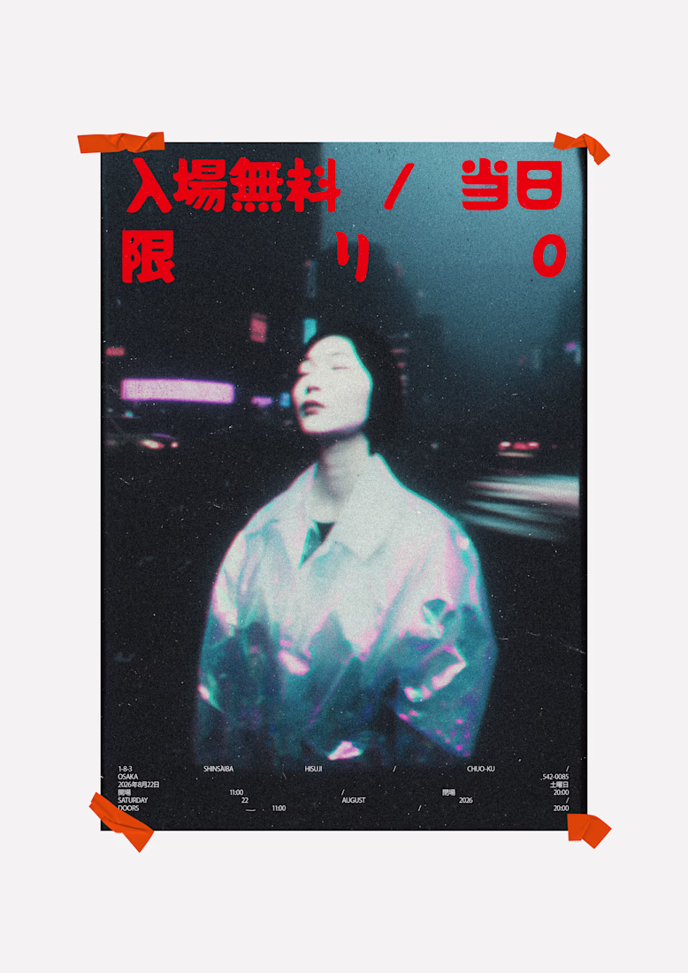
Taste Test

Exploring restraint in a Feng Shui spatial report cover.
One leans quiet and typographic.
The other leans bold and graphic.
Which direction holds more weight?
11 voted
65%
6 voted
35%
17 votes
Closed
Love the green one
The client too! ;-)

The green aesthetic is so nice!!

CAPS + yellow for me, love the bold and graphic feel.
Thanks man, yeah I feel one is the cover, the other is the inner contents of the report. Balance them and maybe introduce the idea of 4 seasons, each assigned to a logo, which we will place at the end of the document. Subtle but sexy. ;ol

lowercase + green

love both!
Thank you Sufyan.
Nice to articulate restraint in a classic A4.
I beg your pardon. A letter format. 😇

I like both, but maybe it would be nice to play with the tracking of the yellow one to make the spaces between the characters smaller, which can go better with the concept.
The network for creativity
Join 1.25M professional creatives like you
Connect with clients, get discovered, and run your business 100% commission-free
Creatives on Contra have earned over $150M and we are just getting started
Related posts


really like the style here and the concept overall


oh again?

Exploring two directions for the same concept.
Which one feels stronger?👀
One leans into strong typography to grab attention instantly.
The other shifts focus to visual storytelling with a more immersive feel.

14 voted
16%
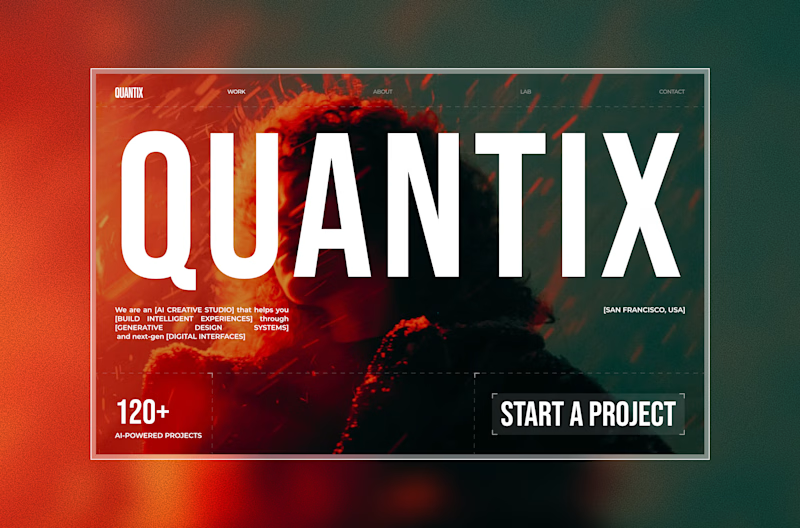
72 voted
84%
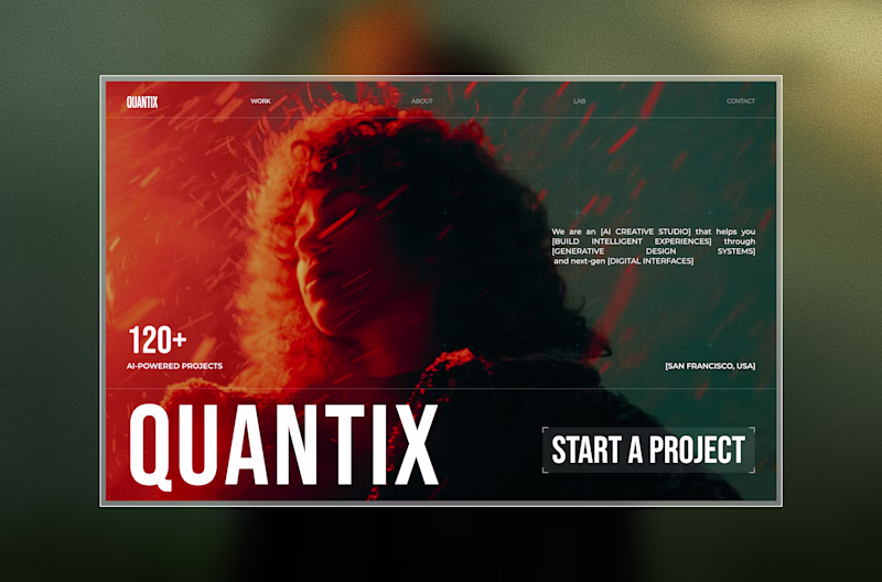
86 votes
Closed
other option?


Trending


FLORA
Reusable workflows are replacing one-off prompts in creative AI. Share what you're building in FLORA.
portfolioreview
The best portfolios tell a story, not just show a grid. Share yours for feedback.
brandguidelines
Brand guidelines are becoming living systems. What are you building for your clients?
freelancerlife
Freelancer life is wins, pivots, and everything in between. What’s yours right now?
aivideo
AI video tools are moving at warp speed. Which ones are you experimenting with?