The network for creativity
Join 1.25M professional creatives like you
Connect with clients, get discovered, and run your business 100% commission-free
Creatives on Contra have earned over $150M and we are just getting started
Back to feedPost

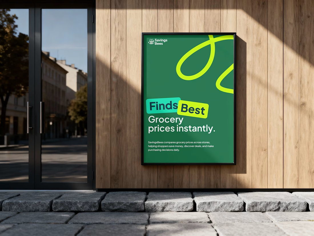
SavingsBees — Making smarter grocery shopping easier
Industry: Retail technology / grocery
Project: Advertising poster
Deliverable: Outdoor advertising design
The business challenge
Grocery shoppers often struggle to compare prices across different retailers, making it difficult to identify the best deals and manage everyday spending.
The objective was to communicate SavingsBees' core value proposition instantly and attract attention in a competitive advertising environment.
The design approach
I combined a bold headline, high-contrast typography, and a distinctive green color palette to establish immediate brand recognition. The playful graphic elements reinforce the brand identity, while concise messaging communicates the primary benefit without unnecessary information.
The visual hierarchy emphasizes the central promise: finding the best grocery prices instantly.
The business value
The resulting advertising concept transforms a functional price-comparison service into a clear, memorable consumer proposition, helping communicate its value, strengthen brand awareness, and encourage potential users to explore the platform.
The result: a recognizable advertising concept that makes everyday savings simple to understand and hard to overlook.


The network for creativity
Join 1.25M professional creatives like you
Connect with clients, get discovered, and run your business 100% commission-free
Creatives on Contra have earned over $150M and we are just getting started



Related posts


I finally updated my personal website, and you can actually "dye" your own canvas on it! 🎨
I've been experimenting with how to bring something physical into a digital space. The idea came from my growing interest in natural dyes and traditional textile-making, which I've been exploring a lot lately.
I designed and built the whole experience in one day using Figma, Claude and Netlify. It's been pretty exciting to see how AI makes ideas that once felt technically out of reach something I can now experiment with and build on my own.
I'm also open to fractional creative director roles, so if you know a team building something meaningful, I'd love to connect!
Come play with it, and please let me know if you find any bugs 🐛
mya-nguyen.com


dyeing your own canvas on a personal site is such a nice idea. most portfolios just sit there, this one lets you play

Amazing!

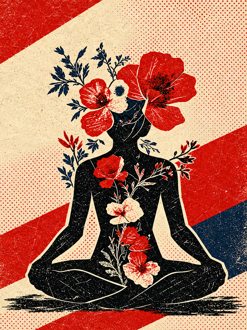
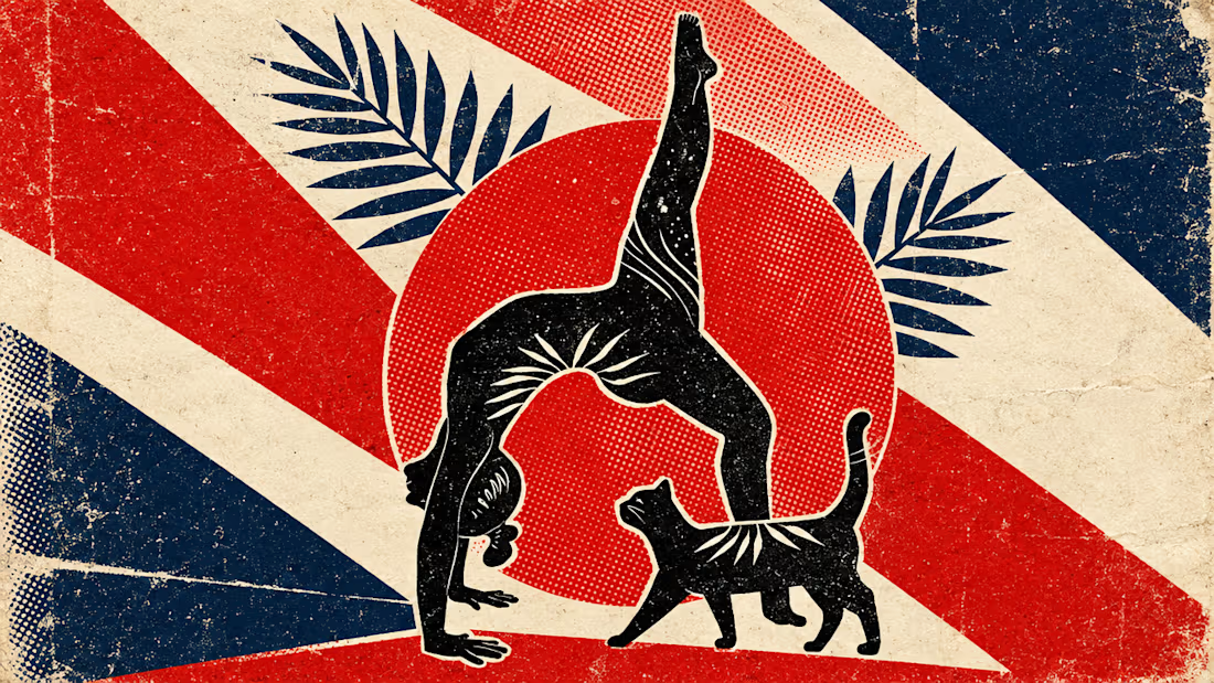
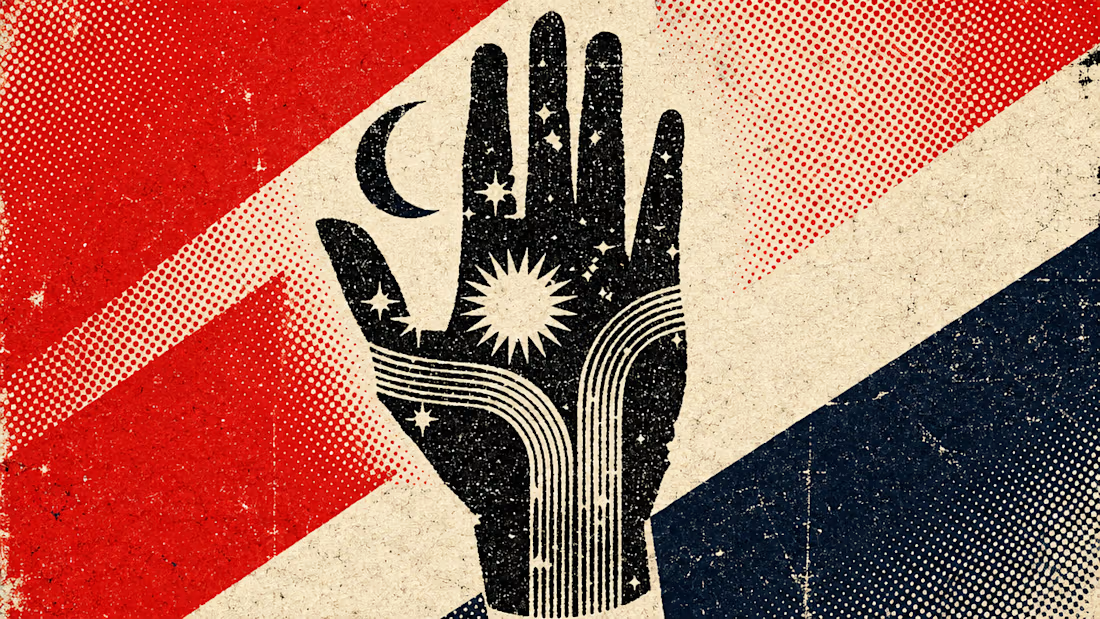
What happens when propaganda designed to erase the self gets pointed at the self instead?
Soviet propaganda spent 70 years trying to erase the individual soul in favour of the collective machine. I pointed that exact visual language at the thing it was built to suppress.
I kept...


Two ad directions for Aura Aesthetics’ Botox Flash Sale. Same offer, different layout and feel.
Option A: split layout, model left, price card right, olive green accents, bold and direct
Option B: model fills the right, soft rounded cards on the left, all warm neutrals, quieter and more elegant
Which one makes you tap “Schedule Your Discount”? 👇
9 voted
53%

8 voted
47%

17 votes
Closed

I'd tap A: the big $179 reads first and the olive block gives the CTA real contrast. Did you run both as live ads? Curious which one won on CTR.