The network for creativity
Join 1.25M professional creatives like you
Connect with clients, get discovered, and run your business 100% commission-free
Creatives on Contra have earned over $150M and we are just getting started
Back to feedPost

I had the honor of visiting my old high school talking about my career as a Product designer. I kept in touch with my favorite teacher and she asked me to come talk to her class of seniors. It was a very casual talk but I still wanted to present something so I am glad I had created this presentation a while back. I love created presentations ever since I can remember and I am so glad about this fixation of mine because I actually got to use them real time. Here is the Link for anyone who wants to take a look.
figma.com
So you want to be a product designer? | Figma
Hope this is useful!
The network for creativity
Join 1.25M professional creatives like you
Connect with clients, get discovered, and run your business 100% commission-free
Creatives on Contra have earned over $150M and we are just getting started





Related posts


The app looks amazing, but do you think the number font might be a bit hard for people to read quickly when checking their money?

New spec: a 31-second launch video for Figma Motion, the animation feature Figma announced at Config 2026.
No screen recordings: every screen is rebuilt and animated from scratch, from the multiplayer cursors to the keyframes and the spring easing.
What would you change in the first 3 seconds?
Unofficial spec, not affiliated with or endorsed by Figma.


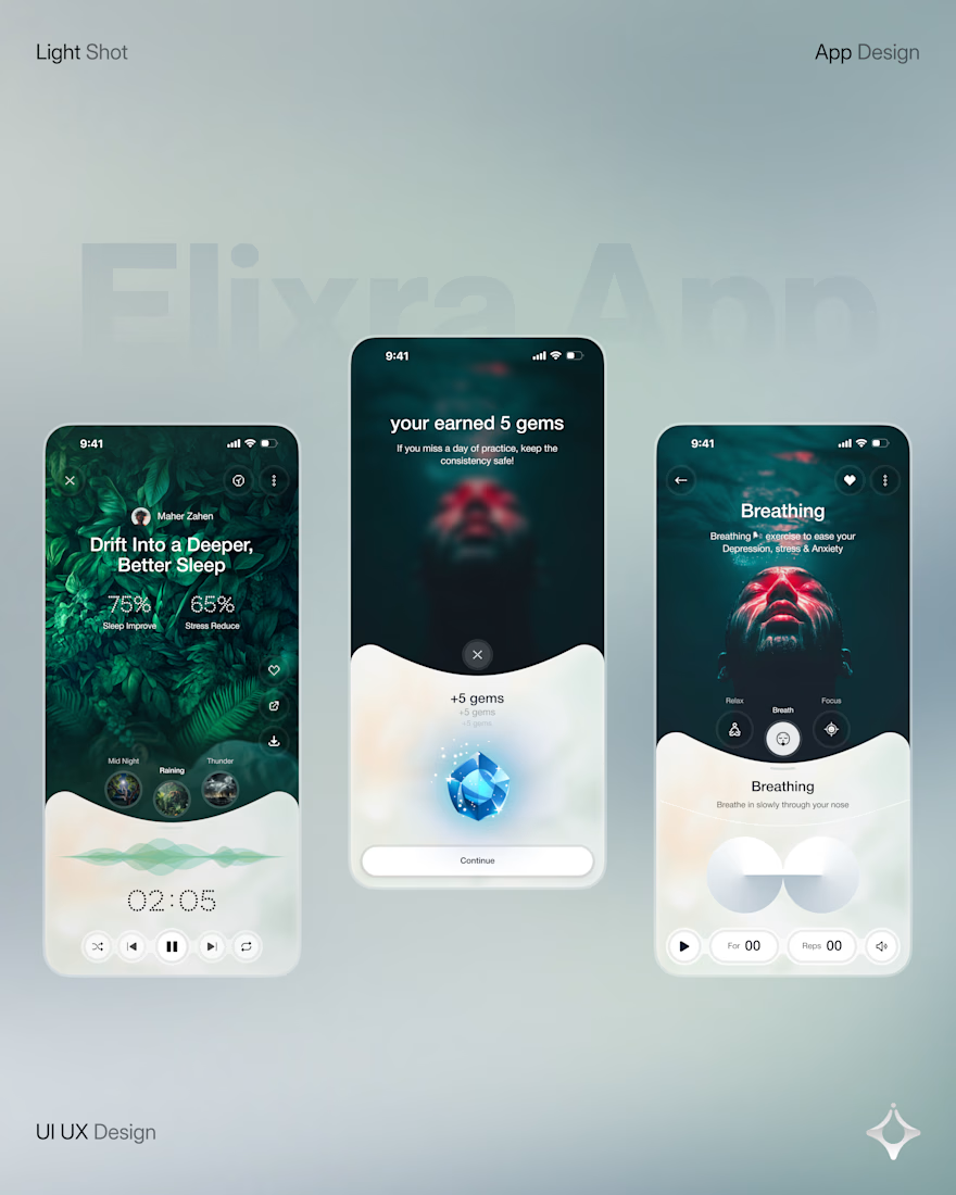
Wellness shouldn’t feel like another task on your to do list.
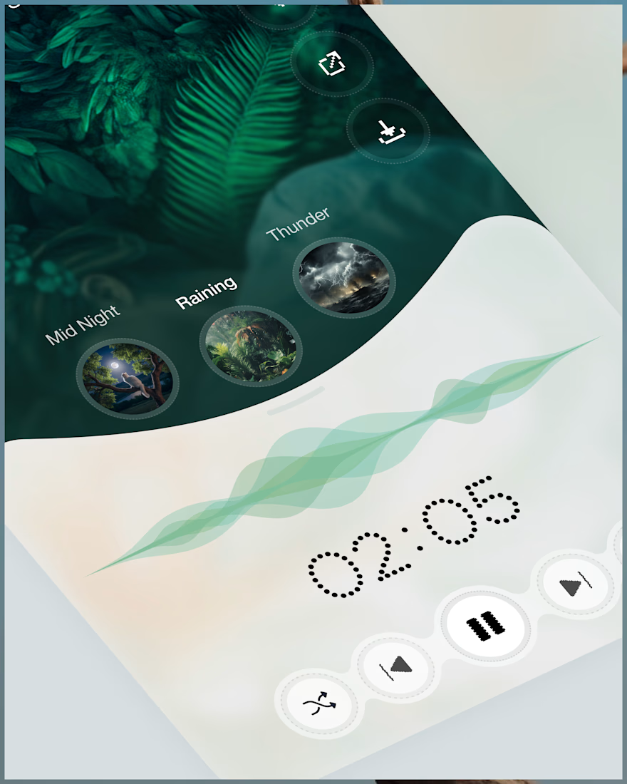
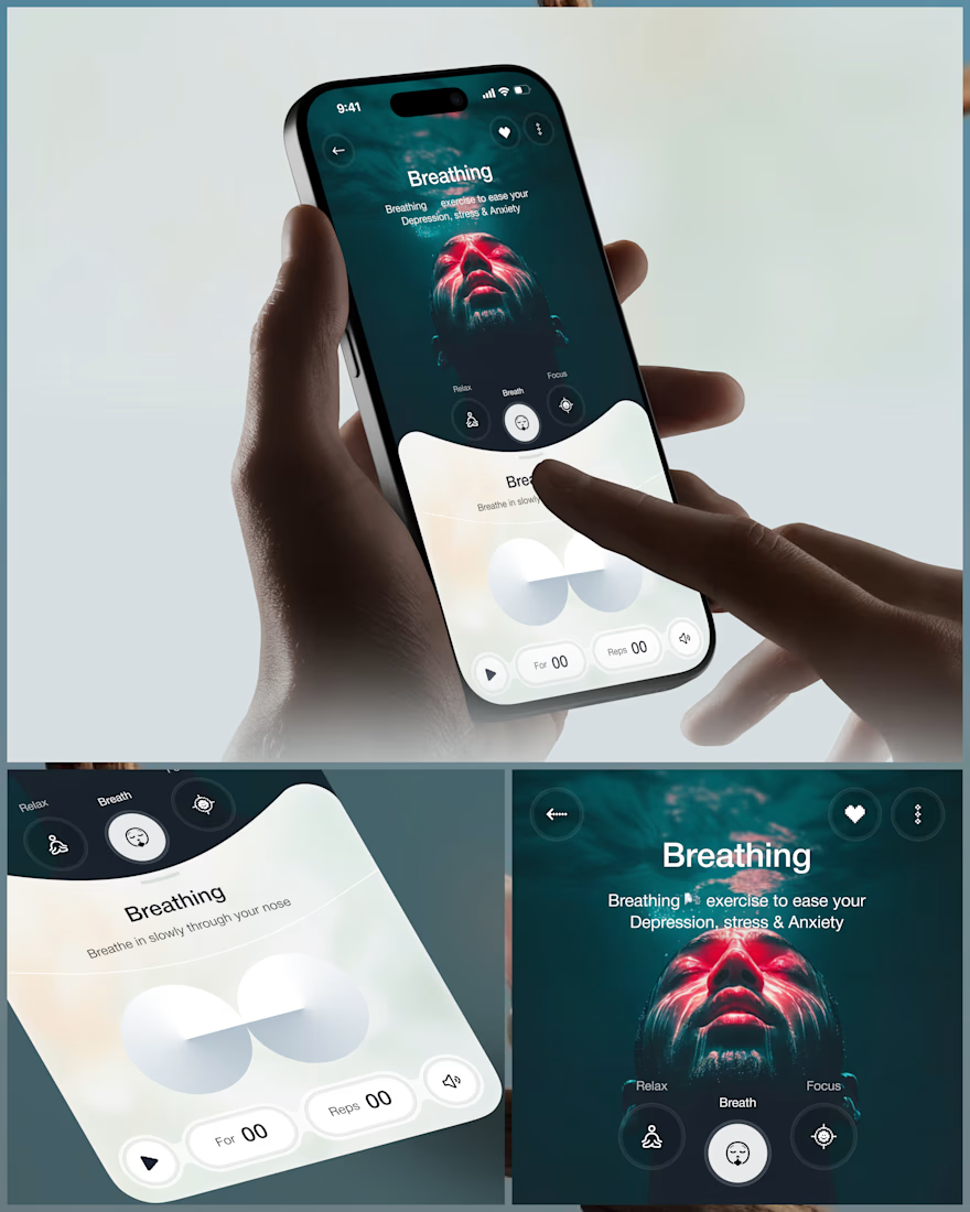
Elixra turns breathing, sleep, and mindful routines into an immersive digital experience through cinematic visuals, soft interactions, and rewarding micro moments.
What if wellness felt like this?


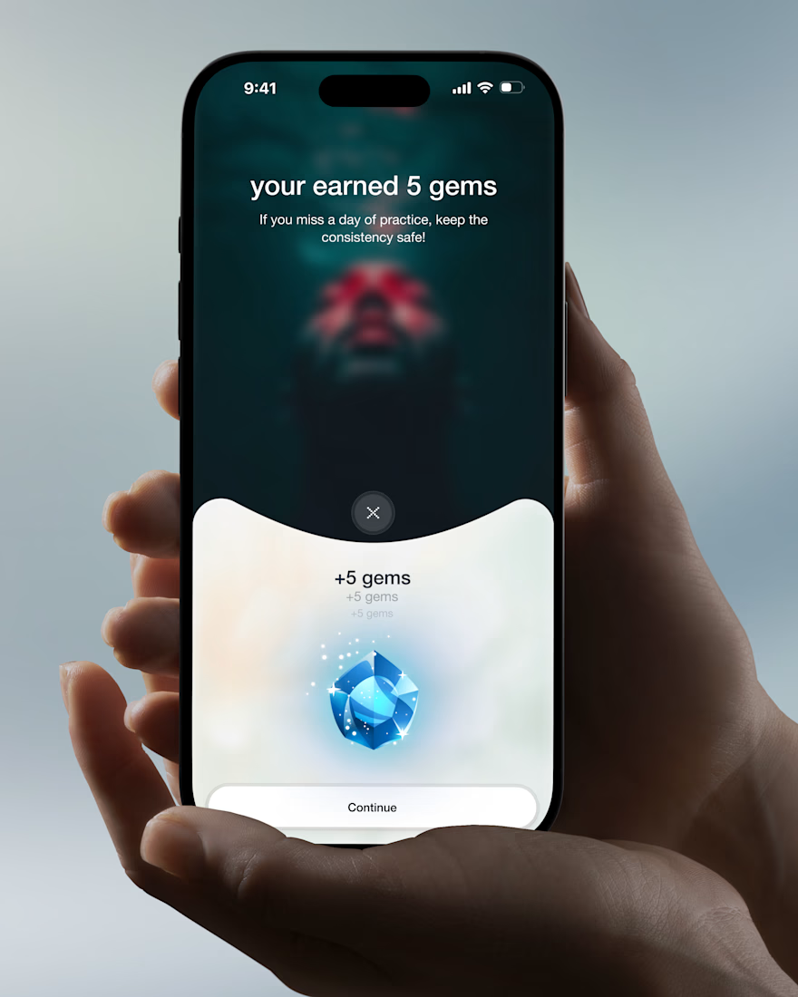

Love the soft interactions and micro moments idea. The cinematic approach makes wellness feel calm, not clinical.