The network for creativity
Join 1.25M professional creatives like you
Connect with clients, get discovered, and run your business 100% commission-free
Creatives on Contra have earned over $150M and we are just getting started
Back to feedPost
Fresh case study live: The Peak
A modern web design exploration built around clean lines, high-contrast layouts, and fluid motion. Designed in Figma and brought to life in Framer.
Feel free to drop any feedback!


Bold and minimalist at the same time and good looking. But i dont know if you added any animations to the site but the case study lacks video and explanation about this part in my opinion.

Thank you for your feedback!

That monitor mockup shot sells the case study before you even click through. What made you go with a single hero product shot instead of a scrolling walkthrough for the cover image?
The network for creativity
Join 1.25M professional creatives like you
Connect with clients, get discovered, and run your business 100% commission-free
Creatives on Contra have earned over $150M and we are just getting started











Related posts


this is really nice 100%. nice job

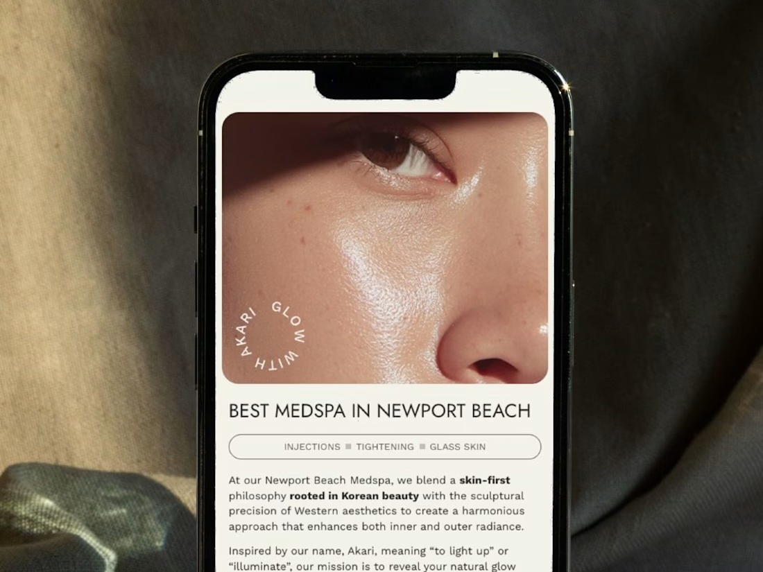
A restructured, clean website for Akari Medspa that turns scattered information into an intuitive experience as precise as the treatments they offer.


Too perfect buddy

looking for a great designer