The network for creativity
Join 1.25M professional creatives like you
Connect with clients, get discovered, and run your business 100% commission-free
Creatives on Contra have earned over $150M and we are just getting started
Back to feedPost

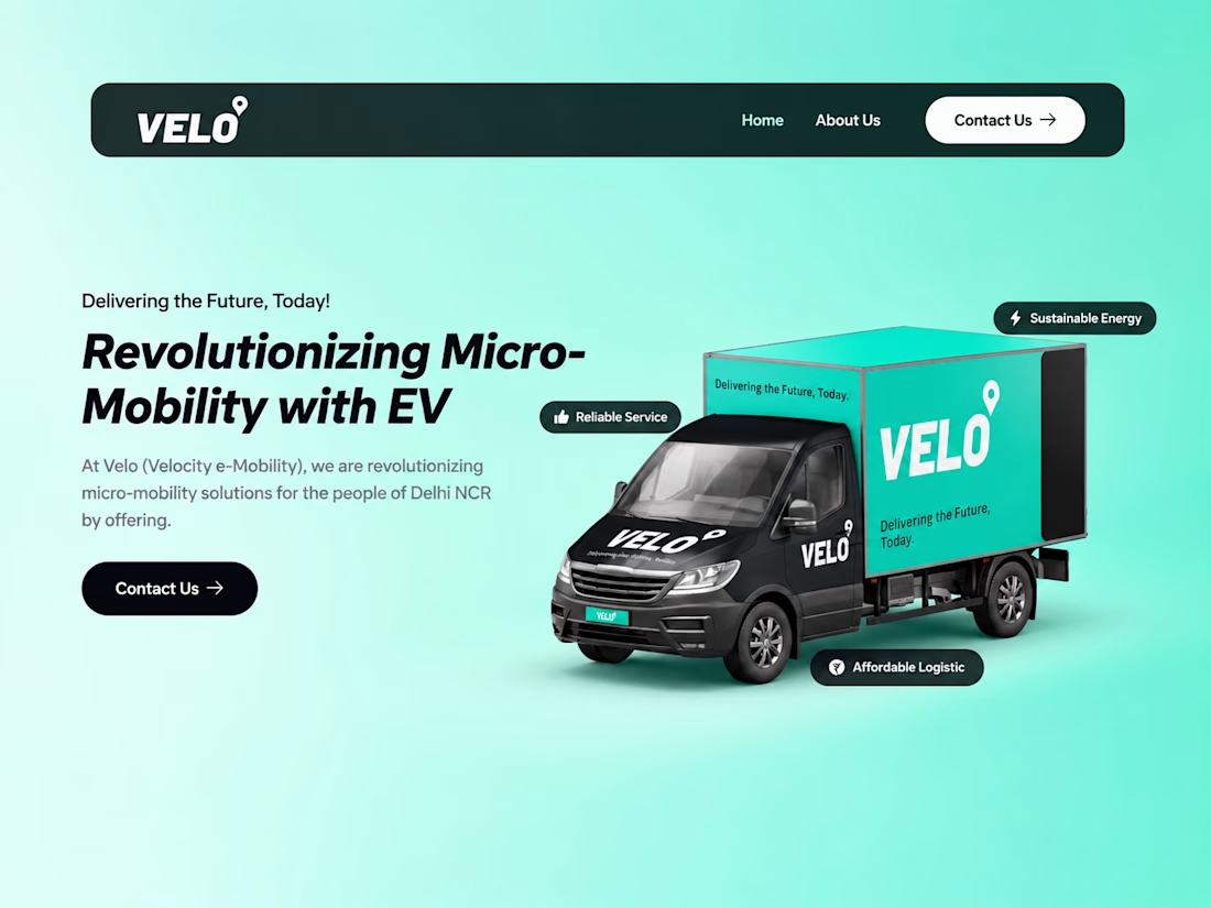
Developed a responsive WordPress website for Velo Mobility, an electric logistics company operating in Delhi NCR. The goal was to create a clean and modern website that clearly communicates the company’s eco-friendly delivery solutions and services.
I implemented responsive layouts, optimized page performance, and structured content for better user experience. The website highlights Velo’s mission of sustainable logistics, showcasing their electric fleet, reliability, and cost-effective delivery solutions.


The network for creativity
Join 1.25M professional creatives like you
Connect with clients, get discovered, and run your business 100% commission-free
Creatives on Contra have earned over $150M and we are just getting started





Related posts

A little Three.js experiment — a torn-edge reveal built with a custom shader and Sobel edge detection.
I wanted the transition to feel more organic and physical than a typical image reveal.


Custom shader + Sobel edge for a torn reveal is the kind of WebGL detail people feel even if they can't name it.

New website for CavioAi
Architectural imagery, blue dither textures, and custom motion showing how enquiries, bookings, and CRM workflows connect.
Designed and built from the first concept to the final experience.
A quick walkthrough ↓


The blue dither on the architecture photo gives it a printed feel. Works well for an AI brand.

🚨 WordPress Security Alert: This One Deserves Attention
WordPress 7.1.2 was released as a critical security update.
But here's the part developers should pay attention to:
Security researchers have reported active exploitation attempts targeting the vulnerability after the patch was released.
The vulnerability can allow an unauthenticated attacker to include local PHP files under certain conditions, potentially leading to remote code execution.
Patchstack has reported attackers moving beyond basic scanning and attempting to write PHP files to the server.
If you manage WordPress websites, don't just assume your sites are safe because automatic updates are enabled.
✅ Check your WordPress version
✅ Verify the update actually completed
✅ Review recently modified files
✅ Check admin users
✅ Review security logs
✅ Verify your backups
✅ Remove unused plugins/themes
A security patch is only useful if it's actually applied.
For WordPress developers, regular security monitoring should be part of website maintenance — not an afterthought.
#WordPress #WordPressSecurity #WebDevelopment #PHP #CyberSecurity #WordPressDeveloper

