The network for creativity
Join 1.25M professional creatives like you
Connect with clients, get discovered, and run your business 100% commission-free
Creatives on Contra have earned over $150M and we are just getting started
Back to feedPost
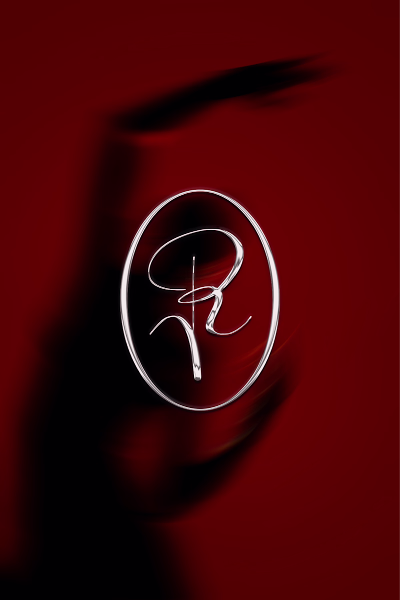
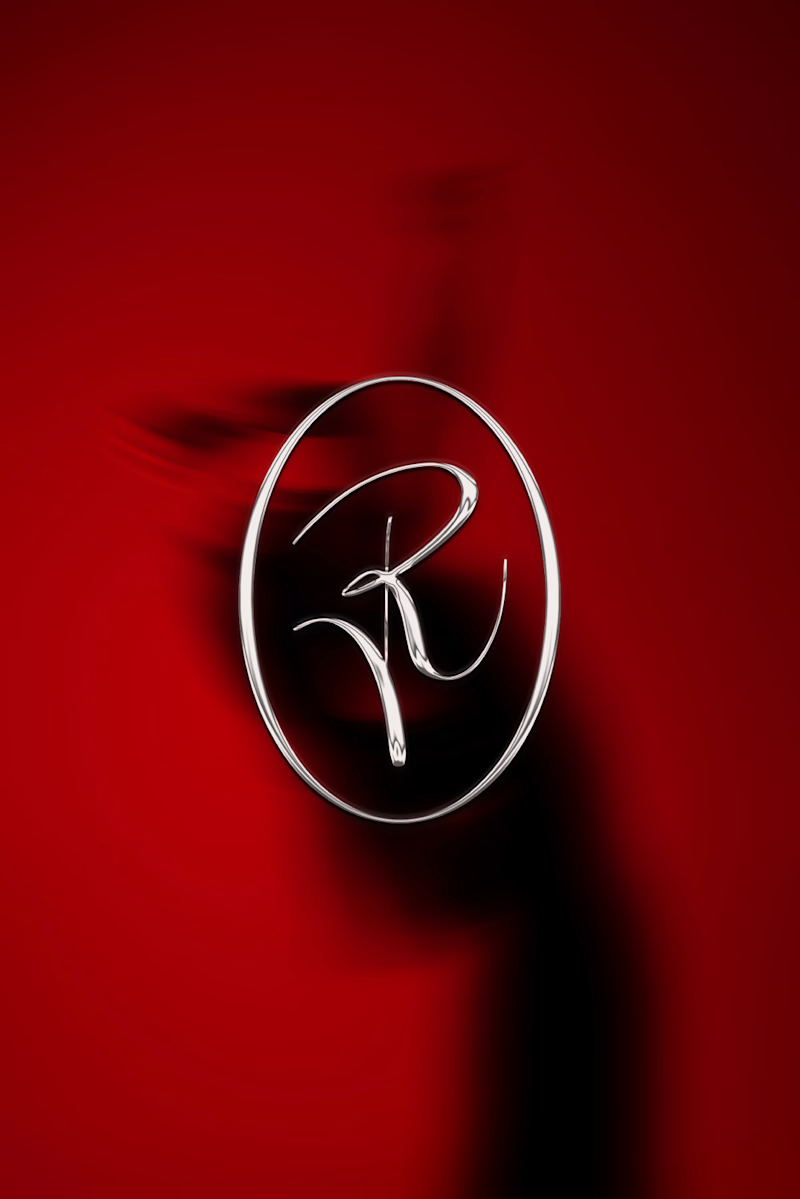
Taste Test
logo mark explorations for a new project, and I genuinely can't decide. It's an R, it's an oval, it's kind of giving flower. hand drawn, simple, a little wild. A or B?
3 voted
23%
10 voted
77%
13 votes
Closed
I would go with A. The flow of the "R" feels more organic and balanced within the oval.
Thank you, I appreciate your feedback 😊
Definitely feeling drawn to the left one more! It feels more elegant & more in line with what you'd expect from an R. The right feels a little bit more expressive, but it didn't grab me like the left one did!
Thank you, I appreciate your feedback 😊
I'm glad! Whenever I see one of these I always feel like I need to justify my choice 😂 I think it helps to know someone's thought process!
It helps a lot; we all see things differently. I like to show my process to a few fresh eyes, just because sometimes we don't notice all the details. Like one time, I was trying to write "spicy" in the shape of a chilli, and 5 people said it was great. The sixth one said it...
The network for creativity
Join 1.25M professional creatives like you
Connect with clients, get discovered, and run your business 100% commission-free
Creatives on Contra have earned over $150M and we are just getting started
Related posts
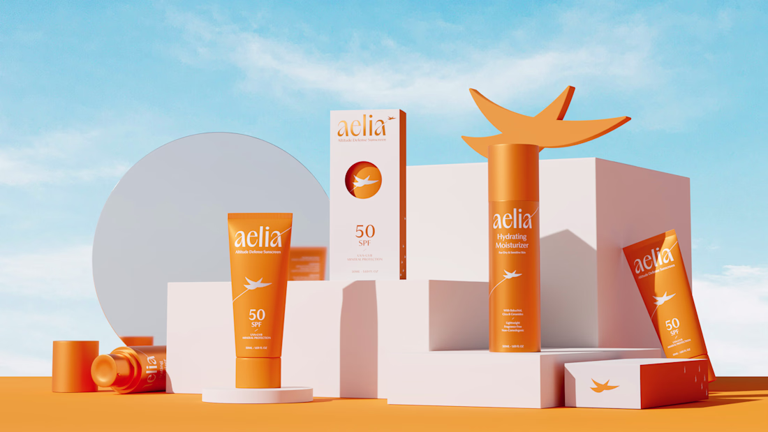
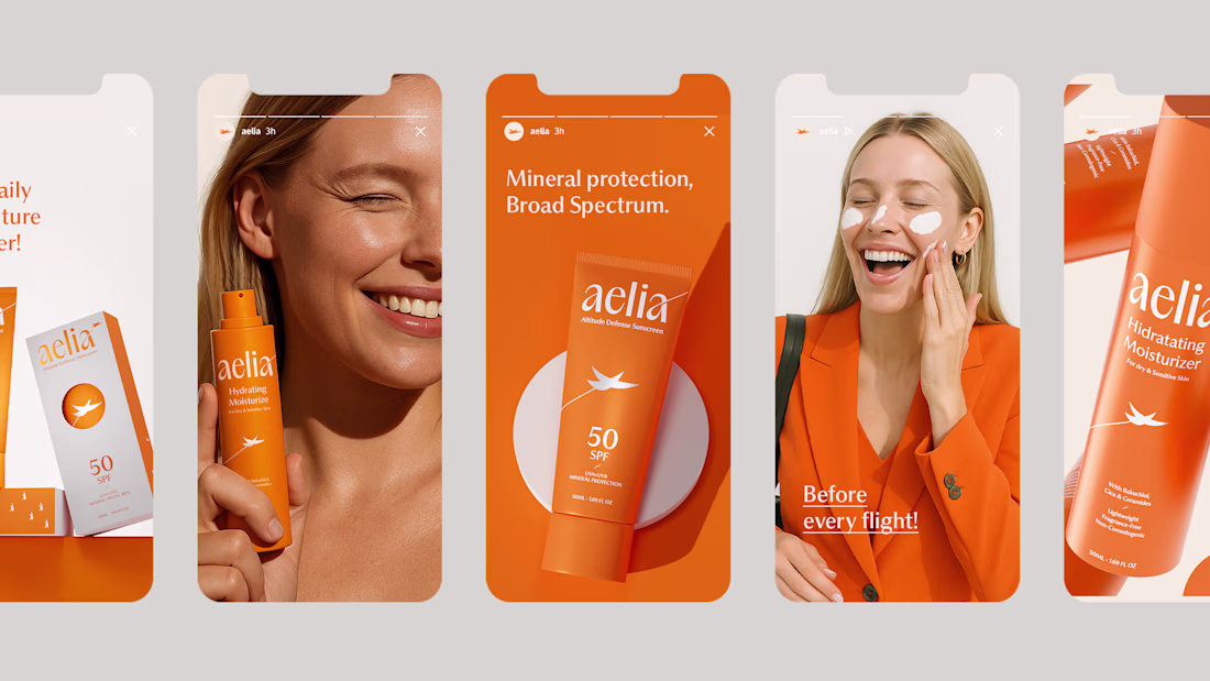
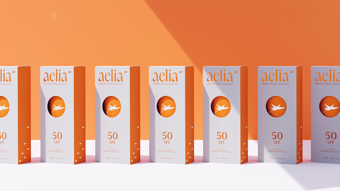
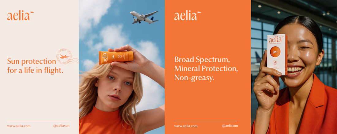
For Aelia, I was responsible for developing the brand strategy, visual identity, packaging design, and the overall creative direction of the project. My goal was to transform the founder’s unique perspective as a pilot into a distinctive brand experience, creating a clear connection between skincare, travel, and life at high altitudes.
The project began with defining the brand positioning and core narrative, which guided every design decision that followed. I created a visual identity inspired by freedom, protection, and elevation, expressed through a custom symbol, a carefully crafted color system, and a modern aesthetic designed to resonate with frequent travelers and modern explorers. The packaging was designed to reinforce this story, featuring a distinctive circular cut-out that references both the sun and an airplane window, creating a memorable and meaningful brand asset.
By aligning strategy, identity, and packaging under a single concept, I helped build a cohesive brand that feels premium, functional, and emotionally connected to its audience.
I love your use of color and composition here.
Which one is designed better?
One I designed using Claude Fable,
Other designed and build from scratch in Framer
Can you guess which is which?
17 voted
85%
3 voted
15%
20 votes
Closed
Outstanding comparison work!
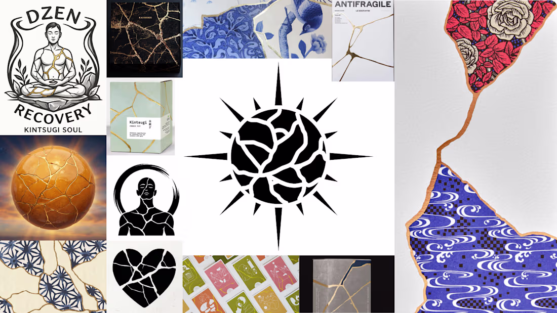
Do you know what kintsugi is?
Kintsugi is the Japanese art of repairing broken ceramics – but instead of hiding the cracks, you fill them with gold.
The damage becomes the most beautiful part. What was broken and put back together ends up more valuable than it ever was before.
Not "good as new." Better than new – with its story showing.
That idea is the core element of the new branding concept.
More soon. ✨
This idea resonates with me far beyond design.
The notion that scars, mistakes, and difficult experiences don't need to be hidden, but can become part of what makes something meaningful, is incredibly powerful.
Excited to see where you take this concept next ✨
Trending
Claude
Claude has entered the design space. How are you using Claude Design?
Contra University
Learn from expert creatives how to earn more using next-gen AI tools.
MagicPath
The canvas is infinite, and exploration is becoming the workflow. How are you using MagicPath?
creativeaiflow
Creative AI workflows are evolving. What tools do you use, and what are their strengths and weaknesses?
freelancerlife
Freelancer life is wins, pivots, and everything in between. What’s yours right now?