The network for creativity
Join 1.25M professional creatives like you
Connect with clients, get discovered, and run your business 100% commission-free
Creatives on Contra have earned over $150M and we are just getting started
Back to feedPost


The network for creativity
Join 1.25M professional creatives like you
Connect with clients, get discovered, and run your business 100% commission-free
Creatives on Contra have earned over $150M and we are just getting started
Related posts

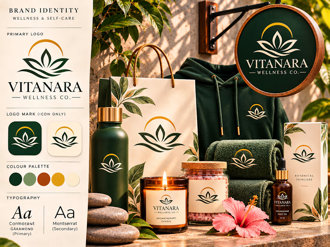
Vitanara Wellness Co. — Luxury Logo & Brand Identity Design
An elegant wellness identity built around a distinctive standalone emblem, refined typography, and a cohesive visual language inspired by balance, renewal, and natural well-being.
Vitanara Wellness Co. is a self-initiated brand identity concept developed to explore how a meaningful symbol can establish brand recognition independently of a company name.
The project brings together symbolic logo design, premium packaging, sophisticated typography, and realistic brand applications to create a cohesive visual experience for a contemporary wellness and self-care brand.
The Creative Vision
The concept began with a simple question: How can a wellness brand communicate its personality through a symbol alone?
Rather than building the identity around a letterform or monogram, the creative direction focuses on developing a recognizable emblem that represents the values associated with wellness.
The result is a visual identity centered on balance, natural beauty, tranquility, and personal renewal.
The brand name Vitanara complements this direction with an elegant, contemporary personality, while the emblem serves as the primary visual signature.
Logo Design & Symbolism
The central logo combines three meaningful visual elements.
The Lotus-Inspired Form
A symmetrical botanical form establishes the identity's most recognizable feature.
Its open petals communicate growth, renewal, and the idea of personal transformation.
The Flowing Lines
Curved lines beneath the lotus introduce a sense of movement and balance.
They reference the calming qualities of water and reinforce the brand's association with relaxation and restoration.
The Golden Arc
A refined arc above the botanical form introduces a sense of completeness and harmony.
Its circular character creates a balanced visual relationship with the petals and flowing lines.
Together, these elements establish an emblem that can function as a standalone brand signature without relying on initials or lettering.
A Symbol-First Identity System
One of the defining features of this project is the intentional distinction between the full brand signature and the standalone emblem.
The complete Vitanara Wellness Co. logo is reserved for applications where brand identification is important, including primary signage, selected packaging, and product labels.
The standalone symbol is used on applications where a more understated presentation feels appropriate.
These include apparel, reusable bottles, towels, shopping bags, and selected product packaging.
This approach creates a flexible identity system in which the emblem remains recognizable without requiring the brand name on every surface.
Typography & Color Direction
The typography combines classical elegance with contemporary simplicity.
Cormorant Garamond introduces a refined editorial personality through its expressive serif letterforms.
Montserrat provides a clean, modern supporting typeface for product information, packaging details, and practical brand communication.
The color palette draws inspiration from natural materials and restorative environments.
Deep forest green establishes a sophisticated foundation, while muted sage introduces softness and balance.
Terracotta brings warmth, golden ochre creates a premium accent, and warm cream provides a calming neutral backdrop.
Together, these colors establish a recognizable visual identity that feels both luxurious and approachable.
Brand Applications & Product Presentation
The identity was explored across a coordinated collection of wellness products and lifestyle applications.
Retail Signage
A circular storefront sign presents the complete brand signature, combining the standalone emblem with the Vitanara wordmark.
Shopping Bags
A premium cream shopping bag features the botanical symbol without the full brand name, creating an understated retail presentation.
Apparel
A forest-green hoodie displays a small standalone emblem on the chest, demonstrating how the identity can translate into lifestyle merchandise.
Reusable Bottles
A matte green bottle showcases the emblem independently, reinforcing the symbol-first design approach.
Wellness Towels
Embroidered-style logo applications demonstrate how the emblem works on textured fabric and hospitality accessories.
Self-Care Products
Coordinated candles, bath salts, skincare packaging, and facial oils demonstrate the identity's versatility across a premium wellness collection.
Selected products use the complete brand signature, while others rely on the standalone emblem.
Art Direction & Visual Experience
The final brand presentation combines realistic product mockups with a structured visual identity showcase.
Warm natural lighting, botanical details, textured stone surfaces, and carefully arranged products create a cohesive atmosphere.
The composition balances the formal elements of brand identity design with the emotional appeal of a luxury wellness experience.
The logo remains central throughout the presentation, while the surrounding applications demonstrate how the identity functions across different materials, formats, and environments.
Project Outcome
Vitanara Wellness Co. demonstrates how a distinctive symbol can become the foundation of an entire visual identity.
The project showcases an approach to branding that emphasizes meaningful symbolism, adaptable logo systems, cohesive packaging, and sophisticated art direction.
Its strongest feature is the relationship between the full brand signature and the standalone emblem.
By allowing the symbol to represent the brand independently, the identity establishes a flexible visual language that can extend across products, packaging, merchandise, and physical environments.
The result is a refined wellness brand concept built around one recognizable visual signature — designed to communicate balance, renewal, and understated luxury.
Self-initiated portfolio concept created to demonstrate symbolic logo design, brand identity development, and premium product presentation.



So pretty

What if getting healthier felt less like a task and more like a part of your everyday life?
That's the thought behind Zenvra, a wellness brand I designed around small goals, healthy habits, and consistent progress.
The idea was simple: make wellness feel achievable, not overwhelming.
A little look into the brand identity. 🌿
What do you think?

Real Estate Email Marketing | Campaign & Newsletter Design




A dusk render of the entrance as the email hero makes the property feel premium right away. How do you pick the hero for a real estate email, architecture or lifestyle?