The network for creativity
Join 1.25M professional creatives like you
Connect with clients, get discovered, and run your business 100% commission-free
Creatives on Contra have earned over $150M and we are just getting started
Back to feedPost
One wrong assumption ruined everything.
Long story short...
A client came to me.
Frustrated.
Stuck.
His Fiverr VSL cover just wouldn't convert.
It wasn't ugly.
Just trying way too hard.
Too many icons.
Too many badges.
Too much "trust me."
The hidden assumption behind that?
"More of anything builds more trust."
Wrong assumption, I guess.
‘Too much’ hides what matters.
People trust clarity & connection.
So I asked one question:
Not,
"What should we add?"
But,
"What should the users feel in one second?"
He sold premium VSLs.
The cover also had to feel premium.
Not just explain it.
One message per card.
"VSL."
"Order Now."
Strong typography.
Premium colors.
Zero clutter.
Maximum clarity.
That’s it.
Here's the pattern:
One wrong assumption never stays alone.
Branding follows it.
Copy repeats it.
Design decorates it.
SEO targets the wrong users.
By the time results disappoint...
It isn't one mistake.
It's the foundation.
What's a wrong assumption you've caught during research?
P.S: To checkout full project, click below 👇

📍Clutter often looks like effort.
Clarity looks like confidence.
📍
The fix usually isn't:
adding another element.
It's removing the wrong one.
📍If your message disappeared,
would your visuals still communicate
the right feeling?
The network for creativity
Join 1.25M professional creatives like you
Connect with clients, get discovered, and run your business 100% commission-free
Creatives on Contra have earned over $150M and we are just getting started
Related posts

Every screen I design starts flat – structure first, style second.
When a designer shows a case, which do you actually want to see?
Same screen, two stages.

3 voted
21%
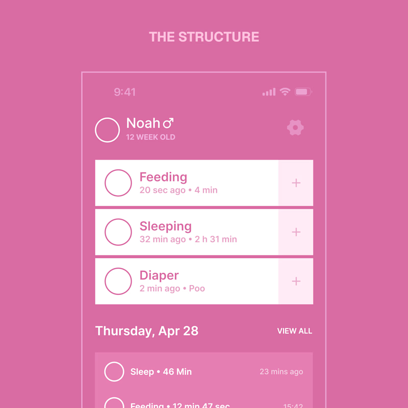
11 voted
79%
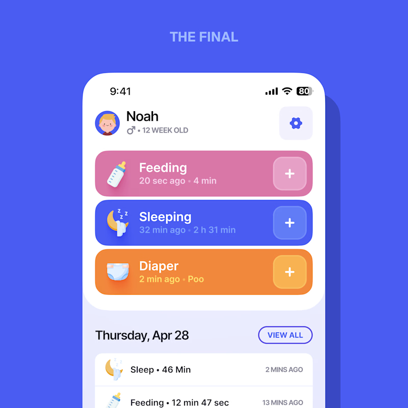
14 votes
Closed

Love it. The final


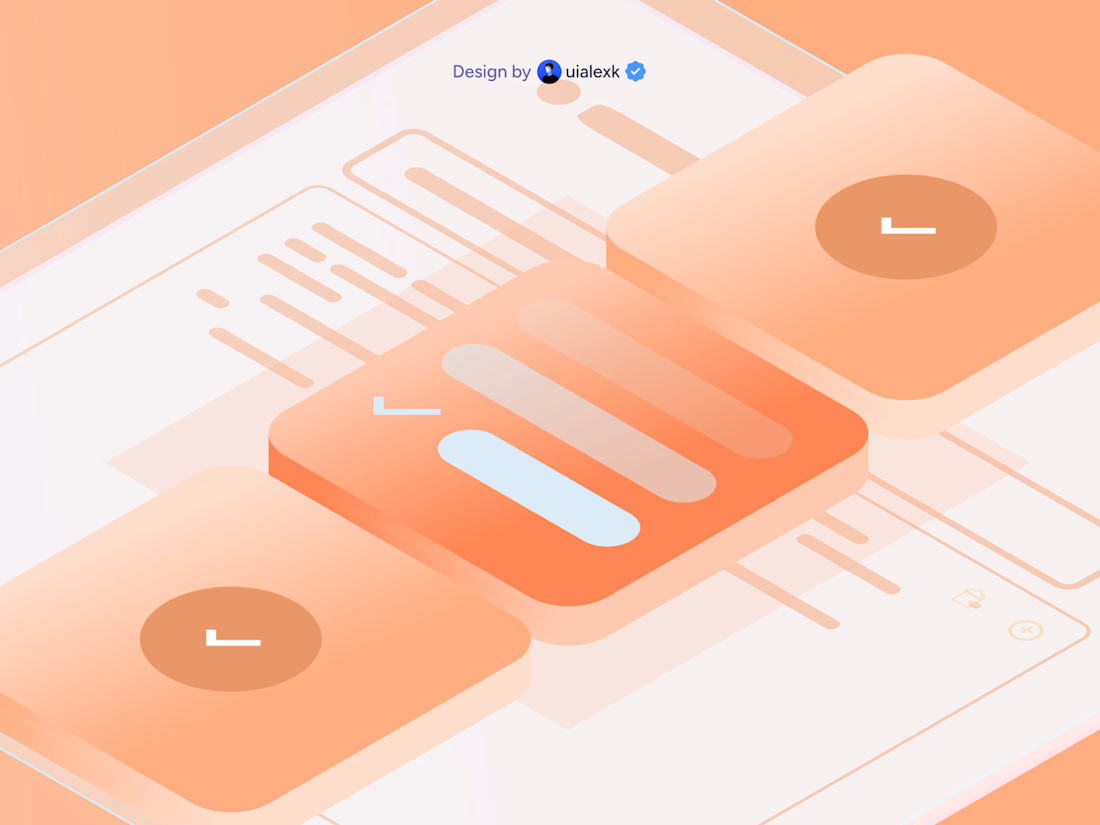

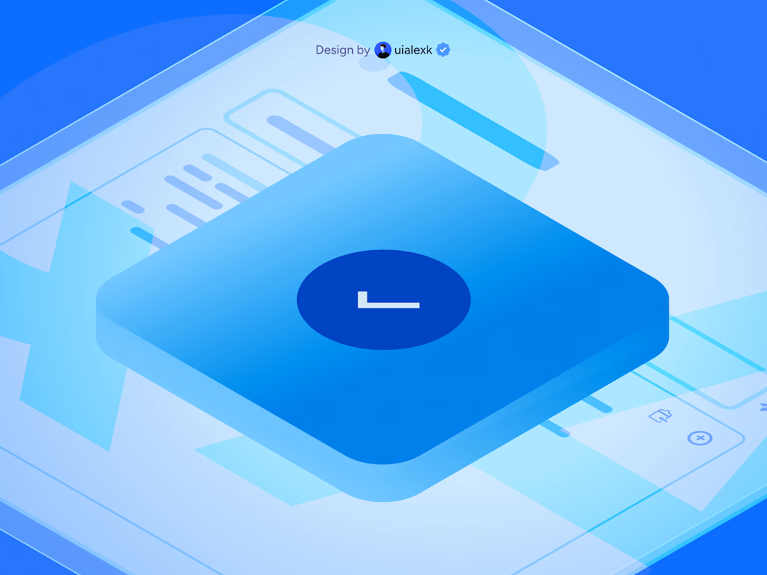

The gradients on these are so smooth they almost look 3D rendered rather than flat vector. Are you animating these in Lottie for a specific product's onboarding flow, or building out a general icon library?

Project Update: Behind the Scenes Go behind the scenes and see how I created a logo, complete brand identity, and promotional video using only Envato assets.


A behind-the-scenes breakdown is such a good move for this challenge, it shows the process instead of just the polished output. Building a full brand identity plus a promo video from only Envato assets is no small feat, what took the most iteration, the logo or the video edit?







Trending

Claude
Claude has entered the design space. How are you using Claude Design?

Contra University
Learn from expert creatives how to earn more using next-gen AI tools.
creativeaiflow
Creative AI workflows are evolving. What tools do you use, and what are their strengths and weaknesses?
freelancerlife
Freelancer life is wins, pivots, and everything in between. What’s yours right now?