The network for creativity
Join 1.25M professional creatives like you
Connect with clients, get discovered, and run your business 100% commission-free
Creatives on Contra have earned over $150M and we are just getting started
Back to feedPost
Taste Test
🔥 Quick feedback needed!
Which entry visual hook grabs your attention first?
🅰️ Left or 🅱️ Right?
Thinking purely as a first impression for a Contra post, which one would make you stop scrolling?
Drop your vote below 👇
Try: https://partly.figma.site/ my submission for figmamakeathon


2 voted
40%
3 voted
60%
5 votes
Closed

good work!

it means lot to mw Mcnove😍
The network for creativity
Join 1.25M professional creatives like you
Connect with clients, get discovered, and run your business 100% commission-free
Creatives on Contra have earned over $150M and we are just getting started



Related posts

Which Yap feels right? 🗣️
I’m working on the branding for Yap, a chit-chat app. The logo is the same in both versions. Only the colors change, and the colors change how the app feels.
Version A: Soft and calm
Lavender mark, a muted charcoal-purple wordmark, a small peach dot, and a near-white background. It’s quiet and gentle. It feels like a cozy late-night chat with a close friend.
Version B: Young and bold
Hot pink mark, near-black wordmark, a yellow dot, and a warm cream background. It’s loud and playful. It feels like a group chat that never goes quiet.
Drop an A or a B in the comments, and tell me why if you have a minute. I’m still deciding, so your pick will help.

10 voted
37%

17 voted
63%

27 votes
Closed

Stunning

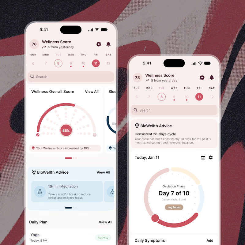
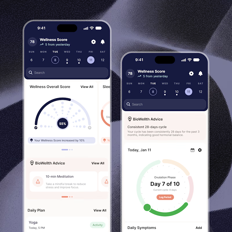
Exploring two color palette directions for a women’s health app. Which one feels right to you? 👀
32 voted
56%
25 voted
44%
57 votes
Closed

Both are amazing! The purple definitely has better contrast, but I’d still go with the berry one, purely a personal preference

guys, I need your help choosing a profile cover video.
which one looks better?
22 voted
13%
141 voted
87%
163 votes
Closed
