The network for creativity
Join 1.25M professional creatives like you
Connect with clients, get discovered, and run your business 100% commission-free
Creatives on Contra have earned over $150M and we are just getting started
Back to feedPost

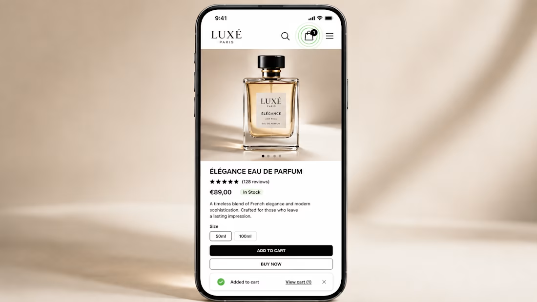
Pulsing Cart Reminder 🛒
A small UX interaction that could help increase e-commerce conversions.
When a shopper adds a product to their cart and continues browsing, the cart icon subtly pulses for a few seconds.
The idea is simple: keep the cart visible and remind shoppers that they already have an item waiting for them.
The Problem
Shoppers often add products to their cart and then continue browsing. As they explore more products, it’s easy to forget what they’ve already added.
The UX Solution
Introduce a soft pulsing animation around the cart icon immediately after an item is added.
It provides a visual reminder without interrupting the browsing experience.
Potential Benefits
🛒 Keeps the cart top-of-mind
👀 Makes the added item easier to remember
🔄 Encourages shoppers to revisit their cart
🎯 Creates a clear path toward checkout
⚡ Requires a relatively small UX change
Pro Tip 💡
Pair the pulse animation with a lightweight “Added to Cart” notification.
The combination provides immediate feedback while giving the shopper a subtle reminder to return to their cart.
Small interaction. Simple implementation. Potential CRO impact.
This is the kind of micro-interaction I’d test through an A/B experiment before rolling it out site-wide.
Would you test this on your e-commerce store?
#CRO #UXDesign #Ecommerce #ConversionRateOptimization #ProductDesign #Shopify #A_BTesting
The network for creativity
Join 1.25M professional creatives like you
Connect with clients, get discovered, and run your business 100% commission-free
Creatives on Contra have earned over $150M and we are just getting started








Related posts


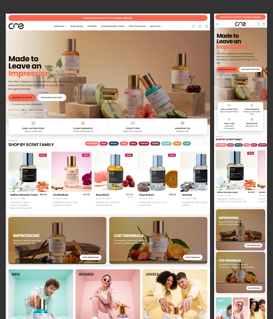
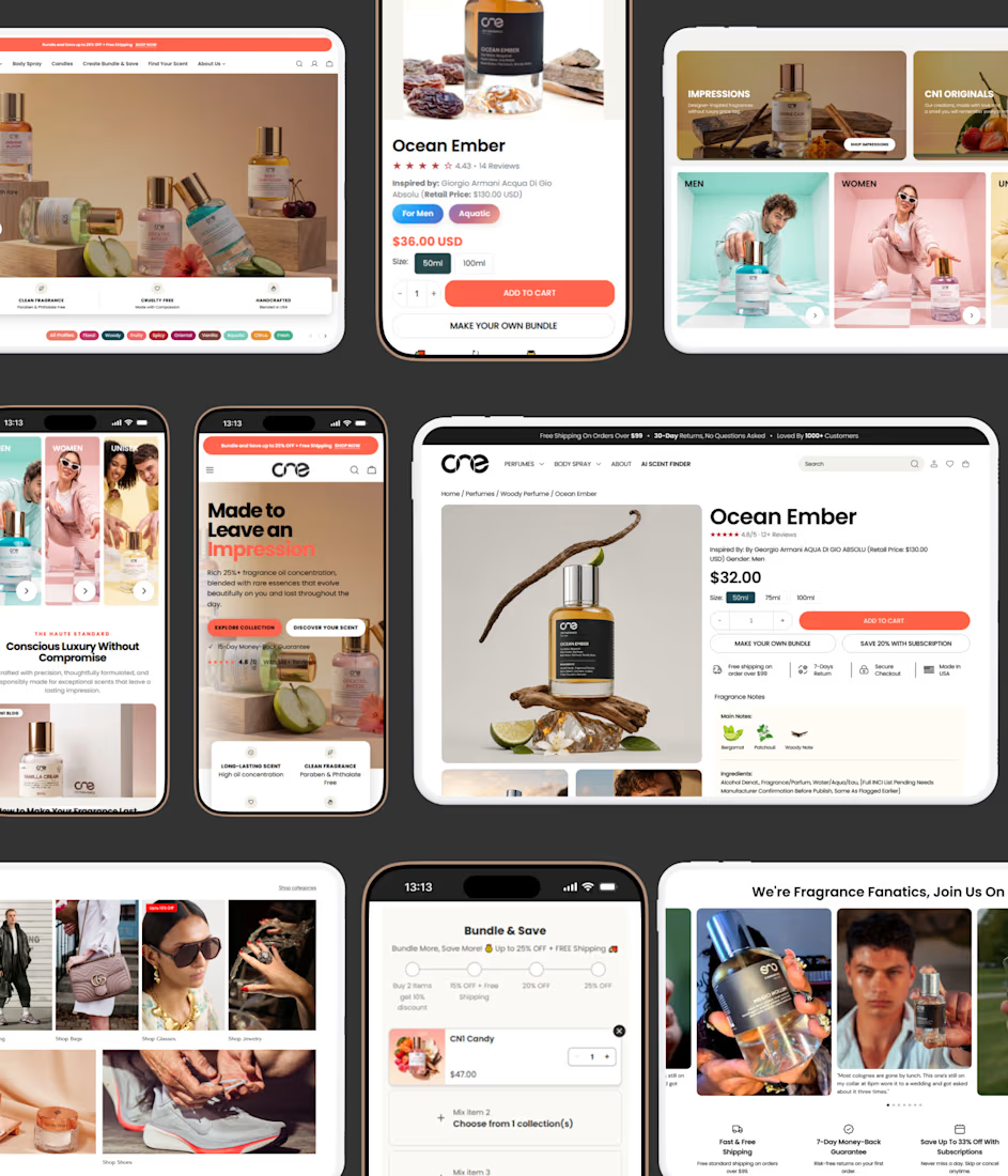
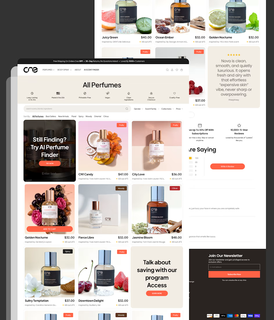
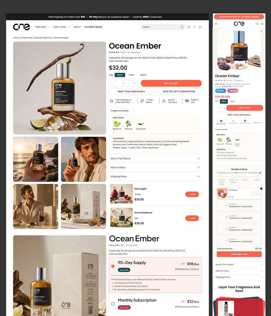
Shopify Store Redesign & CRO Strategy for CN1 Fragrance
CN1 Fragrance partnered with us to transform its Shopify store through a conversion-focused redesign of its Collection Page and Shopify product page.
The project combined Shopify store design, Shopify CRO, competitor research, and premium UX/UI strategy to strengthen product discovery, improve trust, and increase subscription engagement. Every design decision was backed by behavioral insights and conversion best practices to create a premium Shopify website design that encourages higher customer confidence and stronger sales performance.



Amazing work


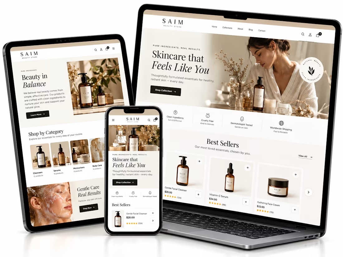
Shopify website setup project, I created a premium eCommerce homepage concept for a startup beauty brand.
Using Lovable, I developed a responsive design framework featuring elegant product showcases, intuitive navigation, clear shopping CTAs, ingredient storytelling, product benefits, customer review sections, FAQs, and email capture.
The goal was to establish a professional brand presence, simplify product discovery, and create a conversion-focused foundation for Shopify development.


The soft neutral palette suits the skincare angle really well, and the best sellers section with the star ratings reads cleanly across all three device mockups. Building the whole concept in Lovable is interesting. Did the generated layout hold up responsively out of the box, or did you rework parts of it by hand?

Rage Create: Bold Shopify Store for Affirmation Decks
Rage Create makes affirmation decks, notepads and calendars for creative people. I built their Shopify store with a bold look that fits the brand’s voice.
What I did:
• Shopify theme customization built around the brand
• Product, collection and cart pages that make buying easy
• Mobile-first layouts, since most shoppers buy on their phones
• Speed and on-page SEO basics
Stack: Shopify, Liquid, Figma
Live: ragecreate.com
Most shoppers buy on their phones. How do you design for thumbs first?
Planning a project like this? Message me with your goals and timeline.
Amazing