The network for creativity
Join 1.25M professional creatives like you
Connect with clients, get discovered, and run your business 100% commission-free
Creatives on Contra have earned over $150M and we are just getting started
Back to feedPost

Have you seen those "AI analysing your image" overlays tracking boxes, scan lines, ticking readouts? Framer didn't have them. So I built it.
Specimen - Living Scan Overlays (check preview) Drop any image or video → pick from 8 scan styles → done. It even tracks real motion in your footage.
🔥 Launch offer: $12 Buy now


The scan overlays look incredibly polished🔥

Really well executed from both a design and UX perspective.

Awesome work man🙌
The network for creativity
Join 1.25M professional creatives like you
Connect with clients, get discovered, and run your business 100% commission-free
Creatives on Contra have earned over $150M and we are just getting started








Related posts


Recent product update video for a client


Really curious about your process here. Did you start with a storyboard or go straight into motion?

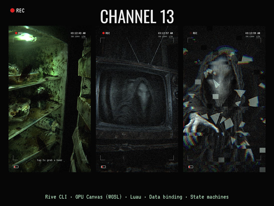
CHANNEL 13 📺👁️ A found-footage horror scene you play through smart glasses.
You open a moldy fridge full of roaches, grab a warm beer, sink into a ruined couch and turn on an old CRT. Every zap, something hooded and faceless gets a little closer in the static. On channel 13 it rushes the glass… and then it comes out. 🎧 Sound on.
How I built it:
• Rive CLI: the whole scene is written in RML with a coding agent (Claude Code), built and checked with rive --verify / inspect / screenshot, then pushed to the Rive editor
• GPU Canvas (WGSL): two shaders. A smart-glasses lens pass over the whole frame (fisheye, chromatic split, low-light grain, light-buzz flicker, digital glitch) and a cursed CRT shader (B/W analog snow, scanlines, rolling bar, vertical-hold slips, the figure bulging the glass, procedural spider-web cracks, power-off collapse)
• Luau scripting: story timing and "dread" level, channels and subliminal flashes, flying glass shards
• Data binding: one Story view model shared across artboards, a Broadcast view model driving the TV
• State machines: beat timelines, roach and bulb loops, 13 channels, all sound cues
• Audio: 22 sound effects, zero music. Fridge hum, buzzing bulb, roaches, footsteps, CRT whine, whispers, heartbeat, screamer, shattering glass
Uses both the CLI and GPU Canvas.



AI Plant Care & Disease Detection Mobile App Design
An AI-powered Plant Health Monitoring mobile app designed to help users identify plant diseases, track plant health, monitor environmental conditions, and receive personalized care recommendations. The app combines intelligent diagnostics, smart reminders, and real-time health insights to make plant care simple, proactive, and accessible for both home gardeners and plant enthusiasts.

Premium and eye catching work