The network for creativity
Join 1.25M professional creatives like you
Connect with clients, get discovered, and run your business 100% commission-free
Creatives on Contra have earned over $150M and we are just getting started
Back to feedPost

Want more views? Start with a good thumbnail! 🛑💸
I designed these vibrant YouTube covers to make personal finance topics instantly clickable. High-contrast typography paired with expressive cut-outs is the ultimate cheat code for boosting your click-through rate.
Be honest as a viewer, which of these four videos would you click on first? Drop your vote in the comments! 👇
#ThumbnailDesign #YouTubeThumbnails #GraphicDesign #CreatorEconomy #ClickThroughRate #FreelanceDesigner #PersonalFinance





The network for creativity
Join 1.25M professional creatives like you
Connect with clients, get discovered, and run your business 100% commission-free
Creatives on Contra have earned over $150M and we are just getting started



Related posts



awesome

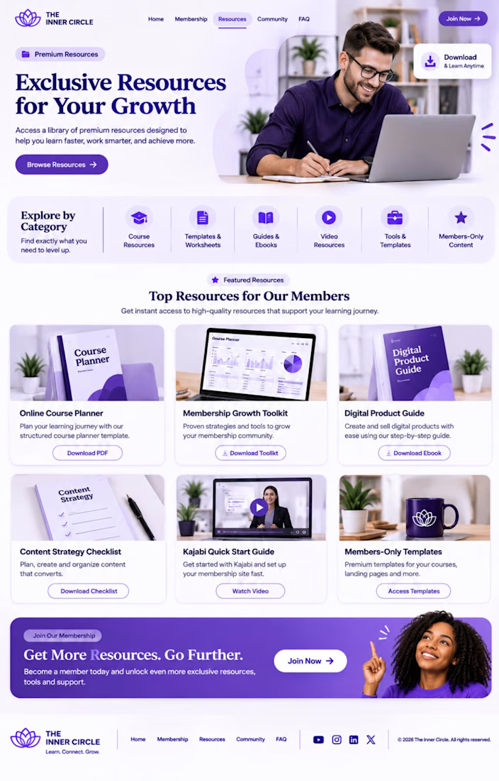
Kajabi Membership Site Setup & Subscription Management


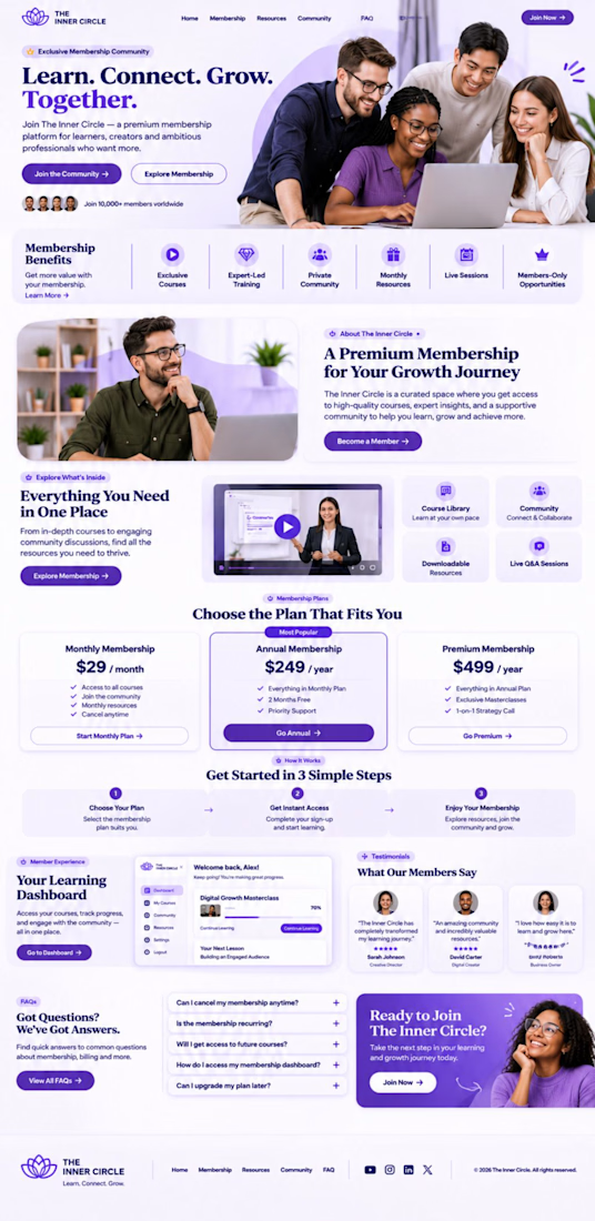
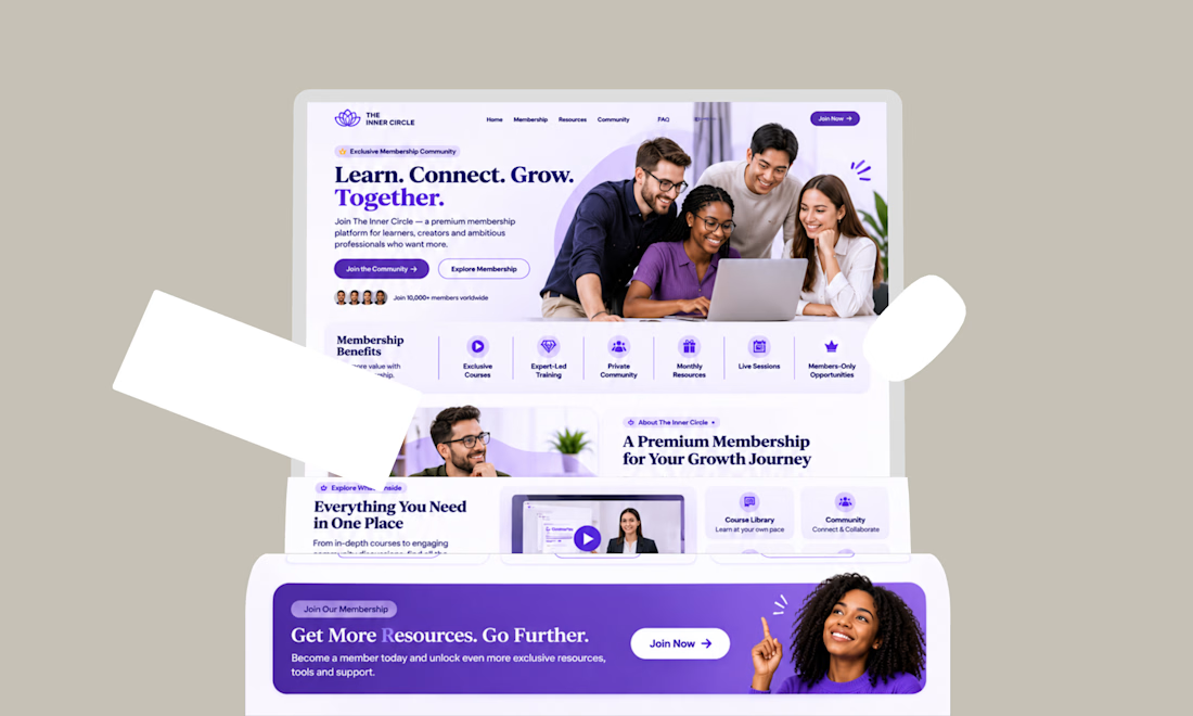

This is looking so professional

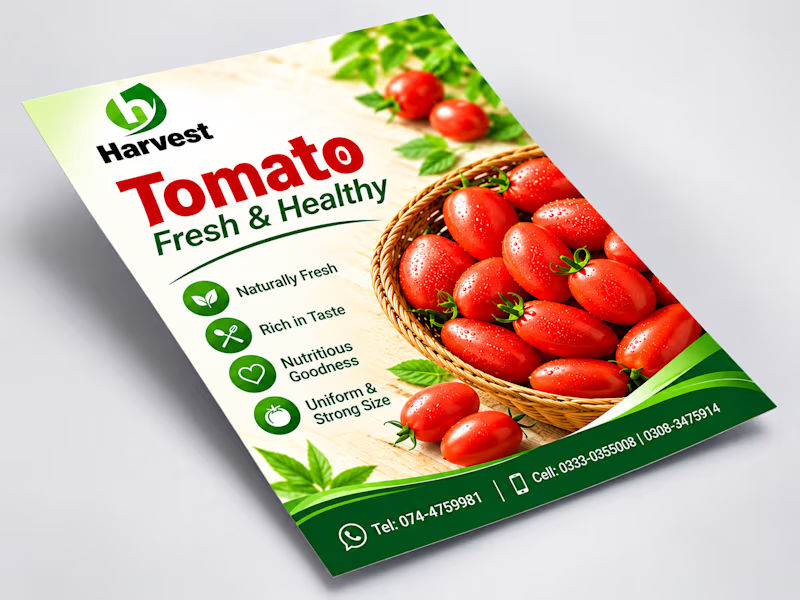
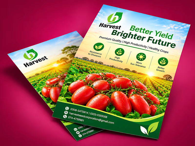
Which agricultural flyer design do you prefer for Harvest:
"Fresh & Healthy Product Focus"
"Better Yield & Brighter Future Field View"
Let me know your thoughts!
#GraphicDesign #FlyerDesign #Branding #PrintDesign #AgriculturalDesign
1 voted
50%
1 voted
50%
2 votes
Closed

I'd go with Option 1. The tomato basket on a clean background reads in one second, Option 2 is prettier but the headline fights the field. Is the flyer aimed at buyers or at farmers?