The network for creativity
Join 1.25M professional creatives like you
Connect with clients, get discovered, and run your business 100% commission-free
Creatives on Contra have earned over $150M and we are just getting started
Back to feedPost
The Onboarding Gap: Why New Users Churn Before They Even Start
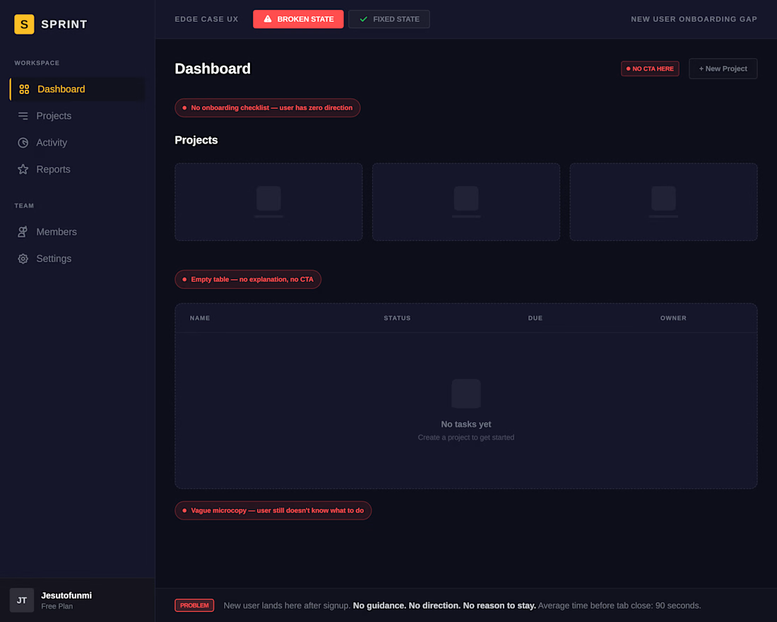
Most design effort goes into the signup page. But the first screen a new user sees after signup — the empty dashboard — is often an afterthought. No guidance, no direction, no first action. That's the onboarding gap.
5 gaps killing your activation rate:
→ No contextual empty state
→ No first-action prompt
→ No onboarding checklist
→ No sample data
→ No progress feedback
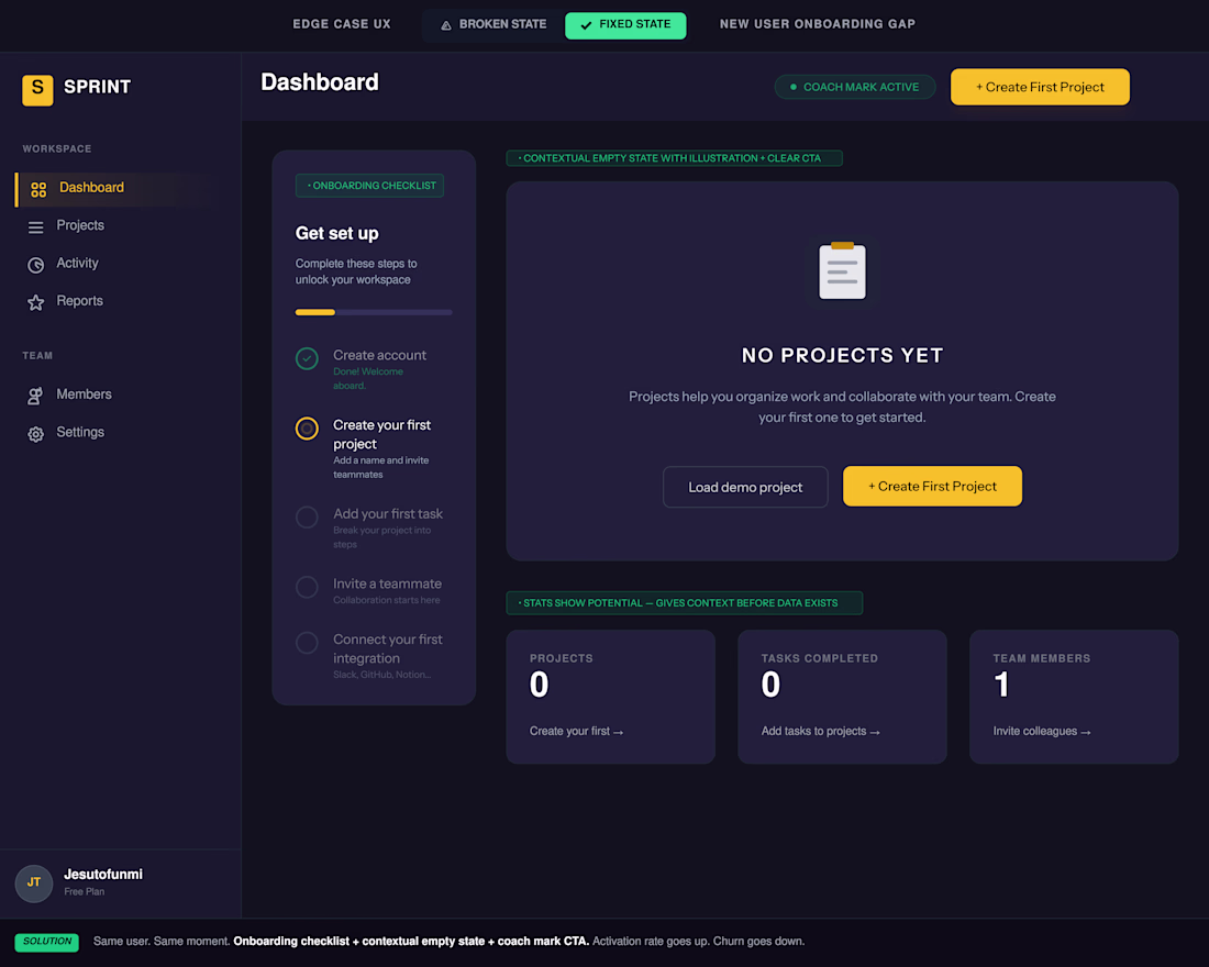
The fix: Redesign every empty state with an illustration, a clear headline, and one CTA. Add a 3–5 step checklist with a progress bar. Use coach marks and contextual microcopy on first visit.
The best onboarding doesn't feel like onboarding. It feels like the product already knows what you need.
🔗 View the Figma prototype — before/after linked below.
Follow for weekly edge case UX breakdowns.
The network for creativity
Join 1.25M professional creatives like you
Connect with clients, get discovered, and run your business 100% commission-free
Creatives on Contra have earned over $150M and we are just getting started
Related posts


This looks awesome !

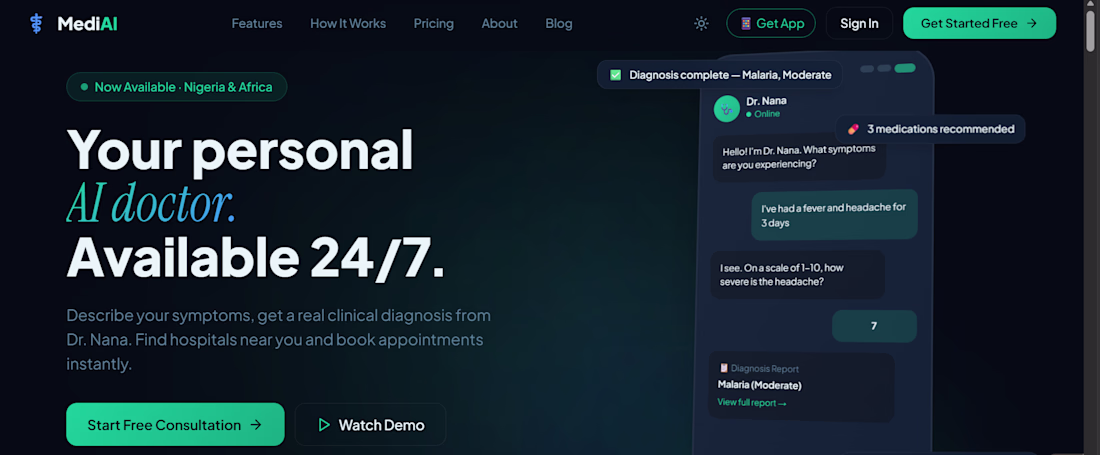
🚨 New Project — MediAI 🩺
Built a full AI-powered medical assistant platform solo. Three products in one:
🌐 Website + Web App
📱 Mobile App
🤖 Dr. Nana — real AI doctor via Anthropic
→ AI clinical diagnosis
→ Location-aware hospital finder
→ Drug recommendations
→ Health records + medication tracker
Built with @Lovable 💡
3 years UI/UX · Figma · Framer · Remote-ready 🌍
🌐 mediai-care.lovable.app .
Available for freelance + remote opportunities. Let's build. 🤝🚀


Impressive work building this solo. Curious how you handled the AI diagnosis logic with Claude.

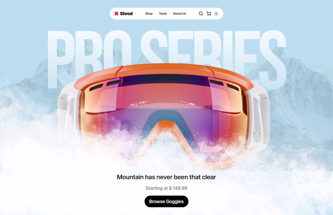
Just finished a landing page concept for Snow Boarding Goggle using Figma and Jitter.


Amazing Design


Trending
aivideo
AI video tools are moving at warp speed. Which ones are you experimenting with?
returntonature
Spring is a reset for creativity. What’s inspiring you outside the screen right now?
aidesignflow
AI tools are redefining design work. What's your current workflow?
freelancerlife
Freelancer life is wins, pivots, and everything in between. What’s yours right now?
allthingsmetal
Metal is having a design moment – from chrome to gates and grates. What designs are you forging?