The network for creativity
Join 1.25M professional creatives like you
Connect with clients, get discovered, and run your business 100% commission-free
Creatives on Contra have earned over $150M and we are just getting started
Back to feedPost

My Portfolio
A one-page portfolio I designed and built end to end: dark, one loud accent colour, and big uppercase type.
The experience
Binary intro: two panels of flickering 0s and 1s that settle letter by letter into "CLICK HERE", then slide apart to show the page. Escape, Enter, a scroll or a swipe also opens it, and it never blocks deep links or visitors who turn motion off.
Projects that play themselves: hovering a card plays through that product's screens (HR Mitra, Sululu.fun, WhatDish, Kya Khaoon).
Live YouTube section: videos and the subscriber count update from the YouTube Data API, with a fixed list to fall back on.
Tilted marquees, scroll-reveal animations and polaroid-style "off-duty" cards, all with a Motion on/off switch for accessibility.
A language selector using Google's website translator, and a contact form that sends real email.
Under the hood
Next.js 16 (App Router), React 19 and Tailwind CSS v4, statically rendered and SEO-ready with generated OG/Twitter images, a sitemap and robots.txt
The page is server-rendered underneath the intro, so search engines and no-JS visitors see all the content
All the text lives in three content files, and a pre-deploy test fails if any placeholder text is left
Tested with Vitest unit tests and Playwright end-to-end tests on desktop Chrome and a mobile profile (accessibility smoke checks, no horizontal overflow, the contact form, hover-to-play)
Containerised with Docker and deployed to Google Cloud Run through Cloud Build
Live: neerajmahapatra.online


The network for creativity
Join 1.25M professional creatives like you
Connect with clients, get discovered, and run your business 100% commission-free
Creatives on Contra have earned over $150M and we are just getting started
Related posts

My personal website is a one-page portfolio that I designed and built myself: concept, visual identity, UI and code.
My mascot is small rubber-duck, a nod to rubber duck debugging.
Stack: React + Next.js, TypeScript, Tailwind CSS, GSAP, deployed on Vercel.
Recordings in 4:3 format to upload them as cover :)
Live at teresasignati.com


Casemate: making malware analysis feel calm instead of scary
Cybersecurity websites usually look the same: black background, green code, a hooded guy. I wanted to try the opposite for Casemate, a concept for a malware analysis tool.
The idea is simple: the product keeps a suspicious file in a sealed chamber and watches what it does. So I put a bug frozen in amber in the middle of a canyon. It’s dangerous and under control at the same time, and you get it without reading a word.
Then I made sure the page still works for a security lead who wants facts. The stats sit right next to the headline: threats isolated, latency, endpoints covered.
The hardest part was keeping it warm without losing trust. I stayed with one terracotta colour, wide capitals and mono labels, so it reads like a serious tool and not a poster.
I’m taking on new projects for SaaS and tech teams. If you have a product that’s hard to explain in one glance, send me a message.
What do you think, would you trust a security product with a canyon on the homepage?


I love it! It feels so calm, and I would definitely try it! This is amazing, Kris. I never thought cybersecurity could be this cool ❤️🔥

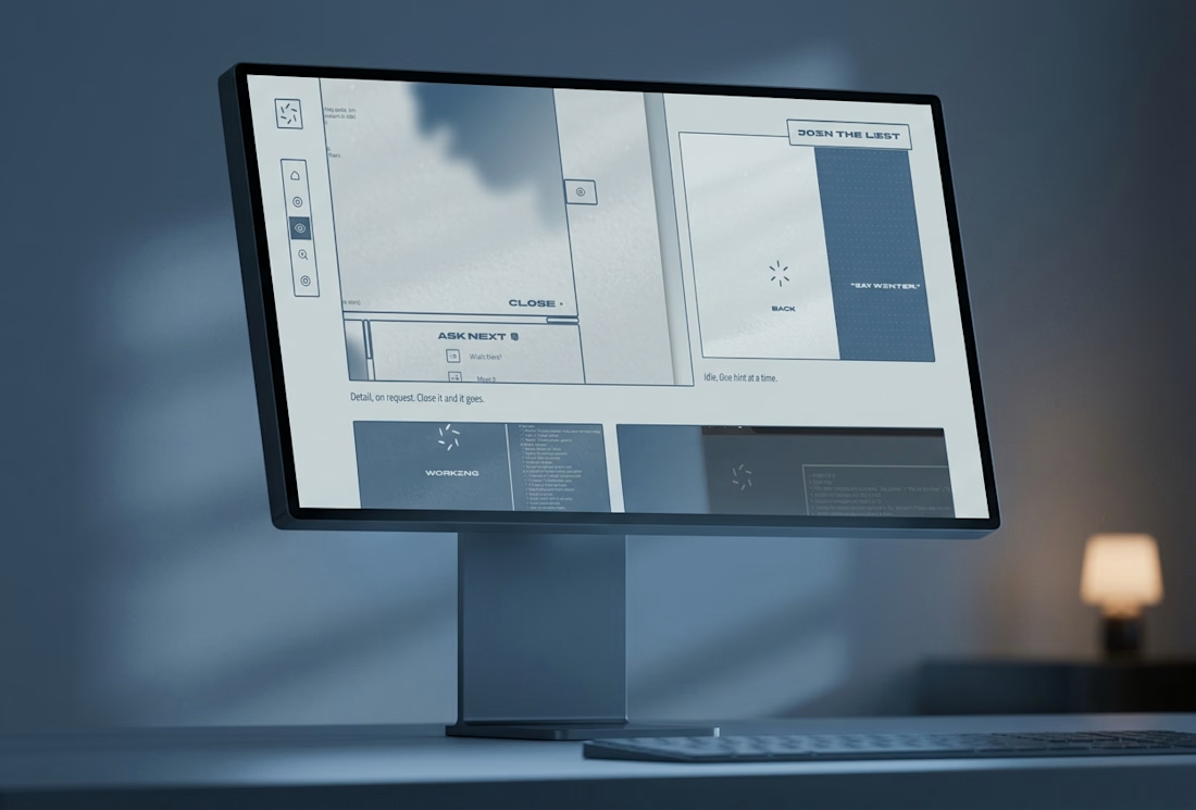
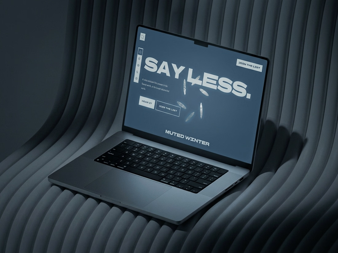
What if a website went quiet as you scrolled?
The Muted Winter site starts on bright snow and ends after midnight. Six petals open like windows, the page dims, and no line runs longer than a breath.
Live here