The network for creativity
Join 1.25M professional creatives like you
Connect with clients, get discovered, and run your business 100% commission-free
Creatives on Contra have earned over $150M and we are just getting started
Back to feedPost
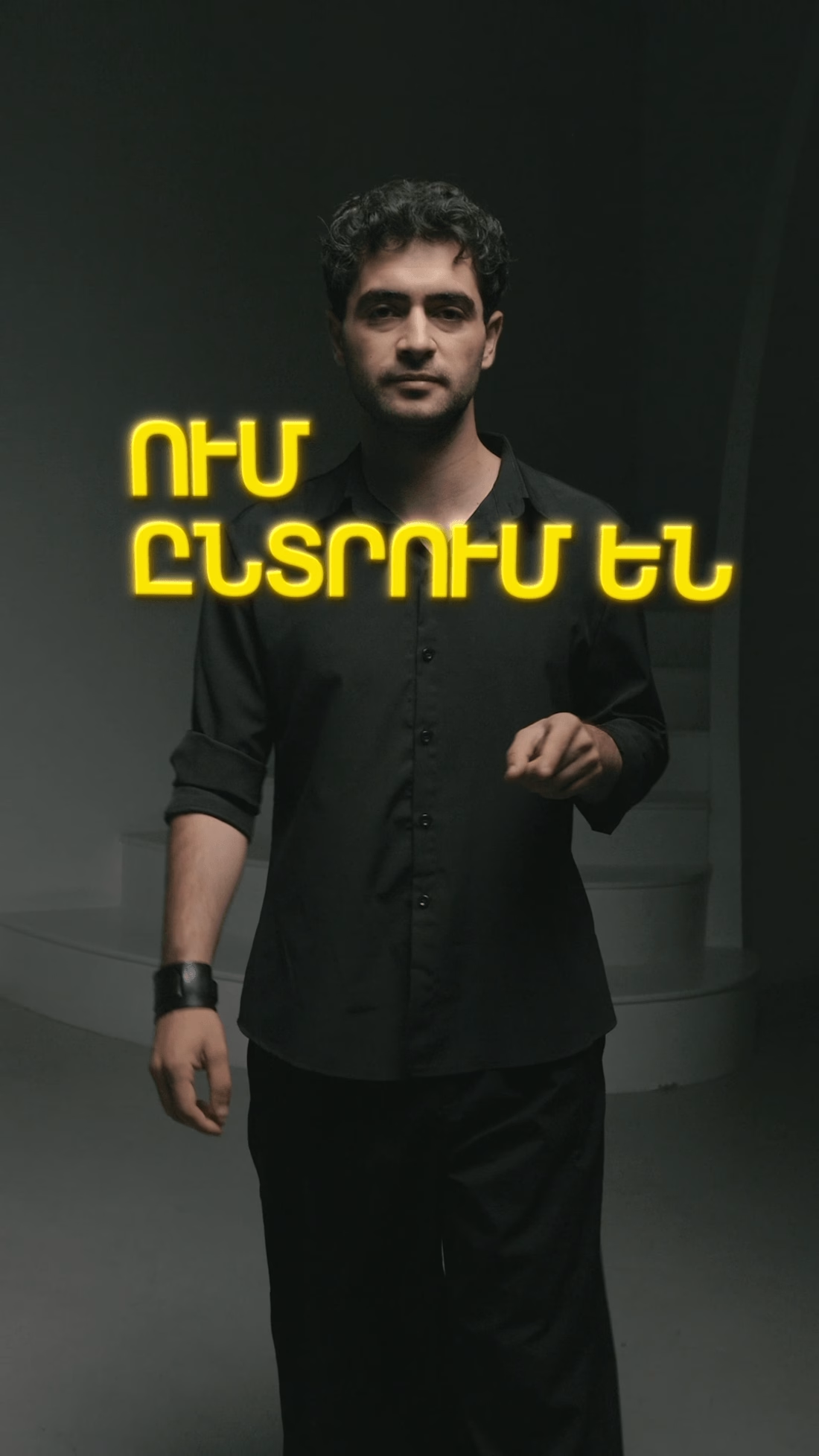
Promo Reel for Pulse Marketing (Armenia)
I love making promotional videos
This time, it was a vertical format


Thanks!
That's exactly what I aim for
Creating content that feels native to each platform

Making content that feels native to each platform is exactly the right goal for a promo reel, Danila. The glowing Armenian typography against the dark frame makes a bold vertical hook. Strong pacing for the format.
Thank you, I appreciate your feedback!
The network for creativity
Join 1.25M professional creatives like you
Connect with clients, get discovered, and run your business 100% commission-free
Creatives on Contra have earned over $150M and we are just getting started








Related posts


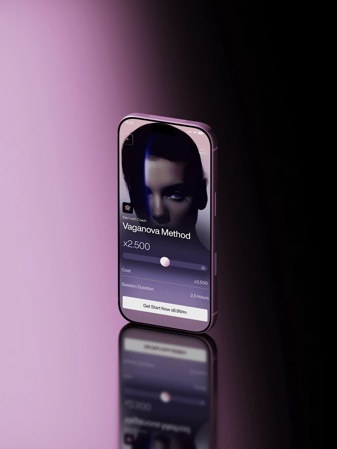
Super sleek presentation! ✨ The phone mockup with that purple gradient is looking premium. Clean editing!


Fresh case study 🚀🚀🚀
Brand identity for Peak, an all-in-one website builder for WordPress that I design and build. A four-letter mark, a warm paper-and-ember palette and one system that runs from the favicon to the packaging.

A four-letter mark that has to hold from favicon to packaging is a tough constraint. Did you draw one letterform first and build the other three from it, or design them together as a set from the start?

📰 FRONT PAGE
A launch-day ad that puts your product on the front page.
Tuesday, October 14. Late City Edition.
A blood orange soda came back.
Shelves cleared in eleven minutes.
Officials urged the public to remain calm.
Friday morning, a phone outlived the news cycle.
Its charger was reported missing, presumed retired.
Saturday, 12:01 a.m.
Cold brew hit the shelves.
Nobody went home.
None of it happened.
All of it made the front page.
🗞️ Every launch wants to be news.
Most of them get a banner.
I couldn't find a single newspaper in SVGator's template gallery.
So I built one.
The Bellbird Times.
The Kestrel Herald.
The Nightjar Post.
Three papers.
One template.
Zero redraws.
Retype the headline, swap the photo and the logo.
Every word is live text. Every layer has a name.
The motion never changes.
So what's your headline?
The press never stops. ✨
🛠️ Built in SVGator with the MCP. 1,038 named layers, 8,440 keyframes.


the idea , the design , motion design
everything is peak-