The network for creativity
Join 1.25M professional creatives like you
Connect with clients, get discovered, and run your business 100% commission-free
Creatives on Contra have earned over $150M and we are just getting started
Back to feedPost

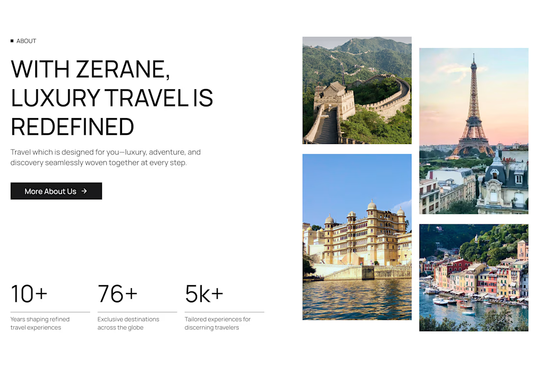
About us section for your home page!

thanks, ganesh!
The network for creativity
Join 1.25M professional creatives like you
Connect with clients, get discovered, and run your business 100% commission-free
Creatives on Contra have earned over $150M and we are just getting started











Related posts



Modern Beauty Salon Website Design
I designed a modern and elegant website homepage concept for a beauty salon. The design focuses on a clean layout, service showcases, a beauty gallery, and clear appointment enquiry calls to action. The goal is to help small beauty businesses present their services professionally online.