The network for creativity
Join 1.25M professional creatives like you
Connect with clients, get discovered, and run your business 100% commission-free
Creatives on Contra have earned over $150M and we are just getting started
Back to feedPost

Clients care less about a site looking good than about what a visitor decides in the first 10 seconds.
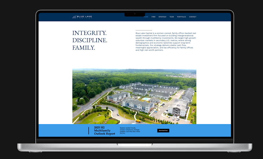
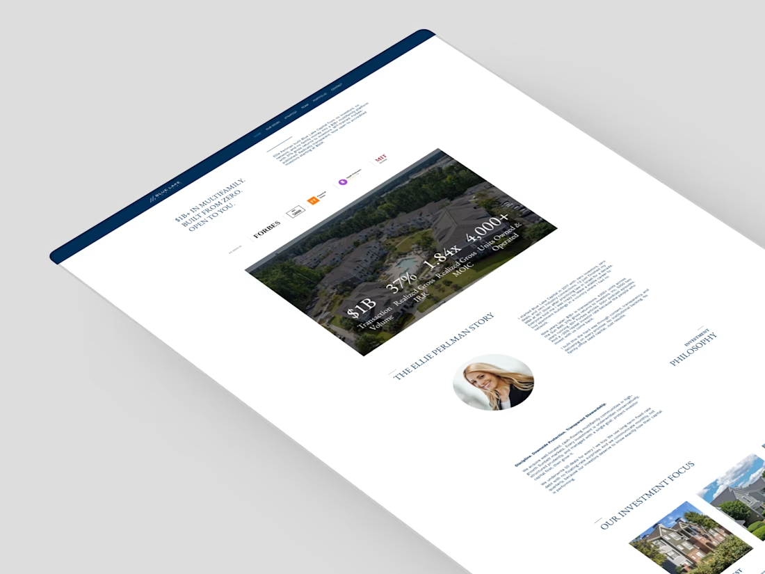
For Blue Lake Capital, a $1B+ real estate firm opening to investors at $50K, I organized the homepage around the five questions an investor actually asks.
1. Who is this?
2. Can I trust them?
3. How do they think?
4. Is this for me?
5. What now?
Each section answers one question, in that order. The hard part was building it inside HubSpot, where every bold idea had to survive the CMS. That constraint gave us cleaner typography and reusable sections the team can maintain themselves.
Full case study on my profile.
Designers, do you plan pages around user questions, or around content blocks? Curious how others approach it.


Thoughtful work on the homepage.
Thanks, Vansita! The trickiest part was the order. “Can I trust them?” had to come before any pitch, so the numbers sit right under the founder’s story.
How do you usually decide what goes first on a homepage?
The network for creativity
Join 1.25M professional creatives like you
Connect with clients, get discovered, and run your business 100% commission-free
Creatives on Contra have earned over $150M and we are just getting started


Related posts

Which one could win here?
A/B testing for a Landing page for B2B search analytics platform.
For startups, converting users is extremely crucial.
Rather than judging on your own, let the numbers tell you which one can help you get more users.
#landingpage #abtesting #b2b #aisearch #businessanalytics
19 voted
44%
24 voted
56%
43 votes
Closed

Light blue. For a B2B analytics tool, showing the actual dashboard in the hero does the selling before anyone reads the copy. “Win in AI search” lands better with the product right beside it. Would be curious to see a second test on the CTA too, “Start Free Analysis” vs something tied to a result.

Today I analyzed the website of a $10M startup.
Great positioning. Great messaging. And no way I’d have read all of it if it weren’t my job.
if you can read the text on your website doesn't mean everyone can.
While very few people have severe visual impairment, about 1 in 3 American adults have some degree of problems with their vision. Even with my glasses on, I struggle with low-contrast text.
Of course people who are really interested in your product will strain their eyes. The rest might just leave.
A quick check: body text should have a contrast ratio of at least 4.5:1 with its background. It might be the cheapest conversion fix on the whole site.

Contrast is the quickest accessibility win and it gets skipped all the time. Do you check it with a plugin or by eye?

Best message I got today:
"You have 27 new followers on Contra!"
🙏 welcome everybody - new project are on the way!


Congrats, well deserved. That ESC keycap field alone is worth the follow, and the glassy CapCut cubes are a close second. Looking forward to the new projects.