The network for creativity
Join 1.25M professional creatives like you
Connect with clients, get discovered, and run your business 100% commission-free
Creatives on Contra have earned over $150M and we are just getting started
Back to feedPost

I built a complete care-service website for a fictional brand, HAVEN, to demonstrate a design principle I use in my real website-design workflow: the 5-second test.
When I review a website, I don't begin by asking whether it looks beautiful. I first ask whether a visitor can understand its purpose quickly. My test is built around three questions:
Who is this for? What do they get? What should they do next?
I started with a deliberately generic version of the HAVEN homepage. Although the structure was functional, the messaging was broad, the value wasn't immediately clear, and the page presented competing calls to action.
I then worked through the three questions before touching the visual polish.
First, I clarified who the website is for. Instead of a generic care statement, I positioned HAVEN around families looking for thoughtful support for someone they love.
Second, I clarified what the visitor gets. I replaced vague messaging with a more specific explanation of the in-home support HAVEN provides and the outcome it is designed to create.
Third, I clarified what the visitor should do next. I established a stronger primary call to action, “Explore care options,” and structured the rest of the page to support that decision.
Once the message and hierarchy were working, I moved into the visual design: typography, spacing, color, layout, responsive behavior, and subtle motion. These elements were used to reinforce the message rather than distract from it.
The final website is therefore not just a visual redesign. It demonstrates how I move from problem → decision → design, and how I use a simple test to decide what deserves attention before I spend time polishing a website.
The lesson I want another designer to take away is simple: before making a website more beautiful, make sure its purpose is obvious.
My 5-second test is:
Who is it for?
What do they get?
What should they do next?
If those three things aren't clear within a few seconds, I'm not finished designing

Starting with clarity before visual polish is the right order. Most redesigns go straight to fonts and colors and then wonder why the site still doesn't convert. The three questions ('who is this for, what do they get, what should they do next') are simple to say but rare to see actually enforced before the design phase starts.
The network for creativity
Join 1.25M professional creatives like you
Connect with clients, get discovered, and run your business 100% commission-free
Creatives on Contra have earned over $150M and we are just getting started
Trending
retrofuturism
Share your favorite designs from the past exploring the distant future. Or your own take on the aesthetic 🚀
halftone
Dots. Texture. Grain. Let's see your designs using the halftone technique.

Midjourney
Creatives are showing off what they're making with Midjourney.
colorgrade
Video editors sound off: How do you enhance the mood of your video in color grading?
Related posts

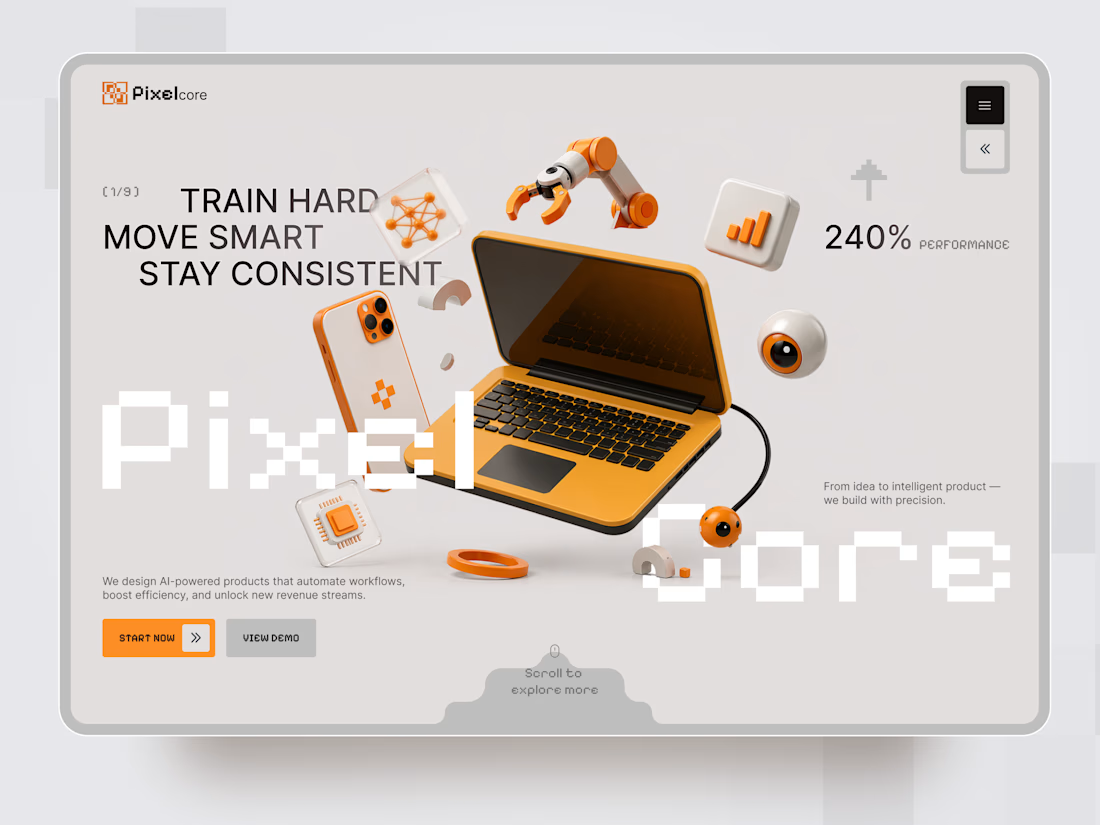
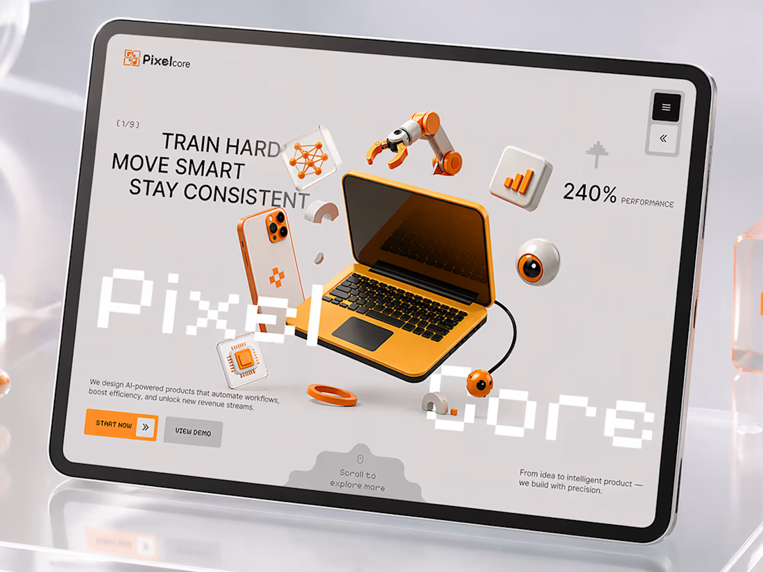
Pixelcore — AI & Technology Landing Page 🤖⚡
Pixelcore is a futuristic landing page concept for an AI-powered technology company focused on automation, data, integrations, and digital product development.
The goal was to communicate innovation and technical expertise without falling into the typical dark, overly complex AI aesthetic. The visual direction combines a clean monochrome interface with bold orange accents, pixel-inspired typography, and playful 3D technology objects.
Special attention was given to:
• a dynamic hero composition built around 3D tech visuals and strong typography;
• a distinctive orange accent system that guides attention toward key actions 🟠;
• pixel-inspired typography that reinforces the digital and technological character of the brand;
• 3D objects representing AI, automation, analytics, hardware, and connected technology;
• clear CTAs that make the next step immediately visible;
• service cards for AI Automation, Data Insights, Integrations, and Product Design;
• trust elements and performance metrics that support the company’s positioning;
• responsive mobile layouts that simplify the composition while keeping the same visual identity 📱;
• a modular visual system that could easily scale across services, case studies, and additional landing pages.
The result is a clean but expressive digital experience that makes an AI company feel innovative, approachable, and visually memorable — without sacrificing clarity or usability.
Looking to create a distinctive website for your AI, SaaS, or technology product?
Let’s turn complex technology into a digital experience people instantly understand ⚡




Wow! How did you approach balancing all the 3D elements without making the hero feel too busy?

🎨 I created this beginner-friendly Adobe Illustrator tutorial to show how simple shapes can be transformed into a complex radial flower pattern using repetition, rotation, and the Live Paint Bucket Tool. The goal is to make the process easy to follow and recreate.

I enjoyed this tutorial Predrag, it's simple, clear, and very easy to follow. Great job!


this project is one of my favourite projects I’ve ever done for a surrogacy brand
I learned a lot while exploring this design direction
charged $2.8k for design +development 💸
now, my starting price is $4k for one page site


Awesome 🔥👏👏


