The network for creativity
Join 1.25M professional creatives like you
Connect with clients, get discovered, and run your business 100% commission-free
Creatives on Contra have earned over $150M and we are just getting started
Back to feedPost

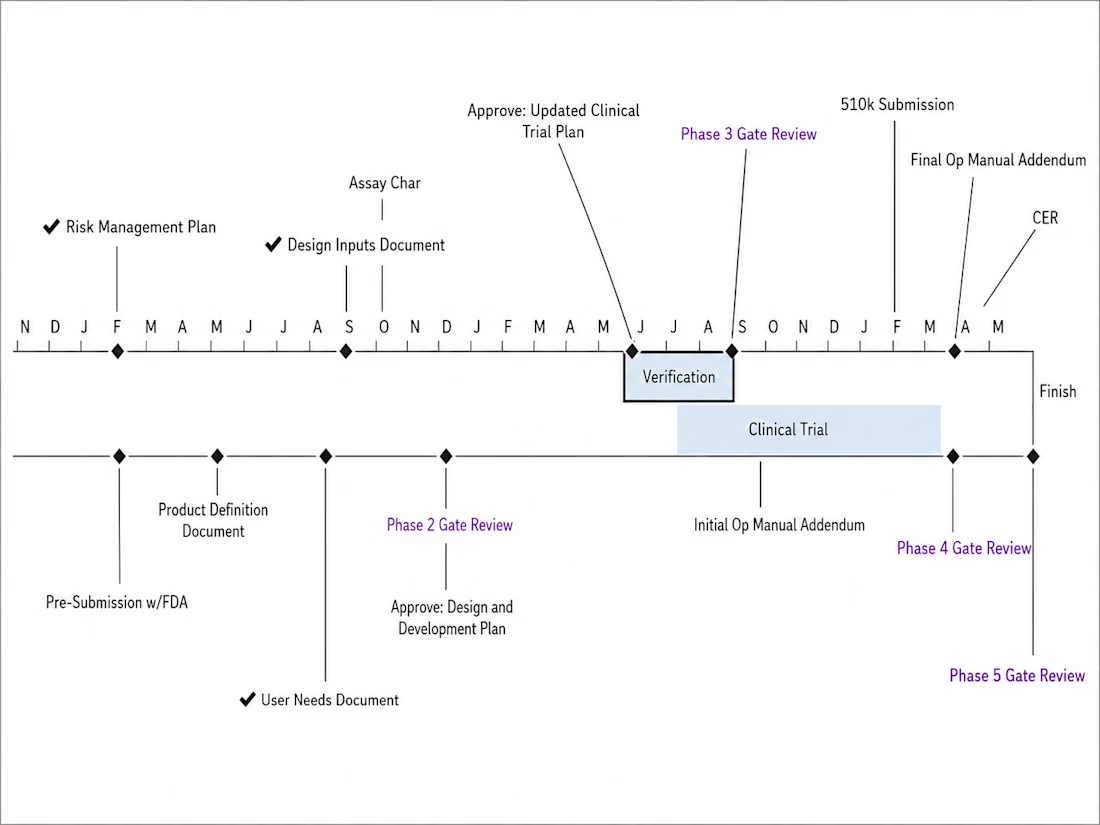

This is an example of a schedule created in MS Project for a med device 510k. I removed the actual dates to ensure confidentiality. So, this image is meant to show a skeletal view of a program I ran as the Sr. Program Manager.
The network for creativity
Join 1.25M professional creatives like you
Connect with clients, get discovered, and run your business 100% commission-free
Creatives on Contra have earned over $150M and we are just getting started











Related posts


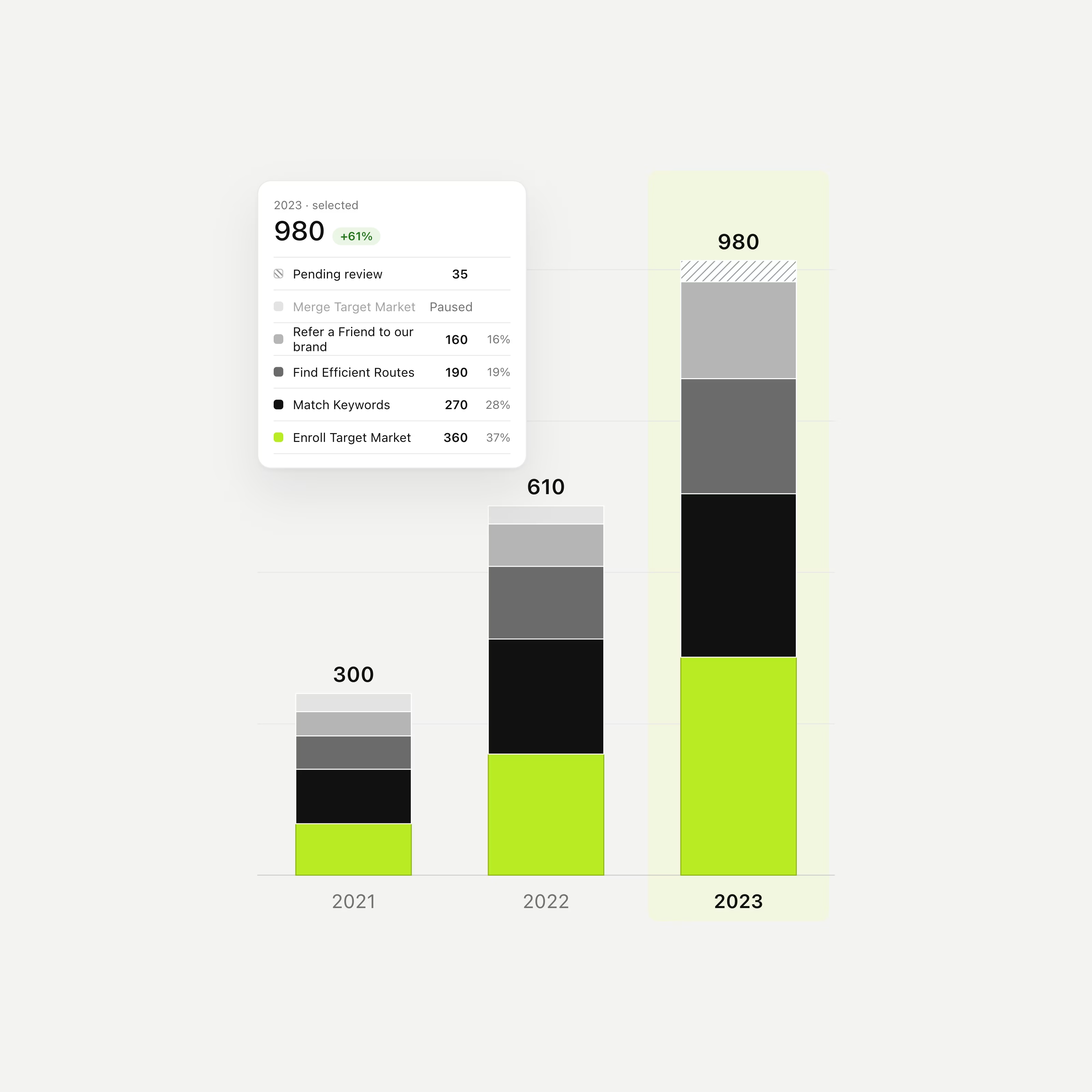
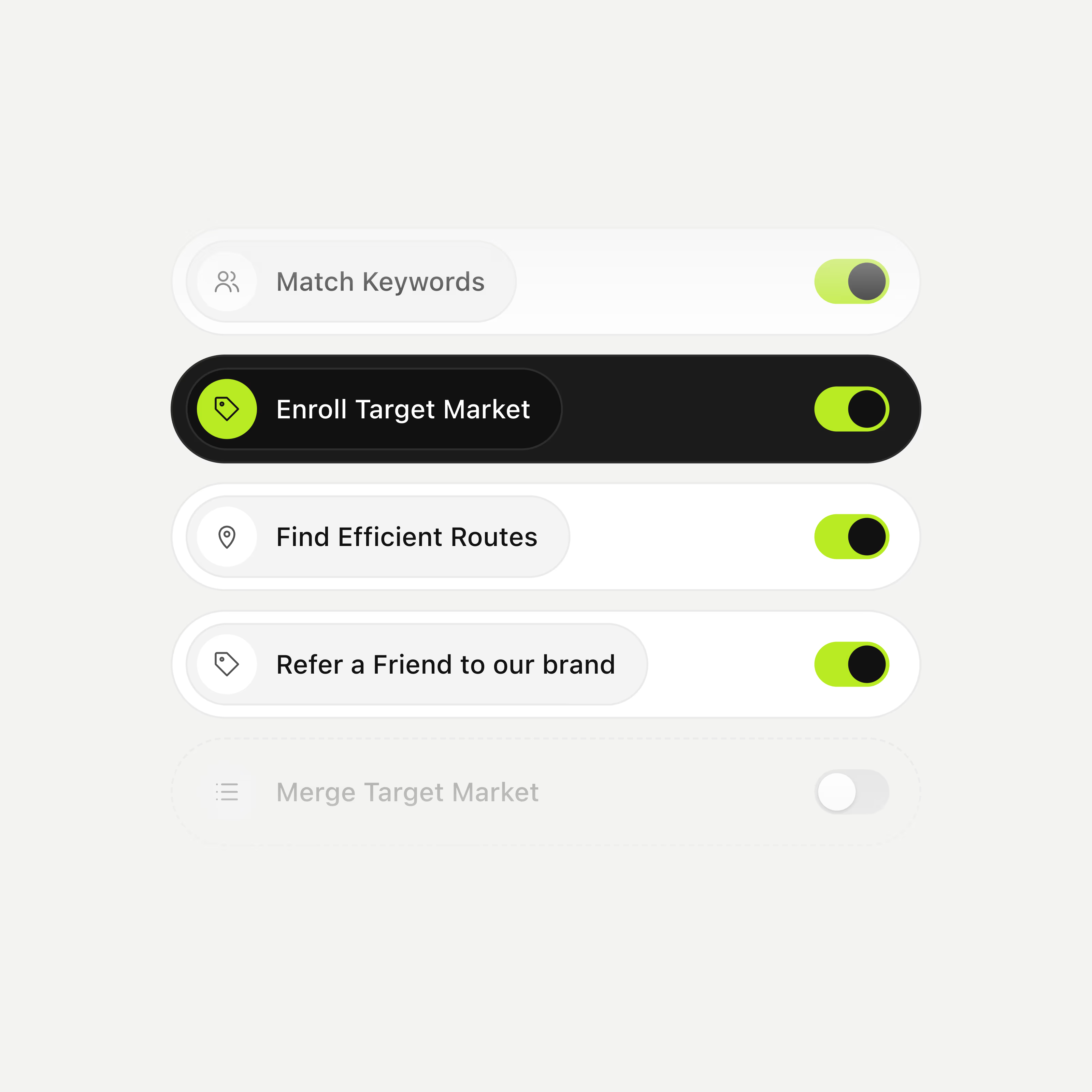
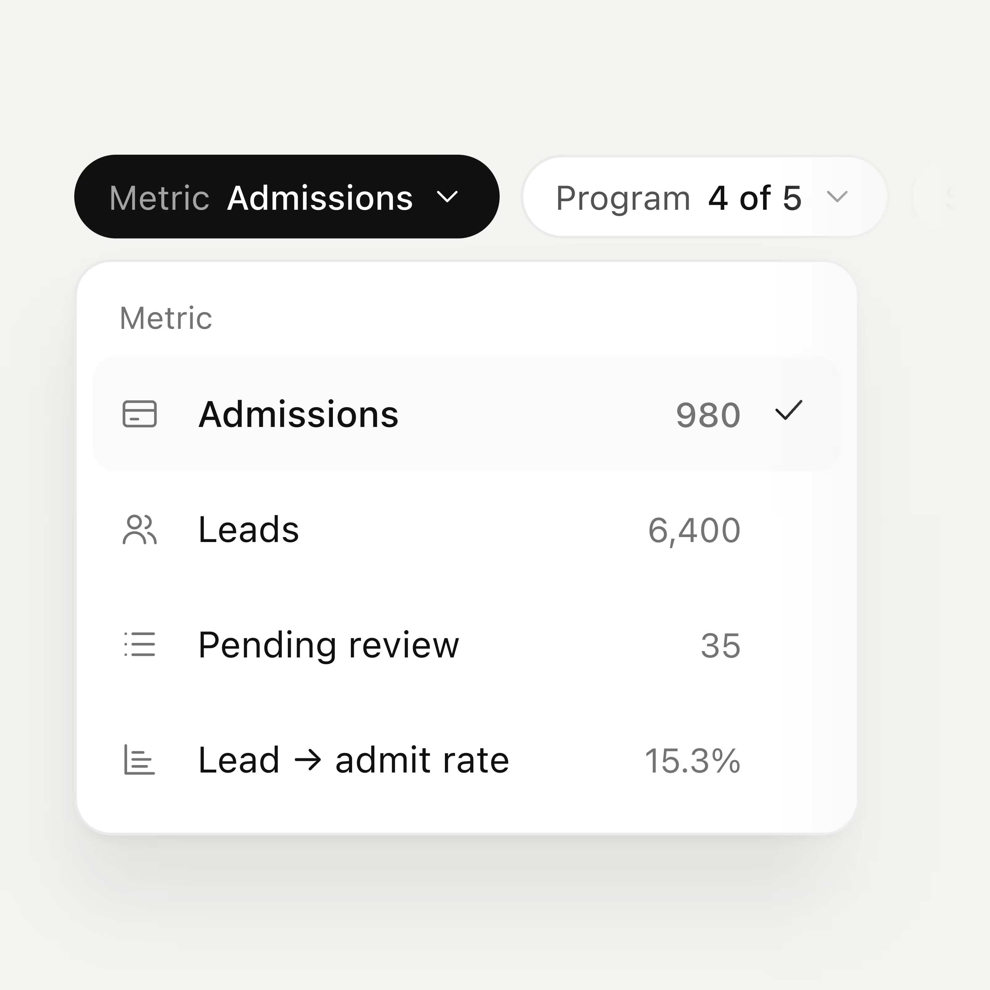

The lime against black and grey keeps these components readable. The stacked bar chart is a nice touch. Are the toggles a custom set or built on an existing kit?

Title: Proper Form — Brand Identity & Visual Language
A brand identity for Proper Form built around a more modern, movement-driven take on recovery and healthcare.
The visual system extends the logo into a complete language through color, typography, imagery and layout, creating a consistent identity across different brand touchpoints.
Created by Lepisov Branding in collaboration with @Creative Mints
Logo design: Ilya Gorchanyuk
Creative direction: Dmitry Lepisov
Brand identity: Lepisov Branding × Creative Mints


Using the logo mark as the big graphic across the layouts is smart. The purple to pink gradient gives recovery a more energetic feel.


AI Ops first is a bold thesis to lead with. The dark cinematic teaser with the floating refund resolver card sells the ambition without giving everything away.