The network for creativity
Join 1.25M professional creatives like you
Connect with clients, get discovered, and run your business 100% commission-free
Creatives on Contra have earned over $150M and we are just getting started
Back to feedPost

Just launched: Reflex 🌌
A cinematic Framer template for AI & automation agencies.
The hero is a real-time, ray-traced black hole that bends light as you watch, and it runs smoothly on desktop and mobile.
Inside:
• 25 pages + 10 CMS collections
• 16 custom interactive components (workflow canvas, agent console, ROI calculator)
• Booking calendar, pricing, blog, careers & changelog
• Fully responsive, rebrand in minutes with color styles
Built for AI agencies that want to look like the future.

The network for creativity
Join 1.25M professional creatives like you
Connect with clients, get discovered, and run your business 100% commission-free
Creatives on Contra have earned over $150M and we are just getting started











Related posts

I've been working on Cervia, a @Framer website for a single product.
A good single-product site combines the landing page and the store in one page, so the call to action is the purchase itself. Visitors learn what the product is, see why it’s better, and add it to the cart without leaving the page.
The challenge is making one page do both jobs. It has to look like a landing page, with room to explain the product and show it well, and still work like a store product page, with the price, colors and Add to cart always close at hand.
Every extra step between arriving and paying loses some buyers, so I kept the steps to a minimum.

This is so well put Heron! 🔥 Single-product site logic is spot on - landing + store in one page removes friction, CTA is purchase itself. No wandering around. Visitors learn what it is, why it's better, add to cart without scrolling through 5 pages - that's conversion gold!...

Are UX designers still relevant in the age of AI? 👀
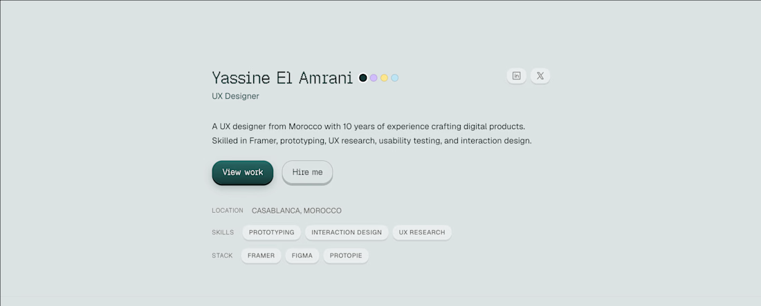
Anyways, here's a minimal header for a portfolio template made in Framer ✨

Yes, definitely! I’ve run into issues with coding agents myself, and Framer gives me more control over the design. AI helps, but a designer’s eye still makes a difference. Clean header, by the way! 👌


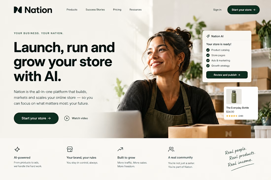

The Nation AI card on the hero is a nice touch. It shows the platform working before the visitor reads a single word. The Real people. Real products. Real income. strip gives the AI pitch a human anchor.