The network for creativity
Join 1.25M professional creatives like you
Connect with clients, get discovered, and run your business 100% commission-free
Creatives on Contra have earned over $150M and we are just getting started
Back to feedPost
Added a new case study that I'm so excited to share!

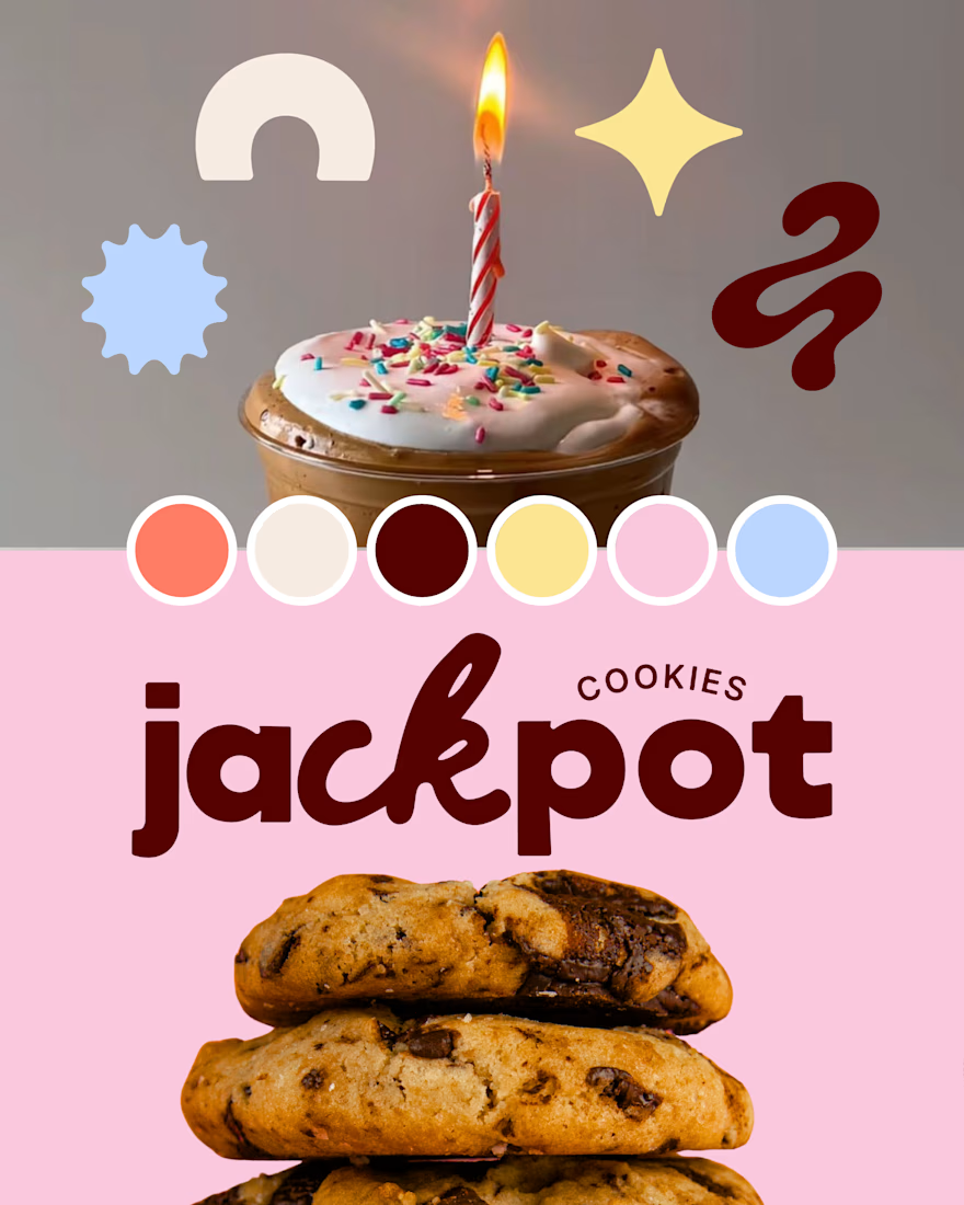
This one started as an unused creative direction from a previous branding project that I still really loved, so I decided to give it a new life as Maple Café.
Swipe to see where it started → and how I adapted the original direction into a playful, nostalgia-inspired café brand with bold typography, warm colors, and celebratory details throughout.

The playful café direction feels really cohesive—the warm palette and oversized type make the nostalgia feel intentional rather than themed. Love the jump from the original route to Maple Café.


the cookie colors are so fun. which one took the longest?

Good call reviving it. The script wordmark on chocolate texture feels much more café than the cookie packaging did.


Yes, I agree! I think the client made the right choice for the project, and it was fun getting to give the unused concept a second life as a passion project

Great work..

I definitely agree!!

Rescuing a shelved direction and giving it a whole new identity is a skill in itself. The warm palette and celebratory feel for Maple Café really work, and those bold typographic choices feel alive.
thank you! Whenever I want to work on a passion project, I always turn to shelved directions. Sometimes they are too good to throw away completely!

Ahhh very delicious!! 🚀


love itttt
The network for creativity
Join 1.25M professional creatives like you
Connect with clients, get discovered, and run your business 100% commission-free
Creatives on Contra have earned over $150M and we are just getting started

Challenges
View all


Related posts

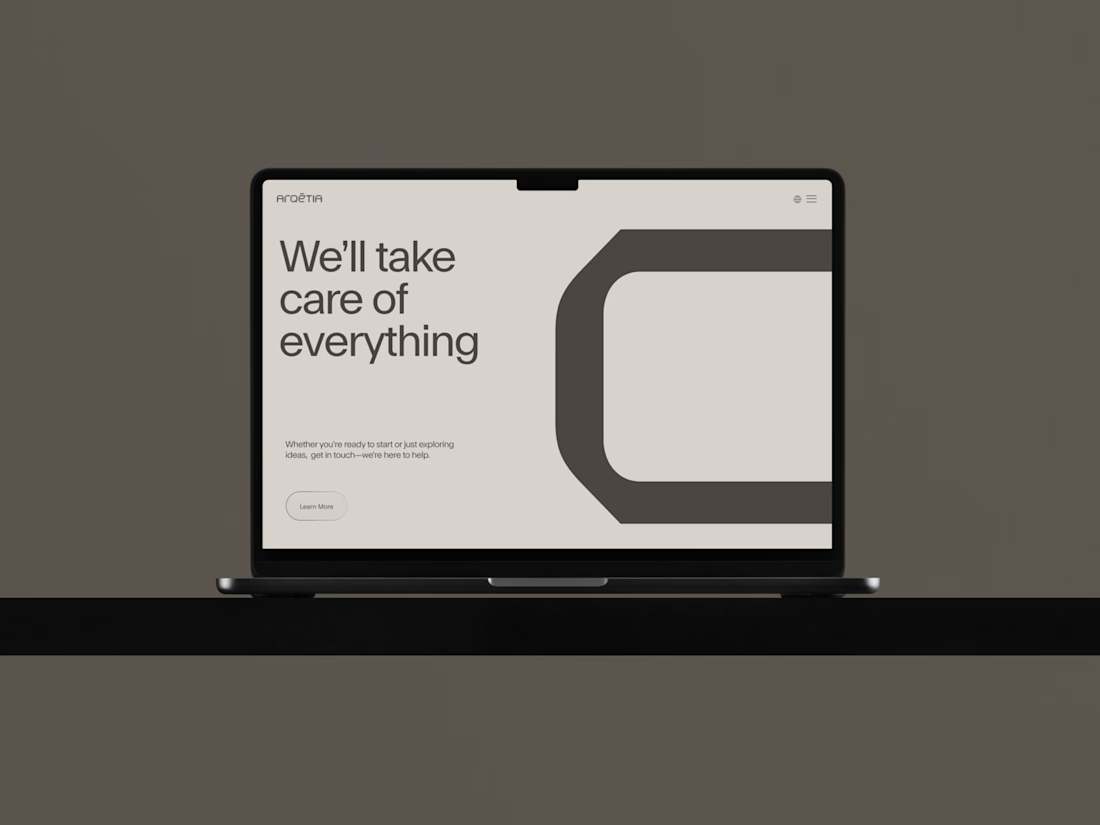
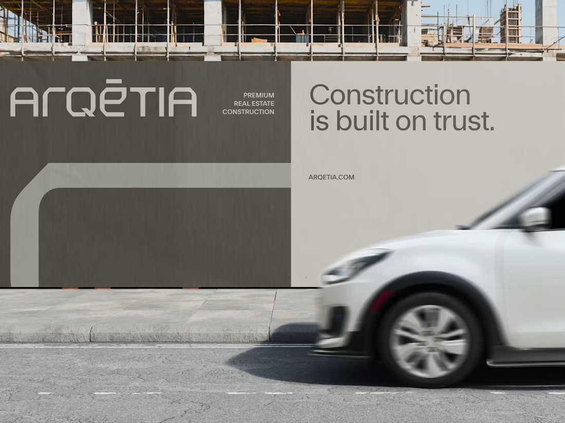
What if construction felt as clear as the space it creates?
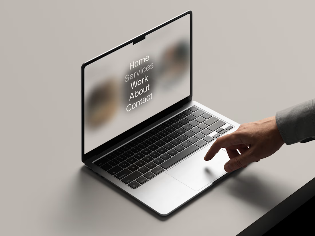
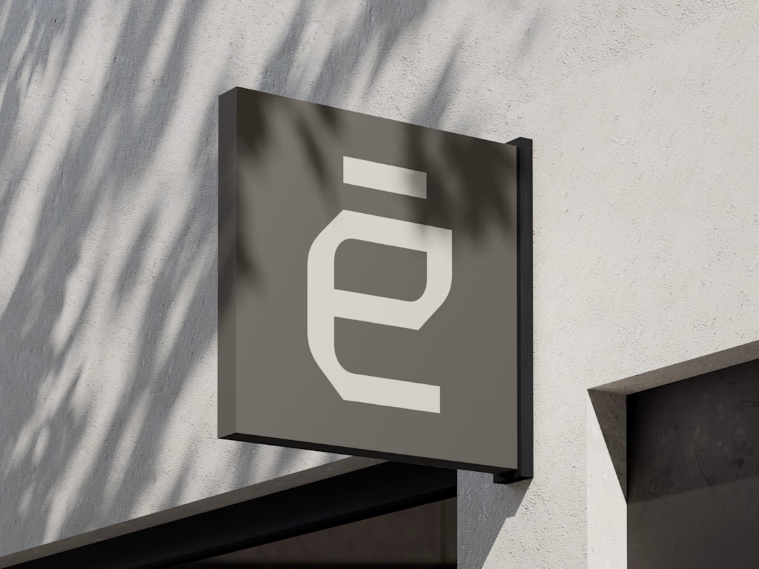
For Arqētia, we built a visual identity around one of the industry's most important client needs: transparency. A direct response to the uncertainty often associated with construction, from unclear processes and budgets to timelines and decision-making.
The concept makes transparency tangible, translating it into a visual system that feels open, structured and precise.
check it out

Very clean identity work

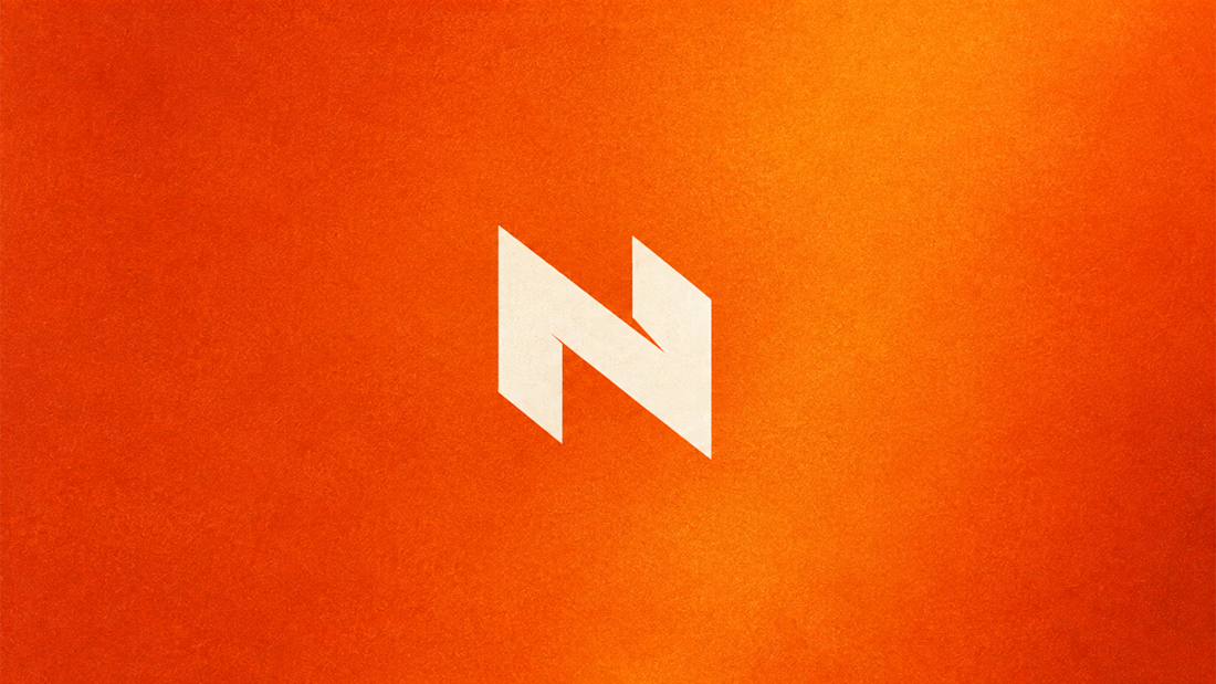
My Top Featured Projects on @Contra Labs 🔥
⚡| NEXVOLU
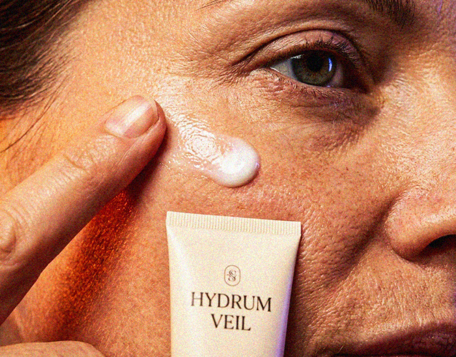
⚡| HYDRUM VEIL
⚡| NOIRÉ
Each project explores a different direction, but the goal stays the same: build brands that stand out.
Which project is your favorite?
Drop the name below 👇


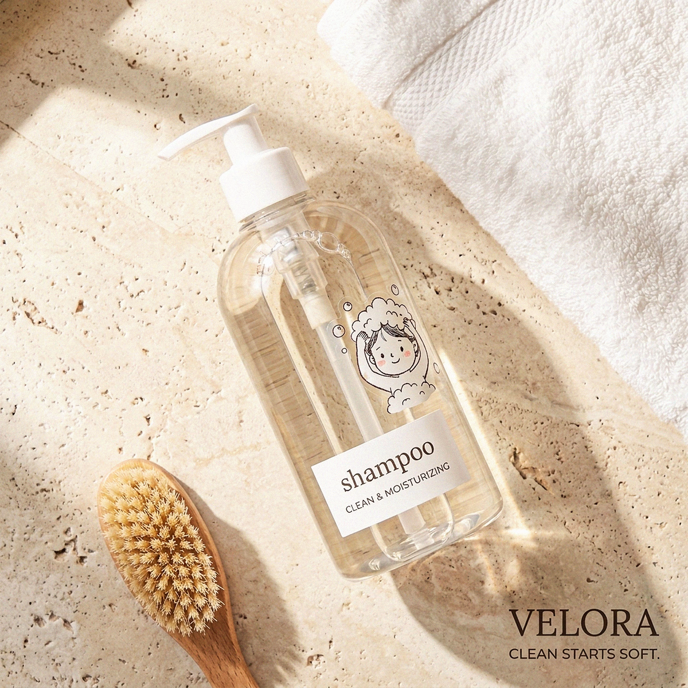
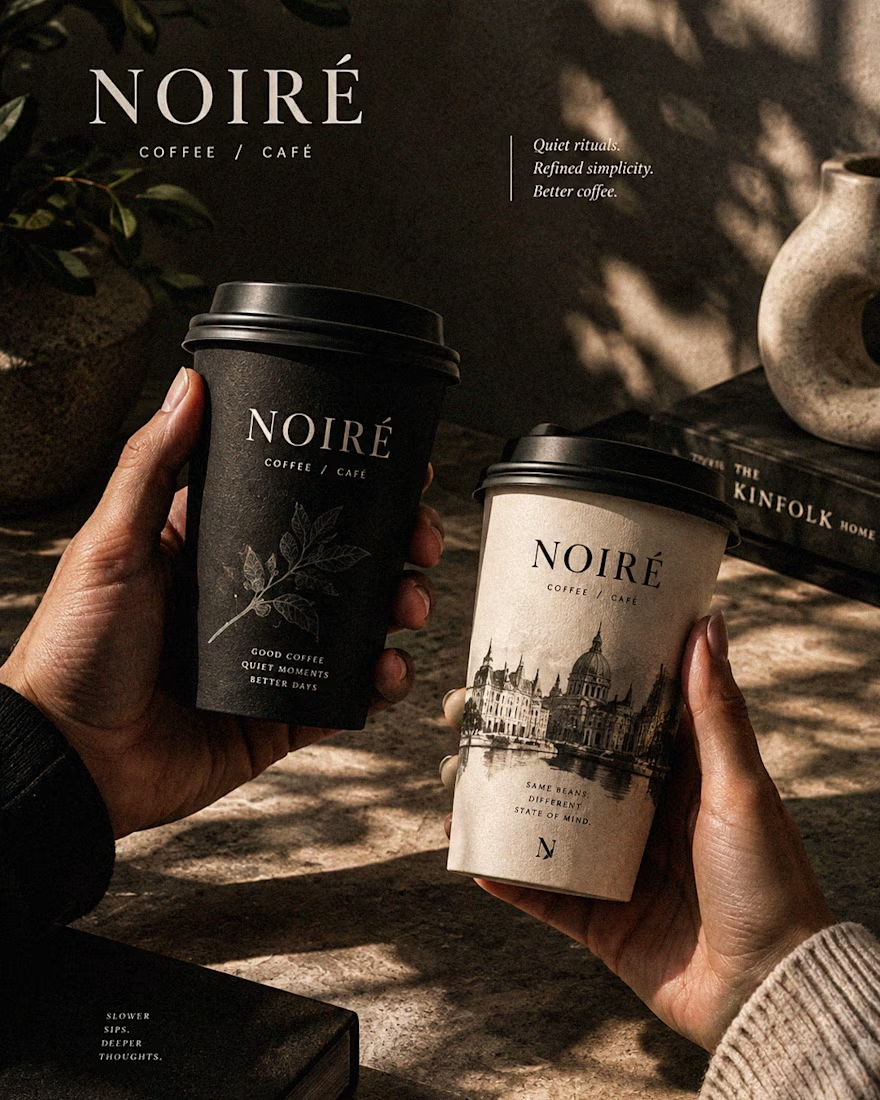

These are 🔥 Mine are all fav 🙌
Congo for Featured on @Contra HQ & @Contra Labs ... 😍

Luxury Lighting E-commerce Website Design for Modern Home Decor
A modern luxury lighting e-commerce website concept crafted to showcase premium statement pieces through a refined, immersive, and editorial-inspired digital experience. The design combines warm ambient lighting, bold typography, cinematic imagery, and clean minimalist layouts to create a sophisticated online presence for a high-end home decor brand. Every element is thoughtfully designed to enhance product storytelling, improve user engagement, and deliver a seamless shopping experience across all devices.


really nice design