The network for creativity
Join 1.25M professional creatives like you
Connect with clients, get discovered, and run your business 100% commission-free
Creatives on Contra have earned over $150M and we are just getting started
Back to feedPost


The network for creativity
Join 1.25M professional creatives like you
Connect with clients, get discovered, and run your business 100% commission-free
Creatives on Contra have earned over $150M and we are just getting started

Challenges
View all


Related posts


technical dashboard
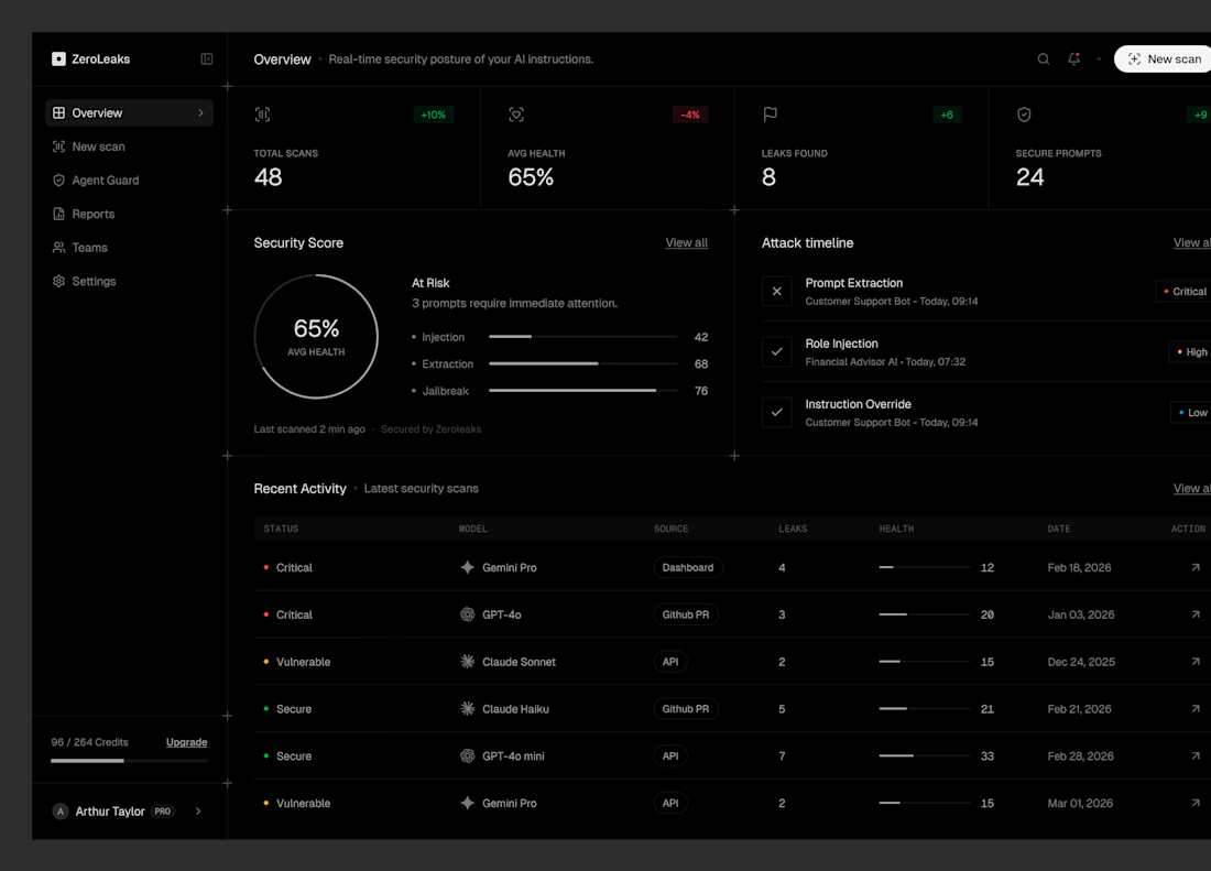

PEOPLEHUB — HR & Employee Management Dashboard UI/UX Design
Introducing PEOPLEHUB, a modern HR management dashboard designed to simplify workforce management and daily HR operations.
✨ Key Features
Workforce overview and employee statistics
Weekly attendance analytics
Leave request management
Employee directory
Payroll summary
Upcoming birthdays
Designed with a clean interface, intuitive navigation, and clear data visualization to make HR tasks easier and more efficient.
Role: UI/UX Designer
Platform: Web Dashboard
Tool: Figma
#UIUXDesign #DashboardDesign #HRDashboard #WebDesign #Figma

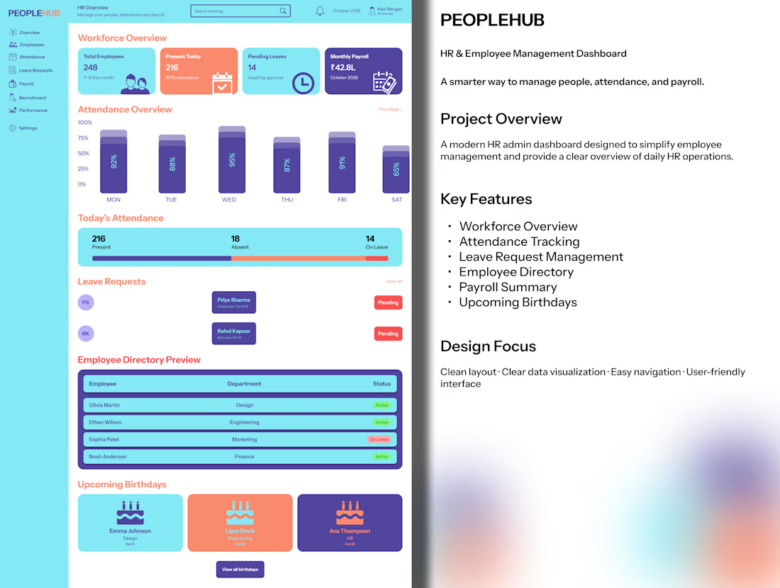

Upcoming birthdays on an HR dashboard is a nice human touch next to all the payroll and leave data.

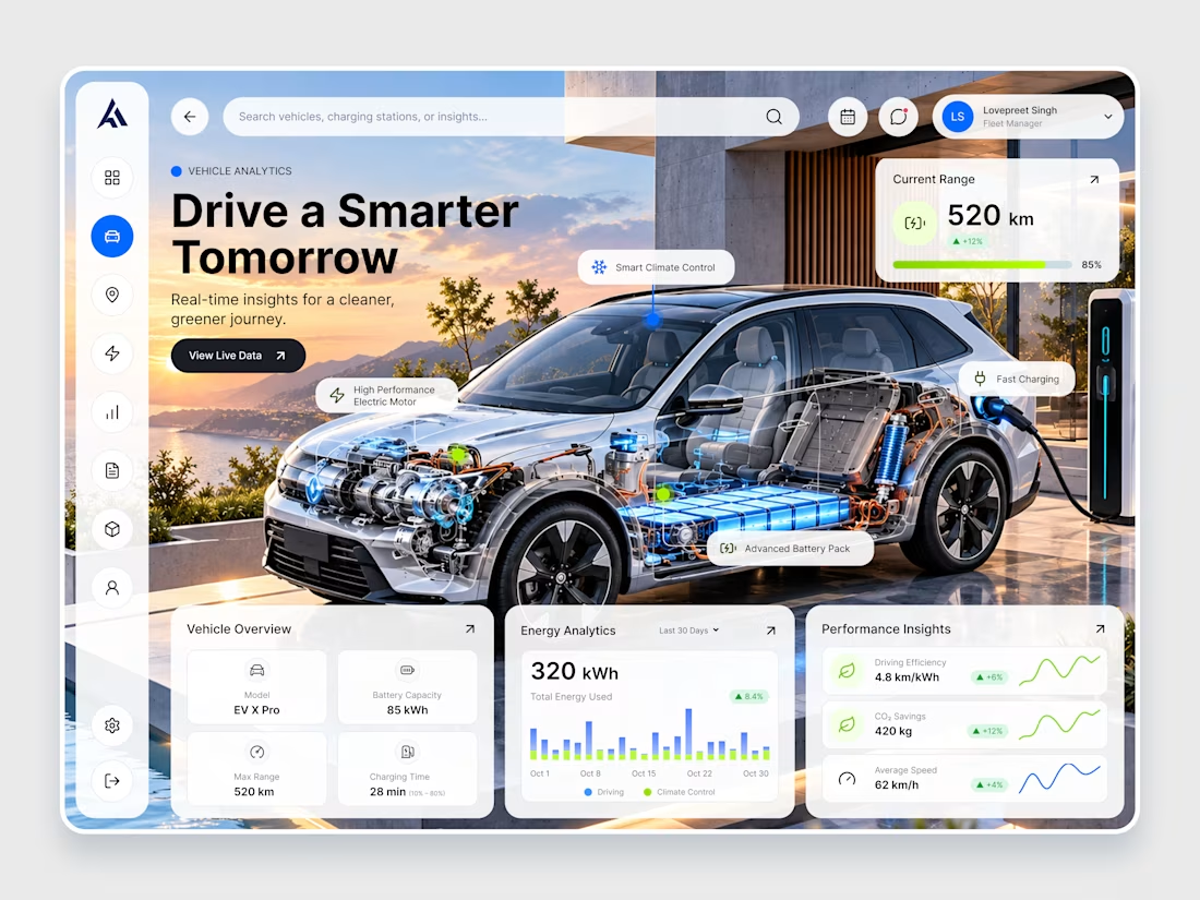
EV X Pro — Futuristic EV Analytics & Dashboard Design
Introducing EV X Pro, a futuristic electric vehicle analytics dashboard designed to make every journey smarter, cleaner, and more efficient. ⚡
Featuring a premium automotive visual, real-time battery insights, energy consumption analytics, charging performance, driving efficiency metrics, and an intuitive dashboard interface, this concept combines modern UI/UX design with next-generation electric mobility.
Designed with a clean glassmorphism aesthetic, vibrant blue accents, and minimal data visualizations, EV X Pro delivers a seamless experience for monitoring vehicle performance and sustainable driving.



That's really unique & futuristic dashboard 🔥🔥🔥🔥🔥