The network for creativity
Join 1.25M professional creatives like you
Connect with clients, get discovered, and run your business 100% commission-free
Creatives on Contra have earned over $150M and we are just getting started
Back to feedPost

Just added a new section to Spandana, my Framer template - “Hall of Fame” 🏆
A clean, minimal way for agencies to showcase awards, recognition, and credibility without clutter.
Simple, structured, and built to elevate trust.


Nice!
The network for creativity
Join 1.25M professional creatives like you
Connect with clients, get discovered, and run your business 100% commission-free
Creatives on Contra have earned over $150M and we are just getting started



Related posts

A quick look at ATELVYN — my latest Framer template for contemporary artists, studios, and galleries.
Clean layouts, elegant typography, and smooth interactions. ✨
Here's how it looks in action.
#Framer #ArtistPortfolio #WebDesign

Bold or calm: which Framer homepage would you remember?
Milemarker (Framer), a platform that connects every system a wealth management firm runs, in bold orange.
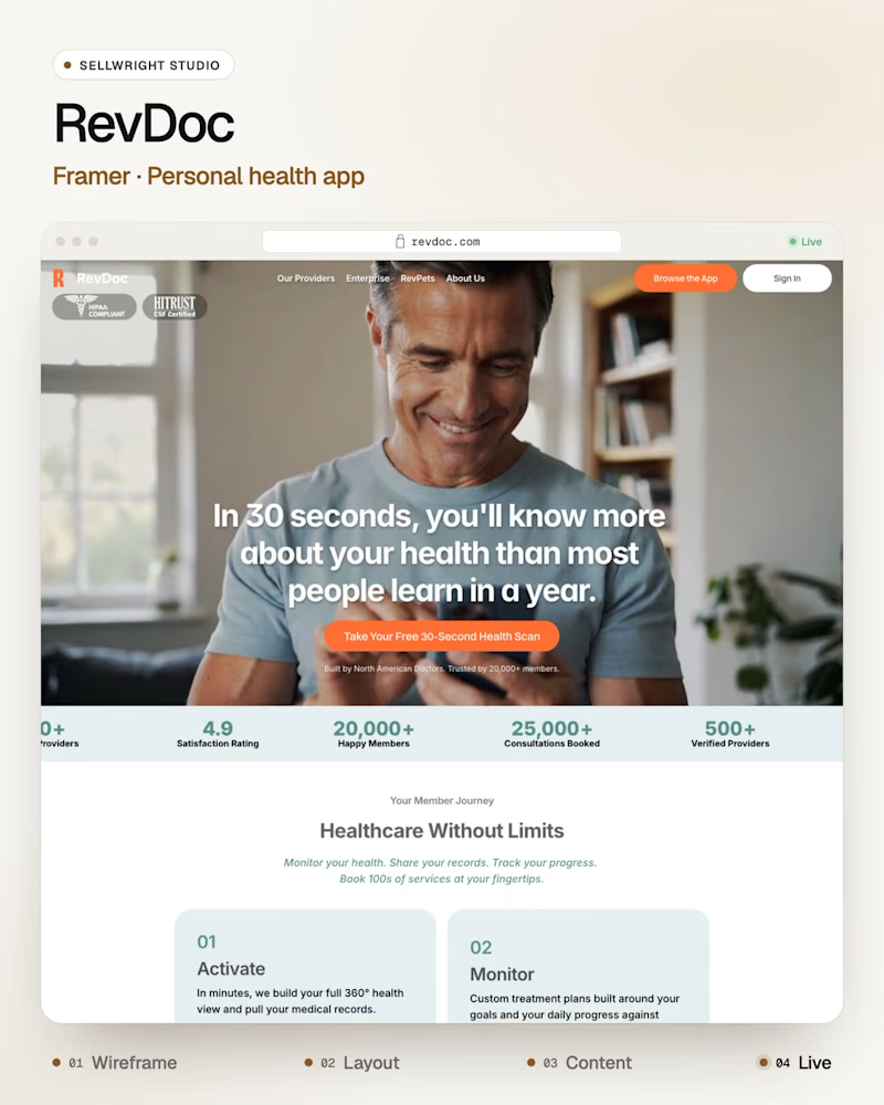
RevDoc (Framer), a personal health app, calm and photo-led.
Both are built in Framer, and both have to explain a complex product in one line.
Which one sticks with you after you close the tab?
Live: milemarker.co · revdoc.com
More builds: instagram.com/sellwrightstudio · youtube.com/@sellwrightstudio

0 voted
0%

3 voted
100%
3 votes
Closed

Both directions work so well for their industries! The bold orange for Milemarker makes sense for a wealth management system connector - it needs to feel energetic and confident. But this calm, photo-led approach for RevDoc is brilliant for healthcare - instantly builds trust...

🚀 The Keel website is now live!
I designed Keel as a fintech website concept focused on presenting financial products through a clean layout, clear messaging, and a simple user experience.
I’ve also built the website in Framer. Check it out below!
🎨 Built with Framer: https://thekeel.site/
Always happy to hear your feedback!


Congrats on the launch Nilkanth! Keel looks super clean — love how you kept the fintech messaging simple and focused. The "Take Control of Your Financial Future" hero with the app preview balances trust and clarity perfectly. Great job building it in Framer too!