The network for creativity
Join 1.25M professional creatives like you
Connect with clients, get discovered, and run your business 100% commission-free
Creatives on Contra have earned over $150M and we are just getting started
Back to feedPost

A musical snippet for a GTA-style rap artist


The network for creativity
Join 1.25M professional creatives like you
Connect with clients, get discovered, and run your business 100% commission-free
Creatives on Contra have earned over $150M and we are just getting started



Related posts

New case study for the brand and digital work we did for Seeper Studios.
Go Check it out


Evolving a brand with almost 30 years of history is the hard version of brand work. You have to keep what people already trust while making it feel current. Nice job balancing both.

What if every museum gave you a card for showing up?
For La Noche de los Museos in Buenos Aires, I designed a holographic tarot card where each museum’s signature piece becomes your ticket.
Which museum would you visit for your card? 🌙


Text on album covers is tacky? Whatever 🤌🏼 Vienna Starlight Boom 😒
Typography can ABSOLUTELY make an album cover.
During the pandemic, I got obsessed with album cover design. I'd spend hours looking at covers, researching the designers behind them, and trying to understand the decisions and creative processes that made them work.
It was one of those design rabbit holes I could never get tired of. 💀
I'm bringing that interest back with a new cover inspired by the music I love, including Neil Young's Harvest, Bandalos Chinos' Paranoia Pop and Uncle Acid & The Deadbeats' Vol. 1.
Looking at these alongside other great album covers, one thing stands out: typography CAN be the image!
I took inspiration and designed one as well!
What's an album cover where the typography is impossible to separate from the artwork? Show me your favorites.
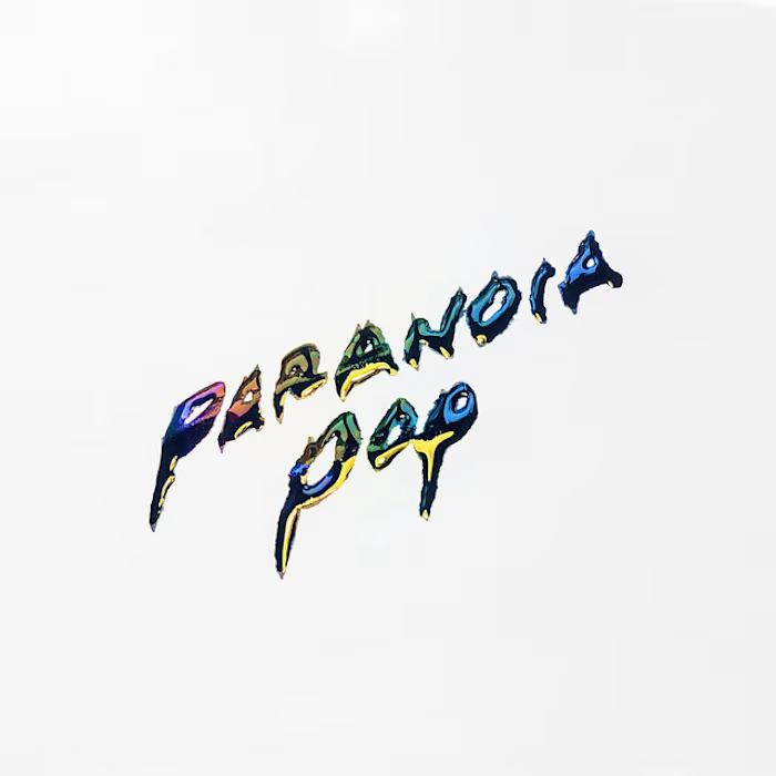
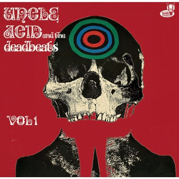
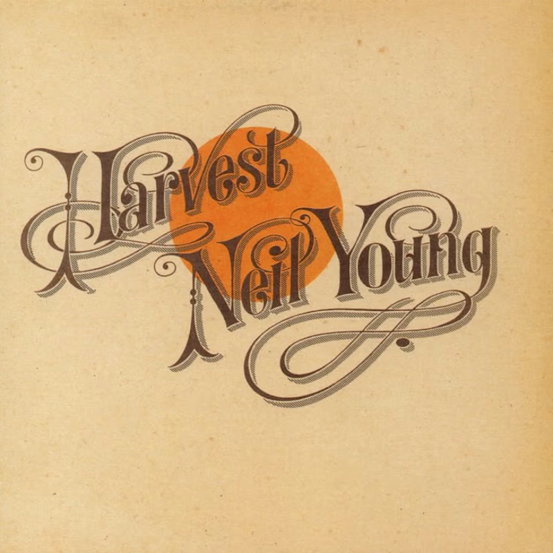
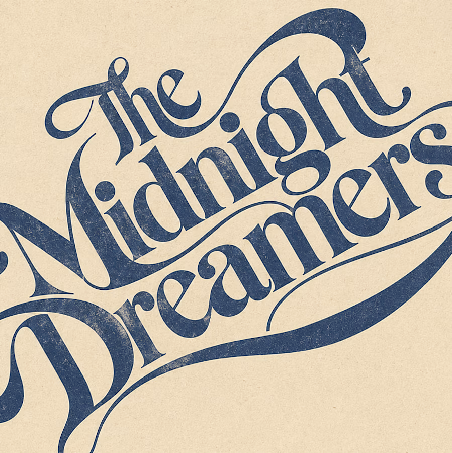

Reid Miles' Blue Note covers are my pick, where the cropped oversized lettering carries as much mood as any photo could. Your Paranoia Pop treatment has that quality too, the letterforms feel poured into the image rather than placed on it.


