The network for creativity
Join 1.25M professional creatives like you
Connect with clients, get discovered, and run your business 100% commission-free
Creatives on Contra have earned over $150M and we are just getting started
Back to feedPost

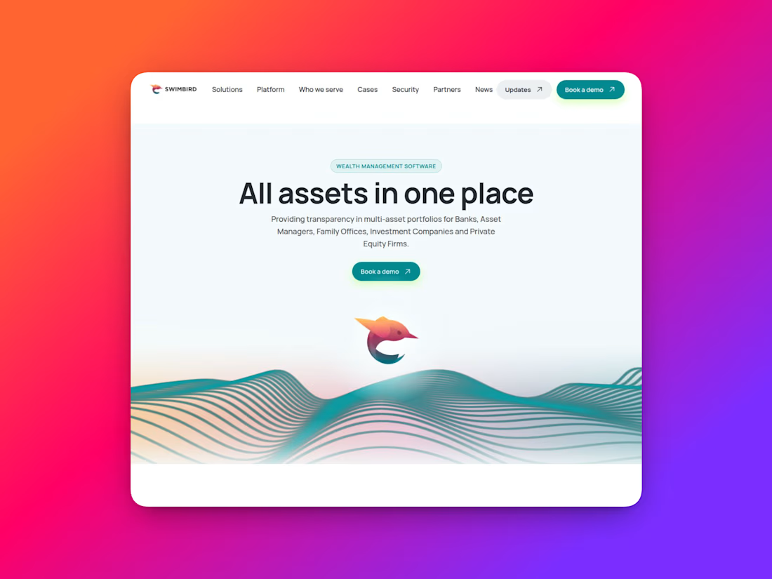
A self-initiated redesign of Swimbird, a WealthTech company. I saw an opportunity to create a clearer, more premium digital experience built around conversion. AFTER, https://swimbird.framer.website/
Before, https://www.swimbird.com/
::


The network for creativity
Join 1.25M professional creatives like you
Connect with clients, get discovered, and run your business 100% commission-free
Creatives on Contra have earned over $150M and we are just getting started

Challenges
View all


Related posts


I found the Cloud Atlas a few days ago and got a little obsessed, so I ended up building this in Framer to play around with it


Amazing work👏🔥🔥

Went deeper on the case study layout in STUDIO HRSE, strategy, visuals, and a scroll transition straight into the next project, so nobody hits a dead end.
This is the page I'd want a potential client to actually read start to finish.
Free template, live on Framer.
https://www.framer.com/marketplace/templates/studio-hrse/


So cool!

What should a platform for tokenized private equity look like?
Probably not like another traditional bank.
For ICME, the client wanted a visual direction that felt modern, disruptive, and native to a new kind of financial market.
The challenge was finding the balance: make the experience bold enough to feel different, while keeping a complex product understandable and credible.
I developed a digital-brutalist direction with retrofuturist touches - oversized typography, hard contrast, pixel textures, raw layouts, blue gradients, and controlled motion.
I worked with Arash Attar and the ICME team across the landing page and parts of the wider product interface. This video focuses specifically on the landing-page experience.
The goal was to:
— Explain tokenized private-company equity more clearly
— Create a memorable visual identity for the product
— Speak to both investors and founders
— Make financial technology feel ambitious rather than conventional
Would this visual direction make you want to explore the product - or should financial platforms feel more restrained?


This is amazing, man.
Good job!


