The network for creativity
Join 1.25M professional creatives like you
Connect with clients, get discovered, and run your business 100% commission-free
Creatives on Contra have earned over $150M and we are just getting started
Back to feedPost

Your website doesn't need more pages. It needs a better job.
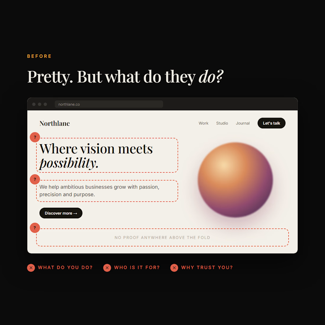
We keep seeing the same pattern: a pretty homepage, then 12 service pages, then 8 blog posts, and still nobody can tell what the business actually does.
The problem isn't how much is on the site. It's that nothing is clear.
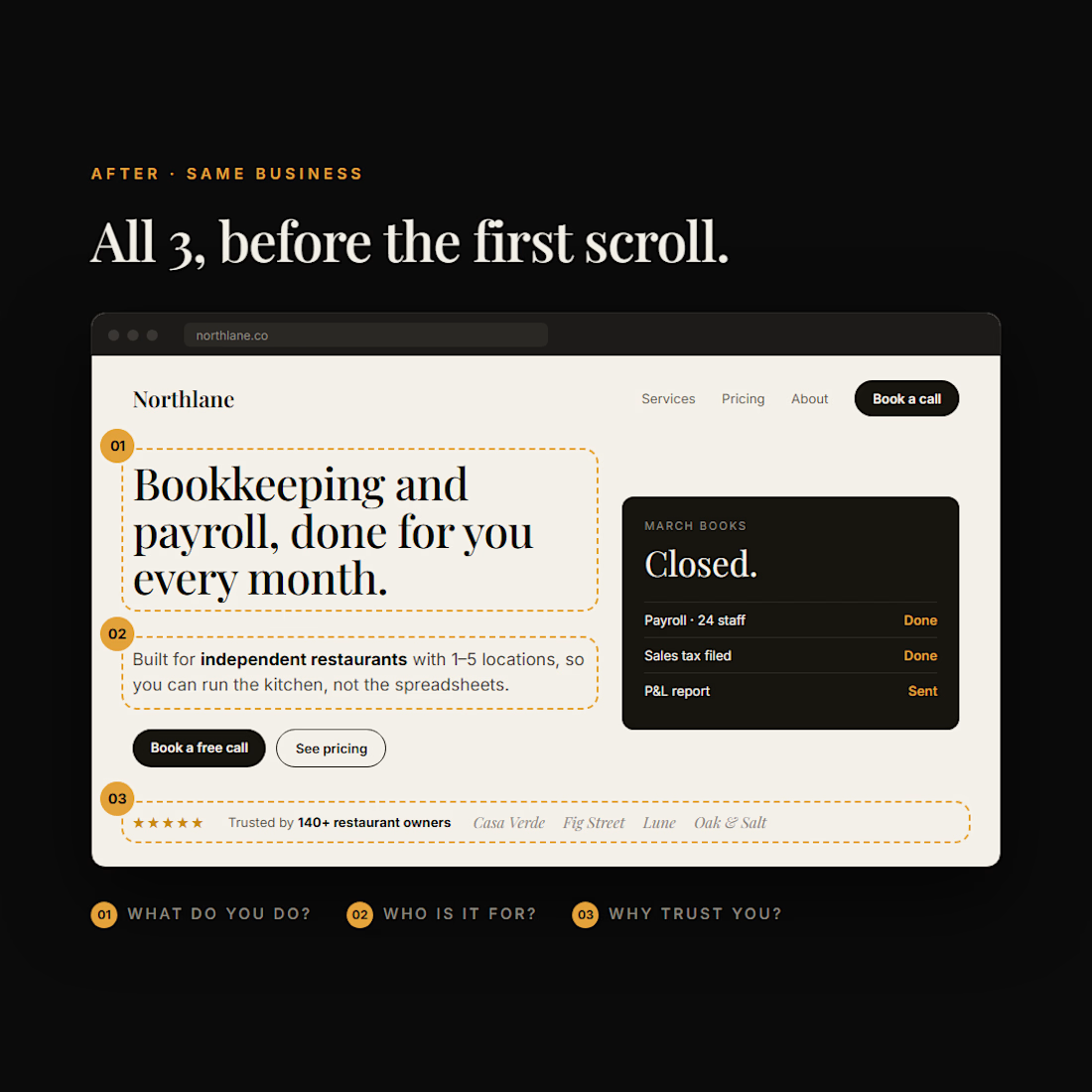
A website should answer 3 things fast:
1️⃣ What do you do? → your headline
2️⃣ Who is it for? → your subheadline
3️⃣ Why should I trust you? → proof, before the first scroll
If your homepage doesn't answer those in about 5 seconds, adding more pages won't fix it. It just gives visitors more places to get lost.
More content ≠ better website.
Sometimes the smartest website strategy is deleting what isn't helping.
What would you fix first on your website? Tell us below 👇
The network for creativity
Join 1.25M professional creatives like you
Connect with clients, get discovered, and run your business 100% commission-free
Creatives on Contra have earned over $150M and we are just getting started





Related posts


Your homepage should answer one question: what do you do? If a visitor can't answer that in five seconds, everything below the fold doesn't matter.
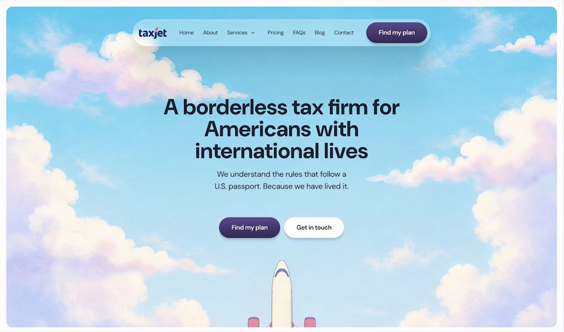

I just saw Bright Studios’ new website. You guys nailed it! Really like it.

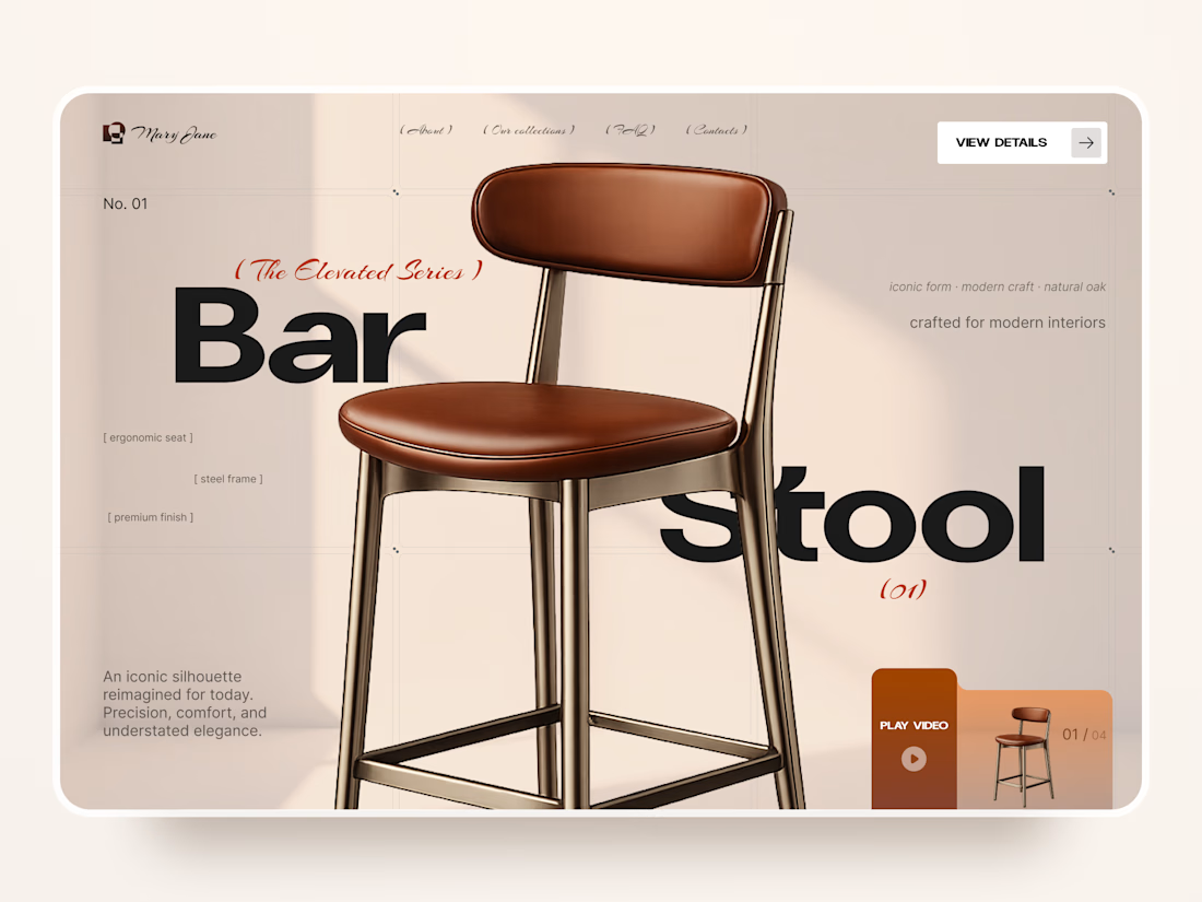
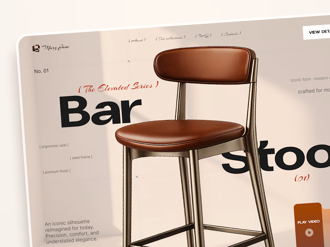
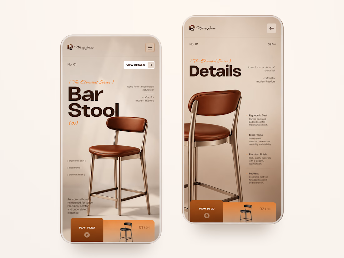
Mary Jane — Bar Stool Product Landing Page 🪑✨
A refined product landing page concept for a modern furniture brand, built around one statement piece
The design combines warm neutral tones, oversized typography, and editorial layouts to give the bar stool a premium, design-focused feel
Special attention was given to:
• Product-first composition
• Clean editorial typography
• Warm premium aesthetic
• Product details and features
• Video and 3D presentation
• Responsive mobile layout
The result is a simple, elegant experience that keeps the product at the center while giving the brand a distinctive visual character 🤎



Nice work

September was a good month:
> crossed $10k+ in revenue on Contra
> shipped 3 projects: landing page, brand design, website
> went fully independent as a designer
> got referred to a big client by another designer
Now opening 2 spots for October.


Great work on this